State of the art, project management and documentation
1. Objective
The objective of this first assignment was to understand how I will document my work throughout Fabricademy and to build the basic structure for my documentation website.
The assignment
The main assignment was to build and publish a documentation website introducing myself, my motivation for Fabricademy and some of my previous work, while learning the basic tools and workflow needed to document the course.
My objectives
For this first week, I wanted to:
- Understand how the Fabricademy documentation system works.
- Learn the basics of GitLab, Markdown and Zensical.
- Build and publish my personal homepage.
- Learn how to organize, resize and optimize images and files for the web.
- Understand the workflow of editing, committing, running the pipeline and publishing changes.
- Customize the website so it feels connected to my own visual identity while remaining clear and easy to navigate.
- Begin researching references related to the subjects I am interested in exploring during Fabricademy.
For me, this assignment was not only about creating a website. I wanted to understand the system well enough to use it as a working documentation tool throughout Fabricademy.
2. References, Research & Inspiration
Before designing my documentation system, I explored previous Fabricademy websites to understand how other students had approached the same challenge.
I was not looking for a visual style to copy. I was interested in seeing how different people organized large amounts of information, created a personal identity within the Fabricademy structure, combined images and text, and kept their documentation easy to navigate.
2.1 Documentation & website references
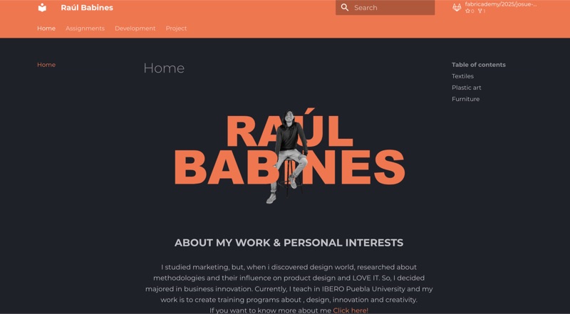
Navigation and reading experience. Website and work: Raúl Babines. Screenshot by Andrea Cesar.
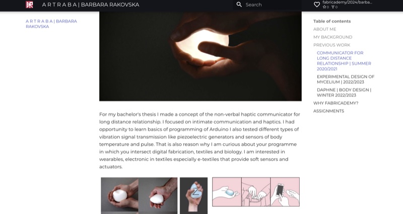
Visual documentation. Website and work: Barbara Rakovska. Screenshot by Andrea Cesar.
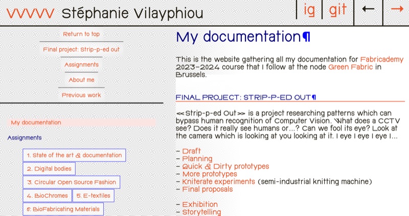
Graphic customization. Website and work: Stéphanie Vilayphiou. Screenshot by Andrea Cesar.
Raúl Babines · Fabricademy 2025
Raúl Babines’ documentation became an important UX reference while I was redesigning my homepage.
My first versions used a relatively narrow content column and became very long as I added previous work. Looking at his website helped me reconsider how much of the screen I could use, how images could be organized more efficiently and how the Fabricademy navigation could remain accessible.
What I took from this reference was not its visual style, but the importance of designing documentation as a navigation and reading experience, rather than only as a composition.
Explore Raúl Babines’ documentation →
Stéphanie Vilayphiou · Fabricademy 2024
Stéphanie Vilayphiou's documentation showed me how far the visual language of the Fabricademy website could be customized.
She modified typography, graphics, colors and navigation to create a documentation site with a very distinctive identity, while still keeping the Fabricademy assignments and project structure accessible.
This reference was particularly useful when I started modifying my own extra.css. It helped me understand that the default template could be treated as a functional starting point rather than as a fixed visual design.
Explore Stéphanie Vilayphiou's documentation →
Barbara Rakovska · Fabricademy 2024
Barbara Rakovska's documentation showed me another approach: large visual elements coexist with clear navigation and structured written documentation.
I was particularly interested in the way projects are introduced through strong images before moving into more detailed information.
I also discovered an unexpected connection with my own research interests in her previous work: a haptic communicator for long-distance relationships. This reminded me that references encountered while researching documentation can also open new directions for my project research.
Explore Barbara Rakovska’s documentation →
2.2 Initial research direction
My broader research interest during Fabricademy is human relationships and how they might be explored through data, textiles, technology, materials and biological processes.
I am beginning with a small group of references connected to personal data, interaction and the body. I introduced these references on my homepage as an initial map of my interests.
I do not consider this a finished State of the Art. I want it to grow throughout Fabricademy.
As each assignment introduces a new field — such as biochromes, e-textiles, computational couture, biofabrication or soft robotics — I will add references that connect that week's subject with my broader research question.
In this way, the State of the Art can develop alongside the project rather than being defined completely at the beginning.
Explore my initial research interests and references on the Home page →
3. Building My Documentation System
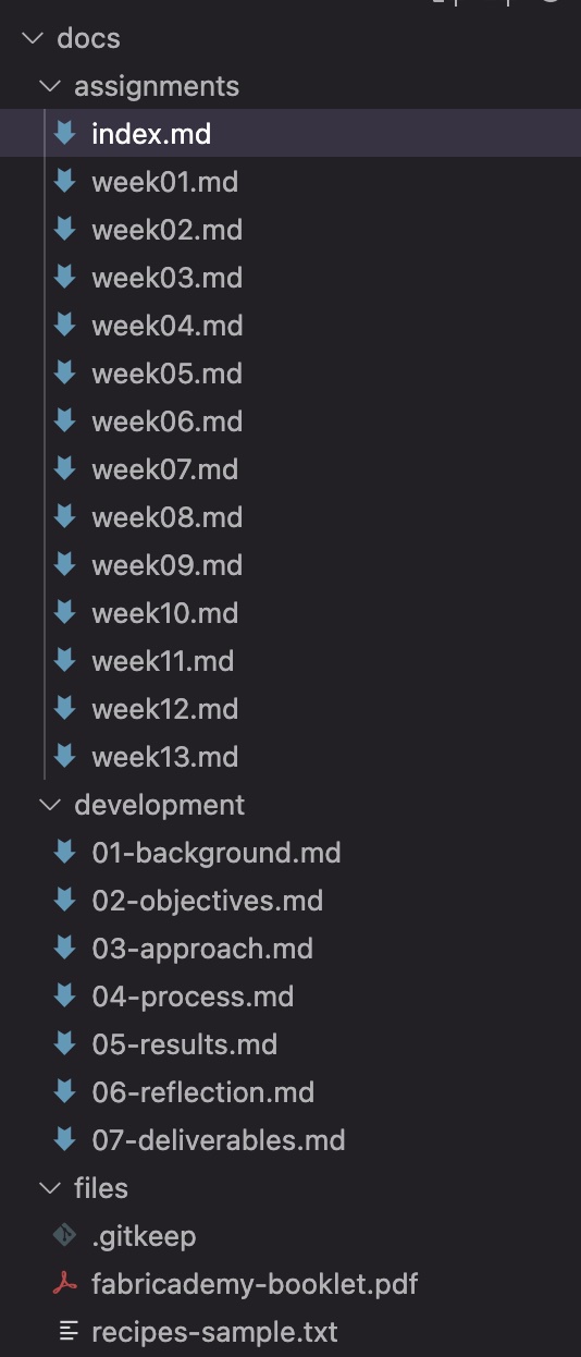
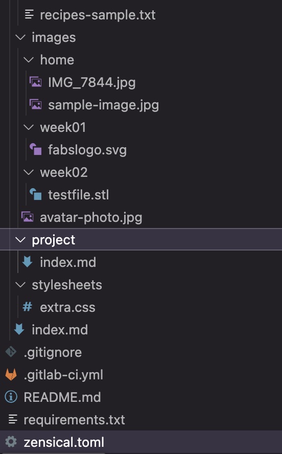
3.1 Understanding the file structure
The Fabricademy repository already contained the basic structure for the documentation. Instead of starting from an empty website, I learned how the different folders and files relate to each other.
docs/
│
├── index.md
│
├── assignments/
│   ├── index.md
│   ├── week01.md
│   ├── week02.md
│   └── ...
│
├── development/
│
├── files/
│
├── images/
│   ├── home/
│   ├── week01/
│   └── week02/
│
├── project/
│
└── stylesheets/
    └── extra.css

zensical.toml
I began using a simple rule:
index.mdcontains my homepage.assignments/contains the documentation for each Fabricademy week.images/contains images organized by page or assignment.files/contains downloadable files and other resources.project/will contain documentation related to my final project.extra.csscontrols the custom visual design of my website.zensical.tomlcontrols the general site configuration and navigation.
Keeping this structure organized from the beginning is important because the amount of documentation will grow significantly during the program.
3.2 GitLab and version control
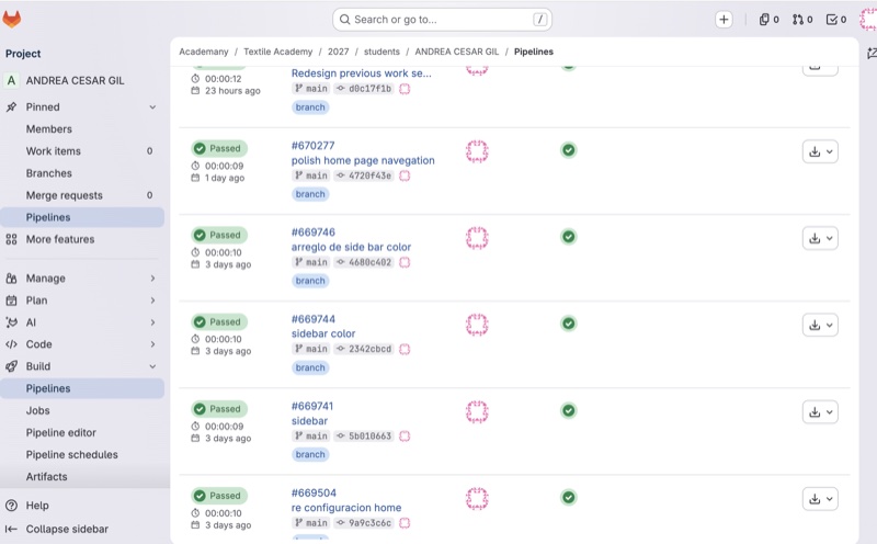
I understood GitLab as the place where the actual files behind my website live. Instead of editing a finished webpage directly, I edit the files that generate the website.
Every meaningful change is saved through a commit. This creates a history of the project and allows me to keep track of how the documentation evolves over time.
My basic workflow became:
edit → save → commit → pipeline → check the published website
After every commit, GitLab runs a pipeline. The pipeline rebuilds the website using the updated files. When the process is completed successfully, GitLab shows a green Passed status.
One important thing I learned is that a successful pipeline only means that the website was built correctly — it does not mean that the result necessarily looks the way I intended. I still need to open the published website, review the changes and decide whether another iteration is needed.
3.3 Markdown basics
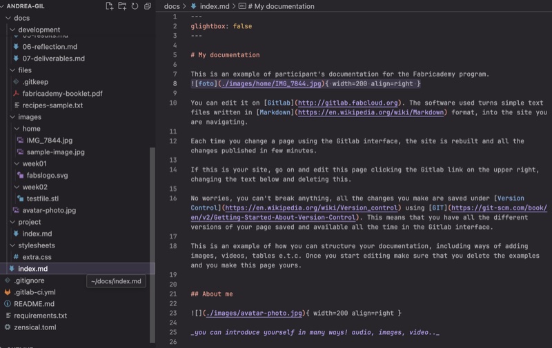
Fabricademy documentation is primarily written in Markdown. I understood Markdown as a simple way of giving structure and hierarchy to plain text without having to build a webpage directly in HTML.
These are the commands I use most frequently:
| What I want to do | Markdown |
|---|---|
| Main title | # Title |
| Section | ## Section |
| Subsection | ### Subsection |
| Bold | **bold text** |
| Italic | *italic text* |
| Link | [link text](https://example.com) |
| Image |  |
| Bullet list | - item |
| Numbered list | 1. item |
| Quote | > quote |
| Horizontal divider | --- |
| Inline code | `code` |
For example:
### Previous Work
**Inoscula** explores human relationships.

Markdown is enough for most of the documentation I need: titles, paragraphs, images, links, lists, tables and references. I also like that the source file remains relatively simple and readable even before it is transformed into a webpage.
3.4 When Markdown was not enough: HTML
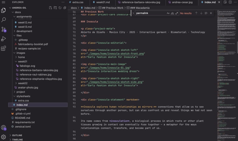
Markdown worked well for most of my content, but while designing the homepage I started needing more control over the position and relationship between elements.
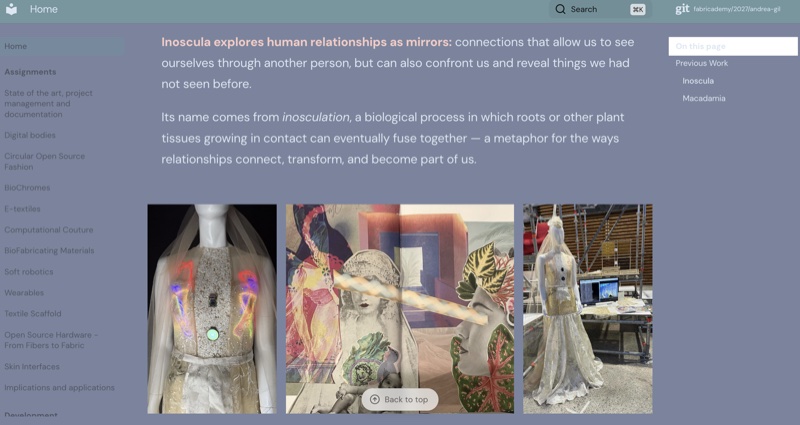
For example, in the Inoscula section I wanted to combine fashion sketches, photographs, text and project information in a specific editorial composition. A standard sequence of Markdown images was not enough for this.
I therefore started combining Markdown with small pieces of HTML.
For example:
<div class="inoscula-editorial">

  <img class="inoscula-sketch sketch-left"
  src="./images/home/inoscula-sketch-front.png"
  alt="Early fashion sketch for Inoscula">

  <img class="inoscula-main-image"
  src="./images/home/inoscula-01.jpg"
  alt="Inoscula interactive wedding dress">

  <img class="inoscula-sketch sketch-right"
  src="./images/home/inoscula-sketch-side.png"
  alt="Early fashion sketch for Inoscula">

</div>
I learned to think of the two languages differently:
- Markdown organizes the content and its hierarchy.
- HTML gives me additional control over the structure when I need a more specific composition.
I tried to keep Markdown as the main language of the documentation and use HTML only when the layout required more control.
3.5 CSS and visual styling
CSS (Cascading Style Sheets) controls the visual appearance of the website. While Markdown organizes the content and HTML can define more specific structures, CSS determines how those elements look.
I used extra.css to customize elements such as:
- colors and backgrounds
- typography and font sizes
- spacing and margins
- image sizes and proportions
- grids and columns
- navigation
- responsive behavior for different screen sizes
A simple example from my website is:
:root {
  --andrea-blue: #79849E;
  --andrea-green: #7197A0;
  --andrea-pink: #F9CAC4;
  --andrea-light: #DAE7F2;
}
These variables allowed me to define my color palette once and reuse it throughout the website.
Learning through iteration
One of the most useful lessons came from making mistakes. While developing the homepage, I initially kept adding new CSS rules every time I wanted to fix something.
The stylesheet eventually grew to more than 600 lines and started to feel like a collection of patches. Some new rules were overriding previous ones, which made it increasingly difficult for me to understand what was controlling each element.
At that point, I stopped adding fixes and reorganized the stylesheet into a clearer system. I grouped the CSS by function and removed duplicated or obsolete rules.
This helped me understand an important principle:
When the code becomes difficult to control, adding another rule is not always the solution. Sometimes the structure needs to be reconsidered.
This was also where I began to understand CSS less as decoration and more as a system of relationships between elements.
3.6 Zensical and site configuration
Zensical is the static site generator that transforms my Markdown files into the website that is published online.
I understood it as the layer that connects the content I write with the final website:
Markdown + HTML + CSS → Zensical → website
The main configuration file is zensical.toml. I did not need to understand every option in the file, but I learned to identify and modify the settings that were relevant to my documentation.
Some of the settings I changed or worked with were:
- the site name and author
- the main typography
- the custom stylesheet (
extra.css) - navigation behavior
- Markdown extensions
- the repository and published site information
For example, I changed the main typeface to DM Sans:
I also learned that some visual or navigation problems were not caused by CSS. For example, when I wanted the complete assignment navigation to remain accessible from the sidebar, I discovered that the behavior was controlled by a feature inside zensical.toml.
The configuration originally included:
With this feature enabled, the main sections were displayed as tabs across the top of the website on larger screens. I disabled it so the complete Fabricademy structure could remain accessible through the sidebar navigation.
This was useful because it helped me understand that a website has different layers of control. Before trying to fix something visually with CSS, I need to understand whether the problem comes from the content, structure, style or site configuration.
3.7 AI as a learning and development tool
I used ChatGPT throughout this assignment as a learning and development assistant. Because my background is in fashion and textile design rather than programming, I did not want to simply ask AI to generate a finished website for me. I wanted it to guide me step by step and help me understand what I was changing.
An important part of the process was giving the AI context about how I wanted to work, not only describing the result I wanted.
One example of the type of prompt I used was:
I am building my Fabricademy documentation website.

My background is in fashion and textile design, not programming.
Guide me step by step and explain what I am changing and why.

I want to work mainly in Markdown and use HTML/CSS only when
necessary for the layout.

Do not invent content or change my voice. Help me organize and
correct my English, but ask before making conceptual changes.

For the website, think as a UX designer. I want it to be visually
personal but also clear, readable and easy to navigate.

When we make changes, work one step at a time so I can test them
in GitLab before continuing.
As the process became more complex, I also learned that the quality of the interaction depended on how clearly I evaluated the results and redirected the tool.
For example, when the website started becoming too long and the CSS was accumulating too many fixes, my prompts became more specific:
The layout still feels too long and there is too much empty space.
Think as a UX designer rather than only fixing the CSS.

Do not add another patch. Review the structure first and propose
a cleaner information hierarchy.
My workflow with AI gradually became:
MY IDEA / DECISION
        ↓
PROMPT + CONTEXT
        ↓
AI SUGGESTION
        ↓
REVIEW + TEST
        ↓
GITLAB / PIPELINE
        ↓
PUBLISHED RESULT
        ↓
ACCEPT / REJECT / ITERATE
One of the most important things I learned was that using AI did not eliminate iteration or decision-making.
Some suggestions worked and others did not. I rejected layouts that did not communicate what I wanted, corrected technical approaches that became unnecessarily complicated, and repeatedly changed the direction after seeing the actual result on the published website.
I also learned to ask the AI to take different roles depending on what I needed: sometimes a technical tutor, sometimes a UX designer, sometimes an editor, and sometimes a research assistant.
For me, the useful part of working with AI was not receiving a finished answer, but having a tool that could help me move between an idea, a technical question and a possible solution — while I remained responsible for evaluating the result.
4. Designing the Website
4.1 Visual intention
Once I understood the basic documentation system, I wanted to move beyond the default template and create a website that felt more connected to my own visual language.
My intention was to find a balance between two things: a documentation website that is clear and easy to navigate, and a more editorial visual identity connected to fashion, textiles and my previous work.
I did not want every page to become highly designed. The documentation still needed to be functional, especially because it will eventually contain many experiments, processes, recipes, failures and technical information.
For that reason, I decided to develop a visual system that could remain consistent throughout Fabricademy: a limited color palette, two main typefaces, clear content hierarchy and a few more expressive compositions for selected projects or important moments.
4.2 Building my color palette
I started the visual design with color.
One of my references was La paleta perfecta by Lauren Wager, a book I have used for years to explore color combinations from art, fashion, photography and design.
Rather than selecting one palette directly from the book, I chose three references that interested me for different reasons: Mysterious, Tranquility and Magical.
I was interested in the contrast between muted blue and lavender tones, soft pinks, very light neutrals and the occasional darker color. I wanted the website to feel calm enough for reading, but not completely neutral.
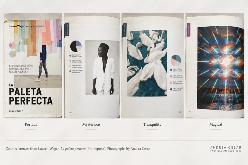
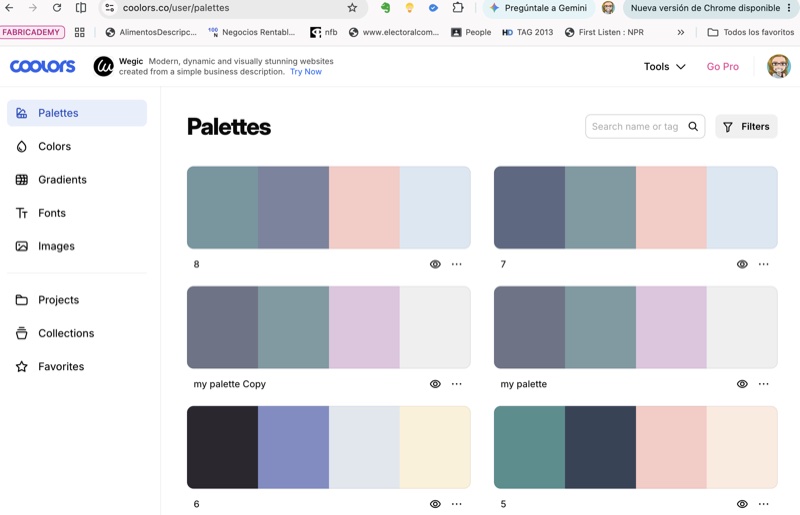
I then used Coolors to experiment with different combinations inspired by these references. I generated and adjusted several palettes, comparing how the colors behaved together rather than copying one combination directly.
Through this process I gradually reduced the options until I arrived at the four colors that became the base of the website.
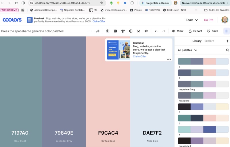
| Color | HEX | Role in the website |
|---|---|---|
| Cool Steel | #7197A0 |
Header and background accents |
| Lavender Grey | #79849E |
Main background |
| Cotton Rose | #F9CAC4 |
Accent text and links |
| Alice Blue | #DAE7F2 |
Light text and details |
The final palette became a small design system rather than simply a group of colors. Each color began to have a function, which made it easier to keep the website visually consistent as it grew.
Final color palette developed by Andrea Cesar using Coolors.
4.3 Typography
Typography was another way of balancing functionality with a more personal and editorial character.
I chose DM Sans as the main typeface for the website. It is used for body text, navigation, headings and most of the technical documentation because it remains clear and readable at different sizes.
I then introduced Bodoni Moda selectively as an editorial accent. Rather than using it for long texts, I use it for quotations, questions and specific statements that I want to separate visually from the technical documentation.
My basic typographic system became:
DM Sans
Body text · navigation · headings · technical information
Bodoni Moda
Editorial accents · quotations · research questions · selected statements
Using only two typefaces gave me enough variation to create hierarchy without making the website visually complicated.
4.4 UX and information hierarchy
Designing the homepage also became an exercise in UX (User Experience).
My first versions focused mostly on how the page looked. Once I started navigating the published website, I realized that visual design was only one part of the problem.
Some of the issues I identified were:
- the text was initially too small for comfortable reading;
- the content column was too narrow on large screens;
- some layouts created unnecessary empty space;
- the page became too long when every project was presented vertically;
- images with different proportions did not always work well in the same grid;
- the Fabricademy navigation was not immediately visible;
- the mobile navigation had insufficient contrast;
- some sections contained more information than was necessary for a homepage.
Instead of treating the homepage as a single composition, I started thinking about information hierarchy: what should someone understand first, what deserves more visual importance and what information can be simplified or moved elsewhere.
Previous Work: reducing instead of adding
The Previous Work section was a useful example.
My first approach was to give every project a similar amount of space. The result was technically correct, but the page became very long and all the projects competed for attention.
I eventually decided to create a hierarchy:
- Inoscula became the featured project because it connects most directly with the research I want to continue during Fabricademy.
- Macadamia remained visually important because of its connection to my professional practice in fashion and textiles.
- Baby Hammock, Sector Macadamia, Bazar Ibero and Lo Relativo became more compact entries.
This reduced the length of the page and made the relationship between my previous work and my current interests easier to understand.
One of the design principles I want to keep throughout my documentation is:
Not everything needs the same amount of space. Hierarchy can communicate meaning.
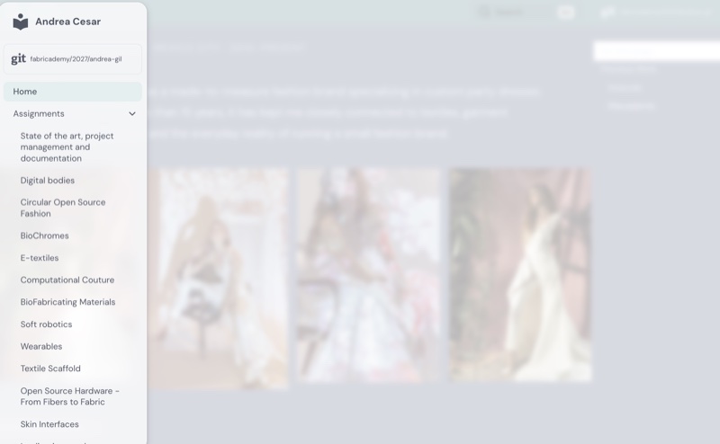
4.5 Iteration and redesign
The website changed considerably through testing.
Rather than designing the entire page first and then publishing it, I worked iteratively: I made a change, published it, looked at the result at different browser widths and then decided what needed to change next.
Three stages summarize this process particularly well:
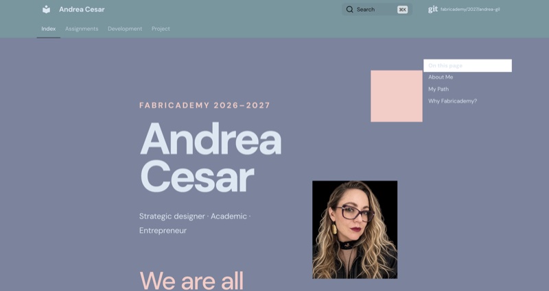
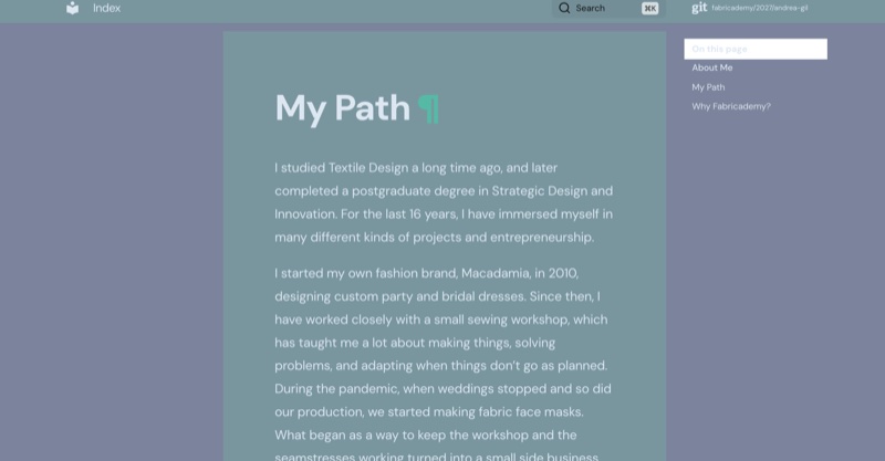
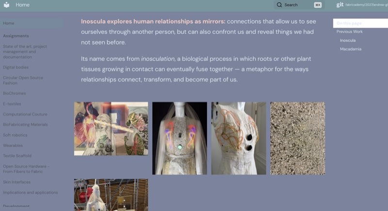
01 · First layout — content without enough hierarchy
The first version was functional, but the content was arranged mainly as a long vertical sequence. Text columns became too narrow in some layouts, images did not always relate well to each other and the page required too much scrolling.
02 · Reorganizing the experience
I began using wider compositions, grids and a persistent navigation system. At this stage I also started reducing content rather than continuously adding elements. Previous Work was reorganized according to relevance instead of giving every project the same visual weight.
03 · Final direction — a system rather than a single page
The final version established the basic visual and navigation system I can reuse throughout Fabricademy: consistent typography and colors, accessible navigation, flexible image layouts and a clearer hierarchy between documentation and more editorial content.
The process made me realize that I was not simply designing a homepage. I was designing a documentation system that needs to remain usable as the amount of information grows over the next months.
Testing on a real phone
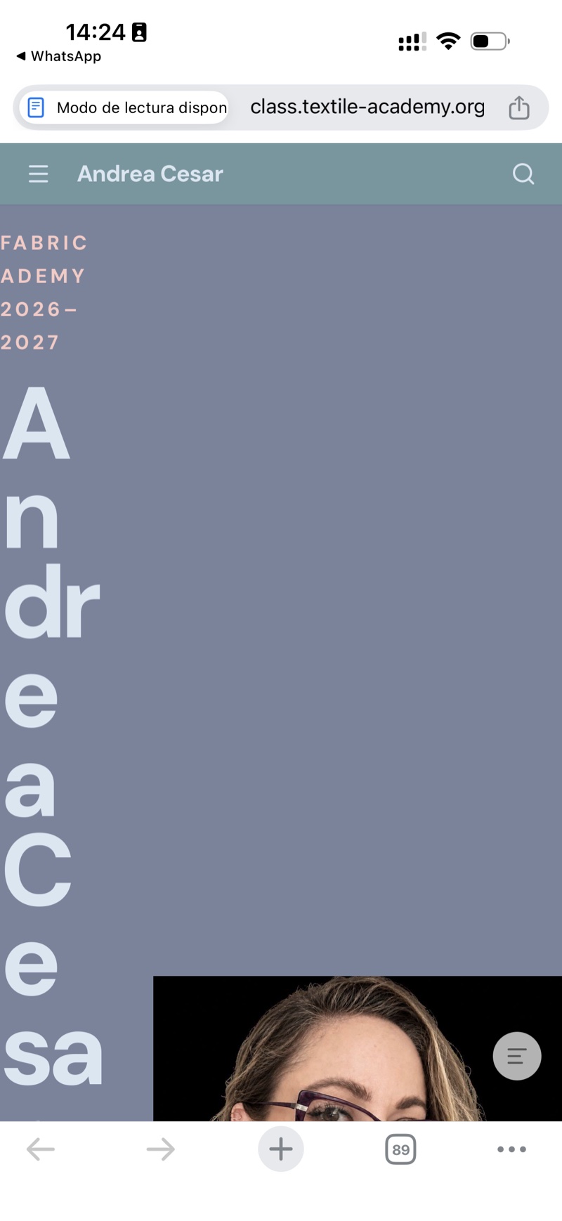
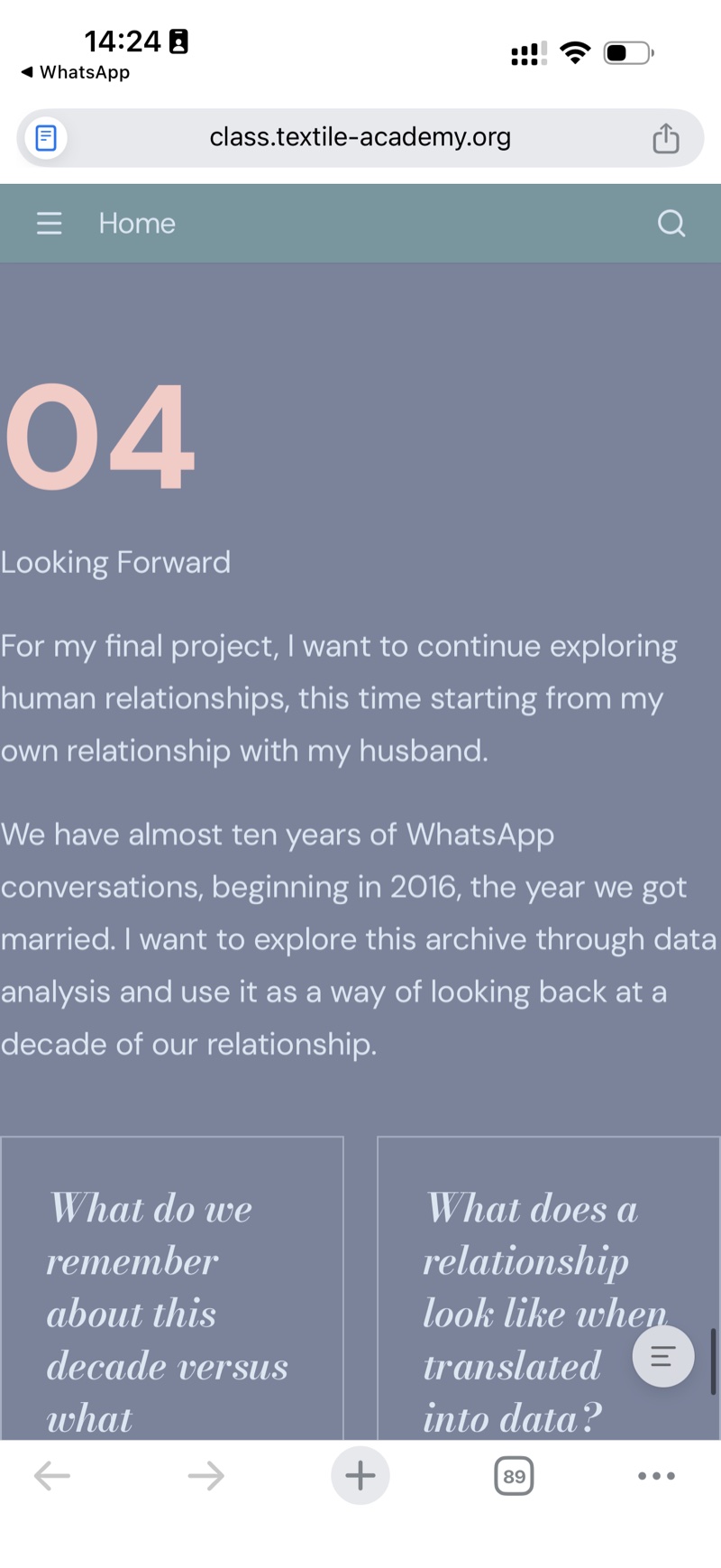
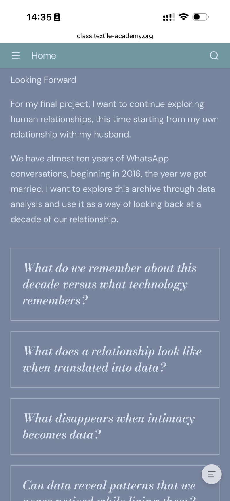
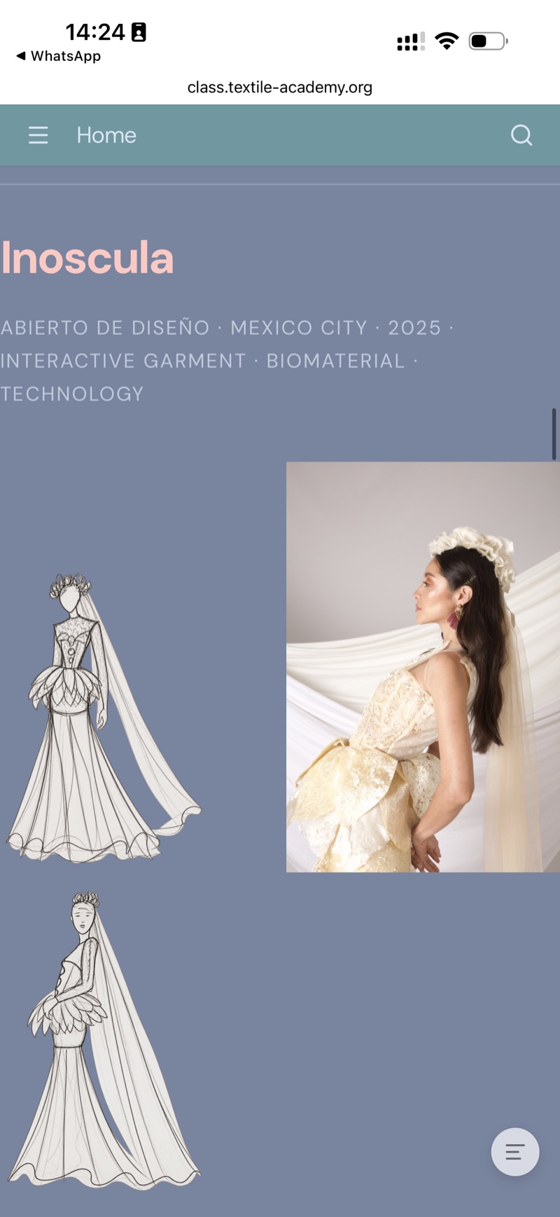
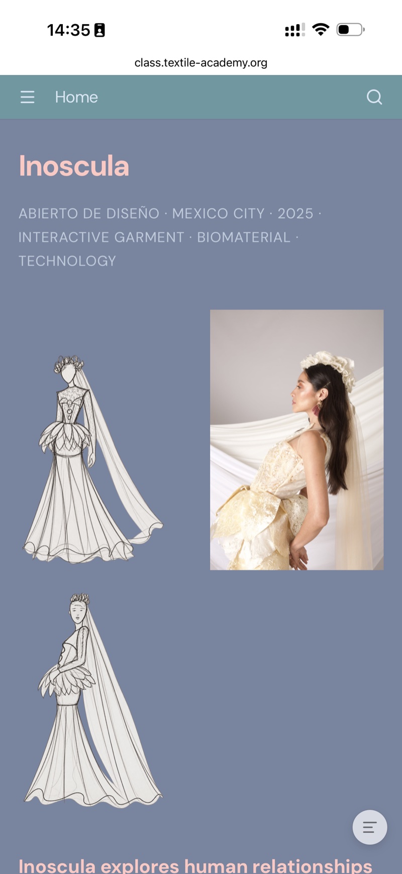
Testing the published homepage on my phone revealed problems that I had not resolved while working on the desktop layout. My name broke into very narrow lines, the Inoscula composition did not fit the available width, and the research questions remained in two cramped columns.
With AI assistance, I reviewed the current extra.css and index.md, replaced the responsive rules with a coordinated set of adjustments, and republished the site. The changes addressed the hero columns, text sizes, side margins, image layout and question cards. I also added markdown="0" to the image containers to preserve their HTML structure during Markdown processing.
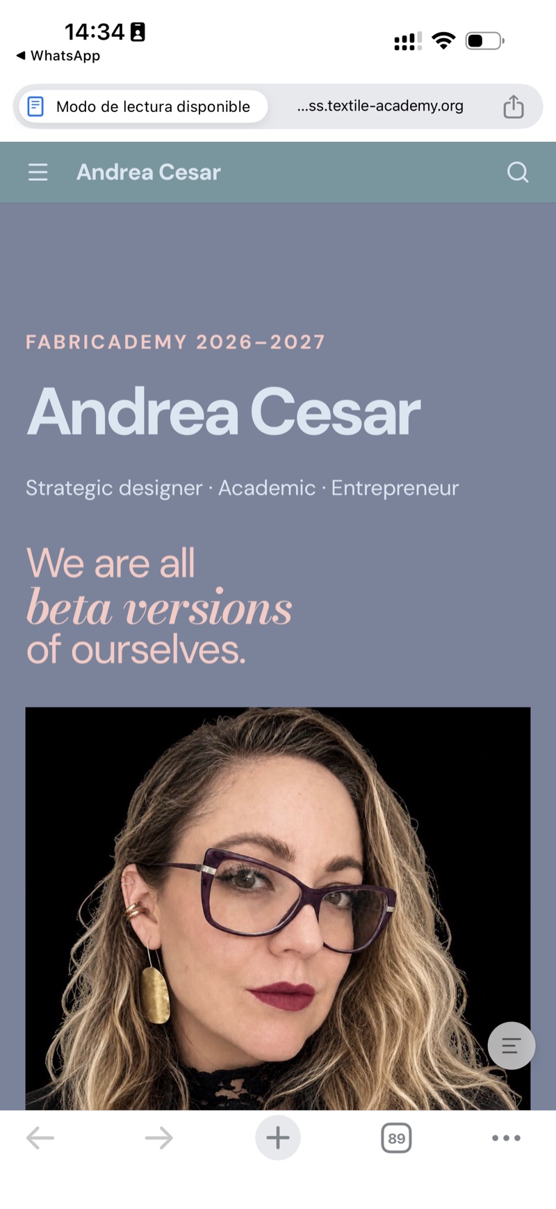
I then checked new screenshots on the same phone. The homepage title became readable, the portrait appeared below the text, and the question cards used a single column. I accepted the resulting Inoscula arrangement with one sketch to the left of the photograph and the second sketch below, and decided not to adjust it further.
These screenshots document the improvement on the phone I tested. They are not a check of every screen size or browser.
More mobile comparisons: questions and Inoscula
5. Documentation Workflow
During this first week I also started defining a workflow that I can repeat for the rest of Fabricademy.
My goal is to document while I am working, rather than trying to reconstruct an experiment or process at the end of the week.
My basic documentation cycle is:
DO / EXPERIMENT
      ↓
DOCUMENT
      ↓
ORGANIZE FILES
      ↓
OPTIMIZE MEDIA
      ↓
WRITE / EDIT
      ↓
COMMIT
      ↓
PIPELINE
      ↓
REVIEW ONLINE
      ↓
ITERATE
5.1 Document while working
For each assignment I want to collect information as the process happens: photographs, screenshots, quantities, settings, observations, failures and decisions.
This is especially important for experiments with biomaterials and fabrication, where details such as time, temperature, material quantities or machine settings may be necessary to reproduce a result later.
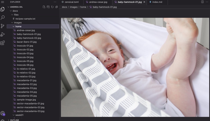
5.2 Organize files
Each assignment has its own Markdown page and image folder. I am using descriptive file names instead of keeping the original names generated by my phone or camera.
For example:
can become:
This makes the files easier to identify when the repository becomes larger.
5.3 Optimize media
I learned that images should be prepared for the web before uploading them. A photograph does not need to retain the same resolution and file size as the original camera file in order to work well as documentation.
My current image workflow is:
select → rename → resize → compress → upload
At the same time, I want to preserve enough image quality to show details that may be important in textile, material and fabrication experiments.
A measured example from this week
I used the mobile homepage screenshot as a record of the optimization process. With Codex assistance, it was resized and exported as an optimized JPG using the macOS image-processing tool sips.
| Property | Original | Web version |
|---|---|---|
| File | IMG_8707.PNG |
mobile-home-after.jpg |
| Dimensions | 1320 × 2868 px | 800 × 1738 px |
| File size | 3,450,807 bytes | 231,992 bytes |
| Format | PNG | JPG, quality setting 85 |
This reduced the file size by approximately 93.3%, while preserving the image proportions. The screenshot was not cropped or visually reconstructed. The new Week 01 exports use a maximum width of 800 px; smaller images were not enlarged. The three alumni references retain their earlier JPG export at quality setting 82.
For code examples, I also include selectable text so that the screenshots are not the only way to read the information.
5.4 Publish and review
Once the content is organized, I edit the corresponding Markdown file, save the changes and create a meaningful commit.
After the pipeline passes, I review the published website, not only the source file.
This final step is important because problems with image proportions, typography, navigation, responsive behavior or information hierarchy may only become obvious once I see the page in context.
If something does not work, the cycle begins again:
review → adjust → commit → publish → review
6. Results
The main result of this first assignment is a working documentation system that I can continue developing throughout Fabricademy.
By the end of this process I had:
- built and published my personal homepage;
- documented my background, motivation and selected previous work;
- established the basic visual identity of the website;
- customized the original Fabricademy template;
- learned the basic relationship between Markdown, HTML, CSS and Zensical;
- understood the GitLab commit and pipeline workflow;
- reorganized the navigation so the Fabricademy assignments remain easy to access;
- established a folder and naming system for future documentation;
- created a repeatable workflow for documenting, publishing and reviewing my work.
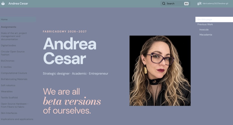
Final homepage
The homepage now works as the entry point to my Fabricademy documentation. It introduces who I am, where I come from and the questions I want to explore during the program.
It also establishes the visual and navigation system that I will use as the documentation grows.
7. Weekly Reflection & Critical Thinking
Before this assignment, I knew nothing about GitLab or Markdown. I had some previous knowledge of HTML and understood its basic logic, but I had never built or managed a documentation website this way.
What surprised me was that I did not find the process particularly difficult. I understood the basic logic relatively quickly.
I think my previous experience helped a lot. I worked for many years as a project manager in a strategic design company where we developed many websites. I was usually involved in the initial ideation, architecture and navigation, and then translated those ideas into requirements for the programming team. I was not the person coding the websites, but I already understood how to think about their structure and how to communicate what I wanted to developers.
This time, the biggest difference was that I was actually working directly with the files and seeing how those decisions are translated into Markdown, HTML, CSS and site configuration.
What I learned about my own process
One of my main learnings was understanding how important it is to think about a website as a responsive system, rather than as one fixed composition.
I also realized how visual my own design process is. I need to see the result in context before I can decide if something works. My process became very iterative:
make a change → publish → look at it → evaluate → adjust → repeat
Seeing the actual website helped me make decisions about readability, image size, hierarchy, navigation and the amount of information much more easily than trying to decide everything only from the code.
What I would do differently
If I were starting another website from scratch, I would spend more time defining the information architecture and hierarchy before designing individual sections.
In this project, some of the first versions became too long because I was trying to include too much information and give too many elements similar visual importance.
I would now start by asking:
- What information is essential?
- What should the user understand first?
- What deserves more visual space?
- What can be reduced?
- What can be communicated through an image or interaction instead of more text?
- How will the structure behave on different screen sizes?
I would probably use less text, introduce visual or interactive elements earlier, and define the overall architecture before working on the details.
For me, this assignment was a useful transition from having experience directing digital projects to beginning to understand and manipulate some of the tools that actually build them.
8. References & credits
Documentation references
- Raúl Babines — Fabricademy 2025. The page identifies its author as Raúl Babines, although the repository URL contains
josue-orozco. - Barbara Rakovska — Fabricademy 2024.
- Stéphanie Vilayphiou — Fabricademy 2024.
Color references
- Lauren Wager, La paleta perfecta, Promopress. Personal reference copy; the publication year and edition have not yet been verified.
- My selected palette in Coolors. Palette developed by Andrea Cesar.
Image and process credits
Screenshots of my website, editor, GitLab and Coolors were captured by Andrea Cesar. The alumni websites and the work shown in them belong to their respective authors. Photographs of the book were taken by Andrea Cesar; the reference composition was prepared with AI assistance. The underlying book images remain credited to their original creators through the source publication.
ChatGPT and Codex supported writing, code review, image preparation and troubleshooting. I directed the design decisions and evaluated the published results. The Inoscula project credits remain listed on my homepage.