State of the art
Diving into fabricademy
First futures story fragment
Year 2100, humanity was able to stop climate change at 2°C and learned to how live and act like the small part of the big big ecosystem earth, that they are. Even the climate crisis brought many challenges, like droughts and extreme weather conditions, humanity was able to mitigate the consequences. They began to live with animals instead of using them, learned how to grow material and live in circular systems, saving ressources. Biodiversity is thriving, energy is produced via sun, wind and water. Technology is used to support the symbiotic ecosphere earth and even that AI is still being used, it's only used in a sustainable and responsible way. Society, art, politics and science are working together and they're planet-speakers, who represent ecospheres needs. People are spending less time in virtual worlds and living in communities became a big thing. Cities are green, livable and lovable places, where you can harvest food or plants for materials on your way to work or friends. On the start of every page, you're going to find a little text fragments about possible futures. "Why?", you're asking? Read more and you'll find out.
What drives me
I'm passionate about educating people and connecting artists, designers, scientists and citizens about current science topics, always discussing effects on different fields like society or environment. I don't like how we humans feel disconnected from our surroundings, acting like we're not part of nature (culture-nature-conflict). But even knowing, that I'm a unimaginable small part, who's actions at the same time have influence to my surroundings, I often feel disconnected and I'm trying to bring this into my everyday live, my work as a science communicator and my artistic practice.
Inspiration and research
As the adhd-squirrel, that I am, I'm inspired by a lot of things. My surroundings, patterns I see in nature, old crafts, new scientific and artistic developments, designers, artists and scientists. I try to keep my eyes open all the time, to learn more and find new interesting and exciting things, that I can weave into my work. This includes both visiting exhibitions, theatre shows, doing walks in the fields and forests as reading scientific articles and papers. I'm interested in technology the same way, as I am in art and natural processes. I prefer touchable things more than virtual things. I have to feel, smell, hear and sometime taste what I'm doing.I guess, that's one thing, that I love about biodesign.
Learning 15 years ago, that it's possible to grow a (on the first look) leather-like material out of bacteria, absolutely amazed me. I loved the material leather, but I didn't want to work with it anymore. Bacterial cellulose has one thing, that's similar to genuine leather: every piece, every squaremilimetre is absolutey individual. The growing process makes every piece unique, something fake leather could never be. This is one thing, that I love about biomaterials and that's why they are one of my favorite topics. Also the working process is special. You're working together with an organism, more than just using it.
Another thing, that inspires me, are scientific developments. There are these smart people, that are trying to understand our world and/or make it a better place. Especially in this time of fake news, that's so important. I love to take this inspiration, bring it to people and tell and show them about those new developments. Let them learn about it, let them feel it and make them discuss about it.
The last thing, that I'm going to mention here, is Science Fiction. Science Fiction has ever since shown us different ideas of possible futures. Before the first company produced tablets and smartphones or scientists developed them, we had Star Trek showing us some similar devices decades ago in TV. Before (and until now) there have been autors, writing about future scenarios. Futures Thinking is a method, that I want to involve in my work and artistic practise. I want to stop thinking only of the bad things, that are happening worldwide, at the moment. I want to focus on better future-possibilities. That's not easy in current times, where climate crises is getting worse and will become a catastrophe, if we don't change our systems. Utopias seem to be dead. I stumbled upon the idea of Anti-Dystopia, what I think, is a pretty appropriate thing for the moment. We're facing the truth, but we also think of the things we can do to build better futures. I see the fabricademy community as a group of people, who are willing to work on these better futures. To train my anti-dystopic thinking brain, I'm going to try writing small fragments of different futures for every week, involving the research I did for the different topics.
- 01 Diana Scherer, Photo: Michiel Spijkers for frame magazin, https://frameweb.com/article/behind-the-scenes-of-michiel-spijkers-diana-scherer-shoot;
- 02 Dorotea Dolinšek, Ex.A.R.U, Photo: Julia Krayer;
- 03 Natsai Audrey CHieza, Photo: Fernandez, C.R.: Biotechnology is changing how we make clothes (2022). https://www.labiotech.eu/in-depth/biofabrication-fashion-industry/;
- 04 Nancy Diniz, Photo: Domen Nan
- 05 Dr. WhiteFeather Hunter, Bioartcoven, https://www.whitefeatherhunter.ca/bioart-coven;
- 06 Suzanne Lee, Photo: Ryan Lash / TED, https://blog.ted.com/10-years-of-ted-fellows-notes-from-the-fellows-session-of-tedsummit-2019/;
- 07 Lace doily, Photo: Andrew Petrischev via unsplash, https://unsplash.com/de/fotos/ein-zartes-blassgrunes-hakeldeckchen-mit-blumenmuster-jH4V2ICCyOM;
- 08 William Myers, Biodesign, https://www.biology-design.com/;
- 09 Mediengruppe Bitnik, Qwen Stefani Against Techfascism, Photo: Julia Krayer
- 10 Raumpatrouille Orion (Picture and UFO), Youtube Screenshot;
- 11 Alexander McQueen, No. 13 Finale, Photo by Guy Marineau/Conde Nast via Getty Images
- 12 Iris van Herpen, Sonic Stardust, Photo: Steph Pedersen, VOGUE
Documentation
First steps with git and zensical
- Step 01: Download Software
- I downloaded Visual studio code and git. So I was able to make a local copy of my website, that later can be uploaded to my gitlab.
- Step 02: Create folder
- I created a folder for my website called "Fabricademy_website"
- Step 03: Start Visual Studio Code
- I started Visual Studio Code (VS) and opened the terminal. That can be done via the menu Terminal -> New Terminal or usind the shortcut Ctrl+Shit+Ö (I guess the Ö is special for german keyboards).
-
Step 04: Clone the gitlab repository
- I opened my gitlab-fabricademy-repository on the gitlab website in my webbrowser and copied the html-link
git clone "here copied website link";- Now I have a local copy of my repository, that I can later upload.
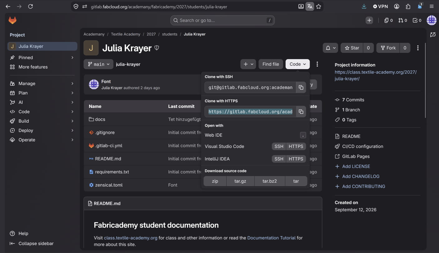
Copying the html-link
-
Step 05: Creating a personal token
- To clone my repository, Gitlab needs an authentification.
- I opened my gitlab page, moved to my profile and opened the access tab, there I chose "Personal access token"
- There I selected "Generate token" and then "Legacy token"
- I named the token in a way, that I understand, what it is for. I chose an expiration date the latest as possible (which is one year)
- I then needed to give Git the permission to read and write the repository for being able to download the repository.
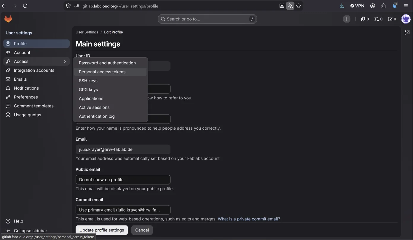
Creating the access token
-
Step 06: Checking python installation
- As we're working with Zensical, Python needs to be installed on your pc. I didn't know, if python was already installed (spoiler: it was), so I typed the command
py --version;in the VS-terminal.
- As we're working with Zensical, Python needs to be installed on your pc. I didn't know, if python was already installed (spoiler: it was), so I typed the command
- Step 07: Zensical installation
- Now I had to install Zensical. Lena showed me how to install it directly via the VS-terminal. Therefore I had to type
py -m pip install zensicalin the terminal. This command uses Python's package manager.
- Now I had to install Zensical. Lena showed me how to install it directly via the VS-terminal. Therefore I had to type
- step 08: Starting the website
- I was now able to see my changes directly on the localhost. Therefore I had to type py
-m zensical servein the terminal. - Now I could open the local website in VS (ctrl + click on the link) or open it in my webbrowser by typing "127.0.0.1:8000" in the browsers adress bar.
- I was now able to see my changes directly on the localhost. Therefore I had to type py
- My dear collegue and fabricademy class mate Lena helped me starting the work. Thank you!
For my documentation and as a personal reminder, I wrote down some of the most important commands, that I used in the VS-terminal
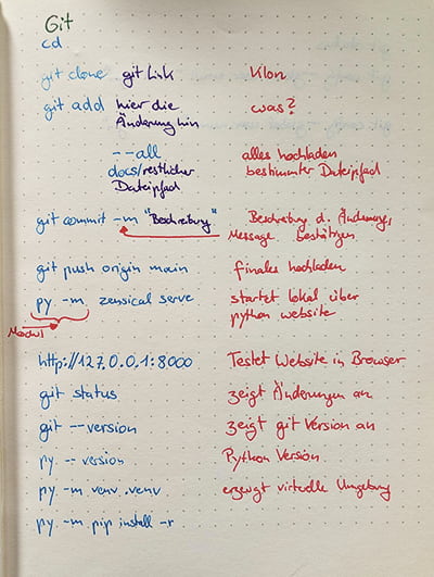
Personalizing my documentation website
As a designer, I wanted to personalize my website (of course). Unfortunately I started with having nearly no clues what zensical is and only a little bit of knowledge of .css, .html and markdown. At the same time, I had some special ideas like using local fonts (in Germany, it's not in compliance with data protection regulations to use dynamic Google fonts, so I wanted to learn how to do it locally), which brought a lot of challenges.
-
Step 01: Download, convert and install fonts
- First I had to install the fonts. Therefore I downloaded the fonts. Doing my research, I learned, that the different file formats ".ttf" and ".woff2" are needed for different webbrowsers. To have the page working on as many browsers as possible, I converted the ".tff" files on fontsource.org to ".woff2".
- I created a "fonts"-folder in the files-folder afterwards and copied all the font-files into the new folder.
- Now I had to integrate the fonts in the extra.css-file, that is found in the folder "stylsheet". To do this, I wrote the following code in the “extra.css” file.
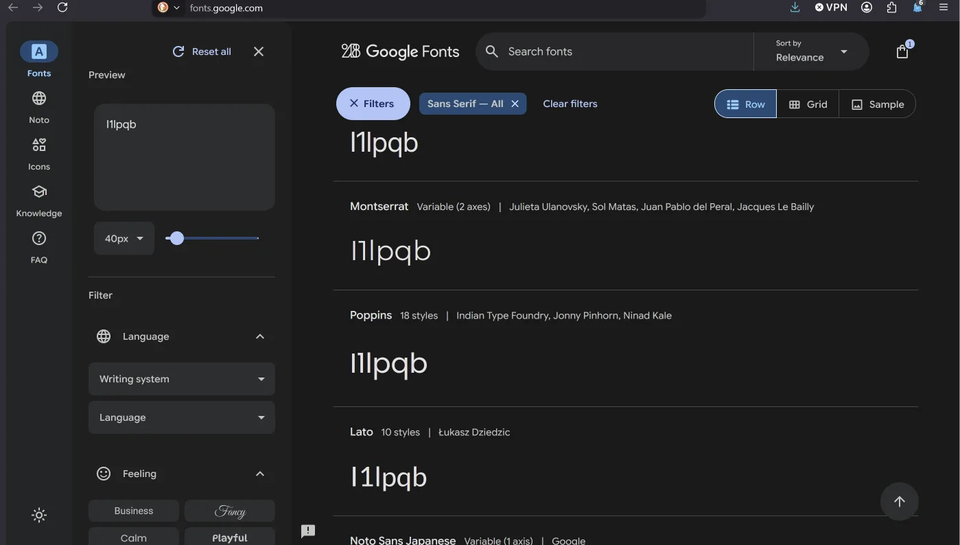
Testing fonts to see if they're dyslexia-friendly
Why did I choose those fonts?
I like the playful style of "Barriecito" and how my name looks written in it. For the plain text-font, I researched for a font, that is easy to read for people, having dyslexia. Therefore the number 1, the capital i and the lowercase L should look as different as possible, the same counts for q, p and d. I chose the font "ABeeZee"
Code
@font-face {
    font-family: 'Barriecito'; /*my font for headlines*/
    src: url('../files/fonts/Barriecito-Regular.woff2') format('woff2'),
        url('../files/fonts/Barriecito-Regular.ttf') format('tff');
    font-weight: normal; /*regular font, not especially thick or thin*/
    font-style: normal; /*regular font, f.e. not italic */
    font-display: swap; /*fallback shows immediately while browser is loading the website font */
}

@font-face {
    font-family: 'Abeezee'; /*my font for text*/
    src: url('../files/fonts/ABeeZee-Italic.woff2') format('woff2'),
        url('../files/fonts/ABeeZee-Italic.tff') format('tff');
    font-weight: normal;
    font-style: italic; /* the italic version of the text-font*/
    font-display: swap;
}

@font-face {
    font-family: 'Abeezee';
    src: url('../files/fonts/ABeeZee-Regular.woff2') format('woff2'),
        url('../files/fonts/ABeeZee-Regular.ttf') format('tff');
    font-weight: normal;
    font-style: normal; /*the regular version of the text-font*/
    font-display: swap;
}
- Step 02: defining the fonts
- In the end, I mastered having a font for the headlines and a font for the text. To define them, I wrote the following code in the extra.css-file, that is found in the folder "stylsheet".
Code
h2 { /*defines second important headline. As I had difficulties with h1, I chose ignoring h1 and using h2. I guess h1 is somewhere else defined, but I couldn't find where*/
color: rgb(212, 0, 198); /*defines the font colour*/
font-family: 'Barriecito', 'Franklin Gothic Medium', 'Arial Narrow', Arial, sans-serif; /*defines the font and fallbacks*/
font-size: 800%; /*defines the font size*/
}

h3 {
color: rgb(23, 19, 23);
font-family: 'Barriecito', 'Franklin Gothic Medium', 'Arial Narrow', Arial, sans-serif;
font-size: 500%;
}

p { /*defines plain text*/
color: rgb(0, 0, 0);
font-family: 'Abeezee', Arial, Helvetica, sans-serif;
font-size: 100%;
}
- Step 03: changing logo and favicon
- I had an old picture of an oyster mushroom, that I embroidered and then scanned. I removed the background and saved it as a .png
- I copied the file into the docs/images-folder
- I added the lines
favicon = "images/Pilz_logo.png"andlogo = "images/Pilz_logo.png"
- Step 04: changing the header font
- I wanted the "Barriecito"-font for my header. I did this, defining the header-font in the extra.css-file.
- Step 05: changing assignments boxes
- I wanted to personalize the assignments boxes, so I copied the code, that was linkes in the assignments/index.md.
- First I copied the .css-code and put it in the extra.css-file. I would like to do some changes on the fomart of the boxes, but I couldn't find the time yet.
- Afterwards I copied the html.-code in the assignment/index.md and personalized it. I changed the picture-links and updated the week descriptions.
css-assignment box code
.assignments-grid .row{
    display: flex;
    justify-content: space-between;
    flex-wrap: wrap;
    margin-bottom: 1em;
}
.assignment-link{
    position: relative;
    width: 32%;
    background-size: cover;
    background-position: center;
    min-height: 200px;
}
.assignment-link:hover{
    opacity: 0.7;
}
.assignment-link img{
    width: 100%;
}
.assignment-link span{
    position: absolute;
    left: 0;
    padding: 6px;
    bottom: 0;
    width: 100%;
    font-weight: bold;
    color: white;
    background: #12121261;
}
html-assignment box code
    <div class="assignments-grid">
    <div class="row">
        <a href="../assignments/week01/" class="assignment-link" style="background-image: url('../images/week01/week01-squished.jpeg')">
            <span>1. State of the Art</span>
        </a>
        <a href="../assignments/week02/" class="assignment-link" style="background-image: url('../images/comingsoon-squished.jpeg')">
            <span>2. Digital Bodies</span>
        </a>
        <a href="../assignments/week03" class="assignment-link" style="background-image: url('../images/comingsoon-squished.jpeg')">
            <span>3. Circular Open Fashion</span>
        </a>
    </div>
    <div class="row">
        <a href="../assignments/week04" class="assignment-link" style="background-image: url('../images/comingsoon-squished.jpeg')">
            <span>4. Biochromes</span>
        </a>
        <a href="../assignments/week05" class="assignment-link" style="background-image: url('../images/comingsoon-squished.jpeg')">
            <span>5. E-Textiles</span>
        </a>
        <a href="../assignments/week06" class="assignment-link" style="background-image: url('../images/comingsoon-squished.jpeg')">
            <span>6. Computational Couture</span>
        </a>
    </div>
    <div class="row">
        <a href="../assignments/week07" class="assignment-link" style="background-image: url('../images/comingsoon-squished.jpeg')">
            <span>7. Biofabricating Materials</span>
        </a>
        <a href="../assignments/week08" class="assignment-link" style="background-image: url('../images/comingsoon-squished.jpeg')">
            <span>8. Soft Robotics</span>
        </a>
        <a href="../assignments/week09" class="assignment-link" style="background-image: url('../images/comingsoon-squished.jpeg')">
            <span>9. Wearables</span>
        </a>
    </div>
    <div class="row">
        <a href="../assignments/" class="assignment-link" style="background-image: url('../images/comingsoon-squished.jpeg')">
            <span>10. Textile Scaffold</span>
        </a>
        <a href="../assignments/week11" class="assignment-link" style="background-image: url('../images/comingsoon-squished.jpeg')">
            <span>11. Open Source Hardware</span>
        </a>
        <a href="../assignments/week12" class="assignment-link" style="background-image: url('../images/comingsoon-squished.jpeg')">
            <span>12. Skin Interfaces</span>
        </a>
    </div>
</div>
Making collages and getting them online
-
Step 01: Making the collages
- I worked with Photoshop and Illustrator. Since I learned to work with Adobe Software nearly 20 years ago, I mostly use this software. I'm motivated to try and use open source software, but it took me to much time to build the website, that I had no more time left to explore Gimp or Affinity.
- First I made a new canvas, collected picture from my own pictures or from the web and placed them in Photoshop.
- The next step was to remove the background. Photoshop has a good automated background-removal, which I used for that. It creates a layer mask, which can still be edited.
- Following that, I sorted the different layers with the containing pictures.
- For some of the pictures I edited the layer mask to create an opacity gradient.
- Afterwards I added a white layer on top, reducing the opacity to 60%.
- I added another transparent layer, in which I draw on my display.
- Now I had the final collage.
- As I wanted to add an hover-effect on my picture, I had to safe to pictures. One picture with all the layers and one picture without the two top layer, on this second layer, I addeded numbers for the references in Illustrator.
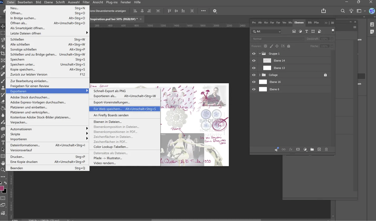
Export-> saving for Web 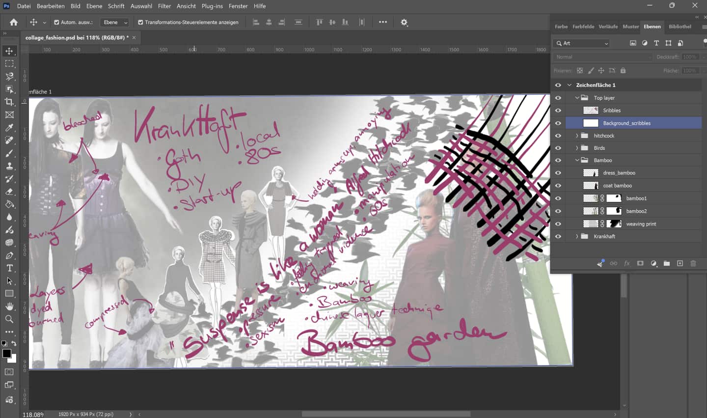
Photoshop layer structure -
Step 02: Minimize the file-size
- Even I used the "exported for web"-option, the pictures were still to big. I used squish.tools to compress the pictures.
- Step 03:upload
- I copied both pictures into the docs/images/wwek01-folder
- Add the hover effect
- I did a lot of research on different methods to change pictures when hovering. I ended up with the solution of picture-swaping. Finding geeksforgeeks helped a lot.
- In the beginning I tried to put the complete html- and css-code in the week01.md-file, which didn't work as expected. So I ended up splitting the code.
- I wrote the html-code in week01.md and the css-code in the extra.css-sheet.
css-Code
.inspiration {
    width: 700px;
    height: 394px;
    background-image: url('../images/week01/Collage_Inspiration_final.webp');
    background-size: cover;
    transition: background-image 0.3s ease-in-out;
} /* This code defines the original image*/

.inspiration:hover {
  background-image: url('../images/week01/Collage_Inspiration_final_all.jpeg');
} /* This code defines the picture, that will be shown, when the cursor hovers over the picture.*/
html-Code
The .html-code launches the .css-class.Adding my portfolio
- Step 01: Compressing the portfolio
- I used ilovepdf to compress my portfolio-PDF
- I copied the file into the docs-folder
- I added html-code to show the booklet on the index-page and set the right specifications for the size.
Booklet-Code
The .html-code launches the .css-class.Optimizing my website
During the second week, I found some points on my website, which could be improved. I optimized a few of them.
Headlines
Structuring my documentation-bulletpoints I stumbled upon the problem, that I wasn't able to change h5. Whatever I wrote into the extra.css-file, nothing changed. So, instead of working on my documentation or collages, I did some procrastination and deepdived into the internet on the search for a solution. The browser-inspector helped me to find out, the my code must be overwritten by a file that lies in assets/stylesheet/modern, wherever that is. As I couldn't find this file anywhere, I had to use the same trick itself does and overwrite this file. I found the website Mediaevent, that showed me a way and even being told by this website, that's not the elegant way (more the sledgehammer-kind), I tried it, it worked, I was finally able to chance the fontsize and the margins and I decided to be inelegant, but happy about how my website looks now.
Headline code
```css /Those were the commandlines, I added:/ h5 { font-size: 1.5em !important; /!important overwrites the commands from the assets/stylesheet/modern-file/ margin-top: 1em !important; /*margin defines the distance to the next website-elements) and I decided to be inelegant, but happy about how my website looks now. */ margin-bottom: 0.2em !important; }
Hyperlinks
My instructor Louis brought to my attention, that all the links in my website are no hyperlinks. Instead of opening in a new tab or window, the open in the same tab, leaving the website. I double-checked the cheatsheet three times (so six times), if I did something wrong, but it was allright. Doing another short deepdive and getting a little help from my partner, I decided to add {target="_blank"}after my links, that helped. Again, a solution that was described as inelegant, but it worked.
Responsive hover-picture
I was annoyed, that the collages with the hover effect were not responsive and disturbed using the website on mobile devices. This time, I couldn't find a solution via normal internet research, so I asked ChatGPT for help. I don't like using AI most of the time. It's consuming a lot of ressources and the regular use of AI prevents us from staying in pratice or even learning new skills in the first place. So using AI during my research can only the last step for me.
responsive code
```css
/*Those were the commandlines, I added:*/
.fashion {
    aspect-ratio: 700 / 340; /*before width and heigth were exactly defines 700px x 340px, those are now used for the picture-ratio*/
    background-size: cover; /* that means, that the picture fills the whole container*/
    background-position: center; /*places the picture in the Center of the container, if parts have to be cropped because of "cover", it will be cropped equally at all sides*/
    background-repeat: no-repeat; /*avoids, that the picture will be repeated like tiles*/
}
FabLab intro
I've been working in our FabLab for two years now and I have worked in a makerspace before. So being in a workspace like that, is not a new thing for me. We're an open FabLab on Wednesdays, a place for students and we're a host for regular school-students courses, so we have to pay close attention to safety regulations. That involves f.e. which materials you can use in the lasercutters, how many people are allowed in the lab and that little children and pregnant people are not allowed in parts of our labs.
At the moment, we're building a small biolabspace. We're going to have there some new things to care for to be sure, that we and our organisms (and Nala, the dog of one of our collegues and emotional support dog of the whole team) are safe. That involves creating a clean environment (we build a small biolab room in room for that), setting up regulations for handling organisms and rules what to do with potential contamination.
For bigger events, we're working together with the event department of our university, which takes a little bit of additional time, but also helps us organizing great and safe events. One example is the local version of the Fab26 with wonderful participants from many other fablabs. We had five wonderful days, as you can see in the following video.
Recap video of FabX-Event in Bottrop
Tools and sources I used
Building website
- Visual Studio Code
- Python
- Git
- Zensical
- Markdown
- css
- html
- fontsource.org
- geeksforgeeks
- design.tutsplus
- fewture.de
- w3schools
Editing images
Reflection
- Even that I learned building a website with .html and .css and used markdown a litte bit in the past, it was a difficult task for me. There were moments, when I thought, it would be easier for me, using clean html instead of markdown, but I fought my way through it and learned a lot.
- Searching for online tools (f.e. for compressing pictures or removing the background) I learned a lot about privacy and copyright. Many of the pages, that offer you easy service, are fishing for your data, training AI or using your pictures for advertising.
- I wanted a lot for my website and not everything is already realized. But I think for the first week, I did a good job in the end (but I also lack some sleep).
- Searching for online tools (f.e. for compressing pictures or removing the background) I learned a lot about privacy and copyright. Many of the pages, that offer you easy service, are fishing for your data, training AI or using your pictures for advertising.
- I wanted a lot for my website and not everything is already realized. But I think for the first week, I did a good job in the end (but I also lack some sleep).