Ideation
Ideation / Methodology
Phase One
Initial Swatchbook - formalising the language of colour 
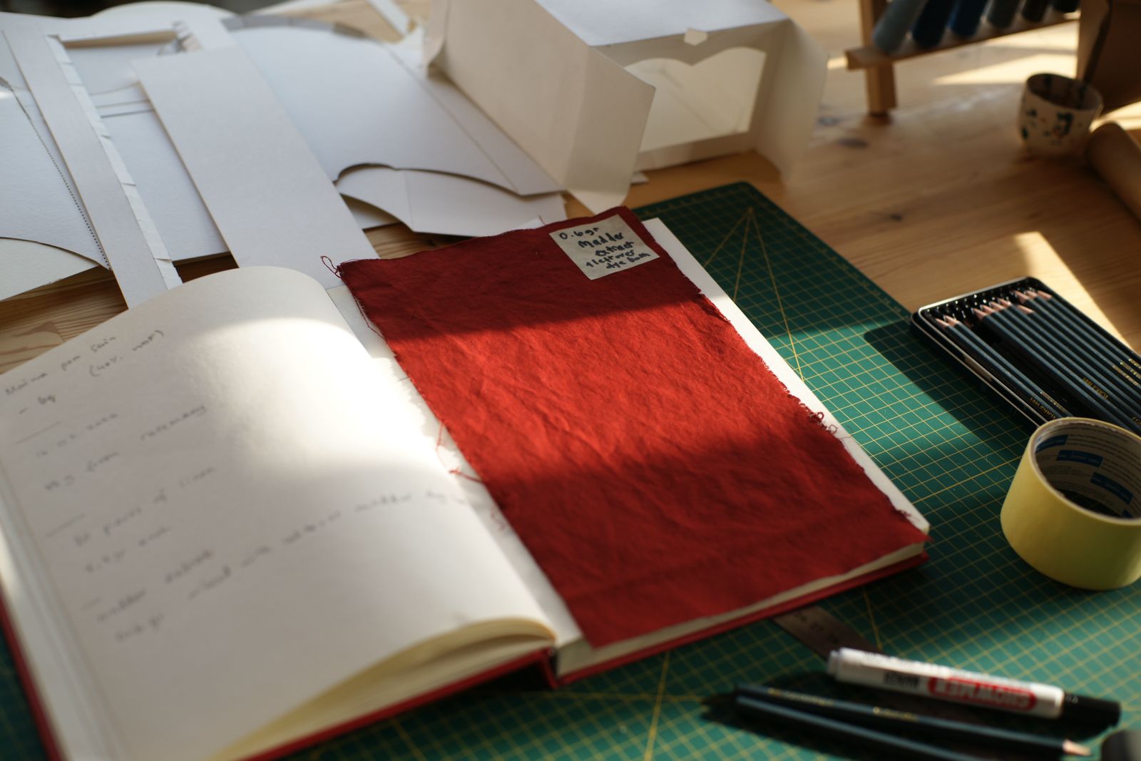
To begin the experiment, I will make a swatchbook containing five naturally derived colours. This will be a good start, without overwhelming or overstimulating the viewer, giving me a chance to make the initial swatchbook with larger pieces. Furthermore, five colours will give the viewer a chance to spend longer time with each colour, a monochrome immersion, without comparison overload.
I will apply the colours on the same material for this experiment, with the same mordant and tannin process. Furthermore, each colour will have a code, which if scanned, the viewer can look at the recipe and dyeing process online.
red yellow blue green brown
This choice of colour will give me a chance to initiate a small ecosystem. From a variety of dyestuff (roots, petals, peels, hulls and pigment), to a variety of chromatic density (bright, muted, deep, pale) and emotional temperature.
The swatchbook will be given to 10 people to look at, spend time with and fill the questionnaire. Based on the answers I will decide which colours to focus on and "open up" for the next phase of research and documentation.
Questions for swatchbook research
To conduct the first phase of research, I prepared 15 questions for the viewer.
- What is the first thing you think of when observing this colour?
- How would you describe the colour, without naming it?
- Where do you feel this colour in your body?
- What emotions, if any, do you feel?
- Which of these would you choose?
calm grounded active unsetlled
- If this colour was a mood, what would it be?
- If this colour was a sound, what would it be?
- Does it remind you of a place, time or experience?
- Which would you rather do while surrounded with this colour?
talk rest work move withdraw
- How much time would you choose to spend in a room dominated with this colour? Why?
- If you had to invent a word for this colour, what would it be?
- Does this colour feel loud or quiet?
- What verb would best describe the affect this colour has on you?
- Has your breathing/ heart rate changed throughout your colour observation? If yes, then how?
- How has your mood changed from spending time with this colour?
Upon conducting research using the questionnaires above, it became immediately obviouse that the questions had many flaws. To better the research, not to trigger the participants and to recieve answers that would be more imformative and helpful in further research I decided to change some of the questions.
To begin the questionnaire, it became evident that, I should first understand the current mood, emotional state of the participant, before introducing the colour swatches. This way, by the end of the questionnaire I could see clear difference if and how the colours have affected.
Opening Questions:
- How you are feeling right now, in this moment?
- Please describe your current mood in a few words.
- Does your mind feel clear, focused or scatterd at this moment?
Questions with colour immersion:
- What is the first thing you think of when observing this colour?
- How would you describe the colour, without naming it?
- Where do you feel this colour in your body?
- What emotions, if any, do you feel? E.g.
calm grounded active unsetlled other
- If this colour was a sound, what would it be?
- Which would you rather do while surrounded with this colour?
talk rest work move withdraw
- How much time would you choose to spend in a room dominated with this colour? Why?
- If this colour was a smell, what would that smell be?
- Does this colour feel loud or quiet?
Closing Questions:
- Has your breathing/ heart rate changed throughout your colour observation? If yes, then how?
- How has your mood changed from spending time with this colour?
- Which of these colours do you most associate with feeling of safety.
You can fill in the questionnaire online:
Colour Chamber
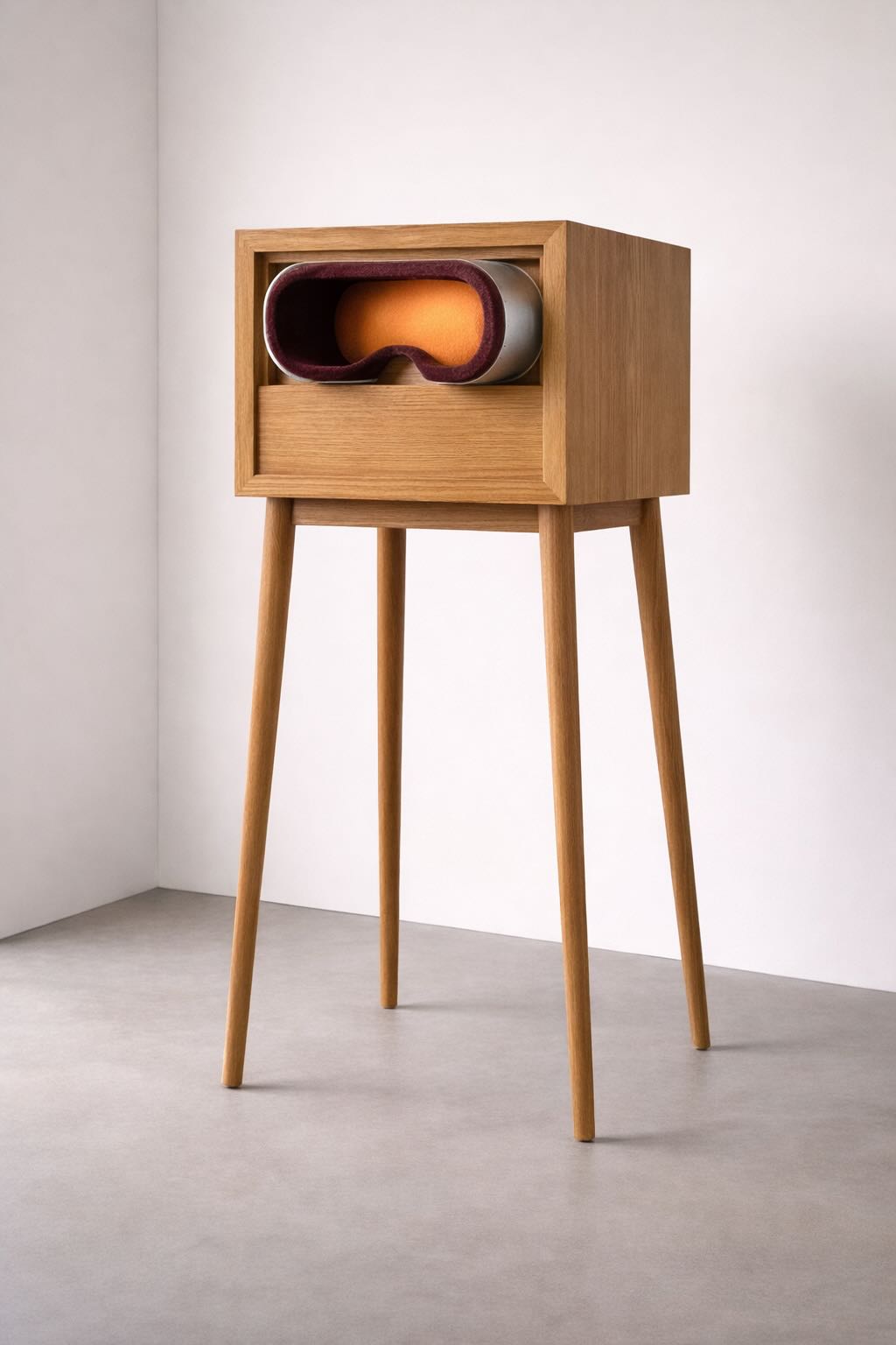
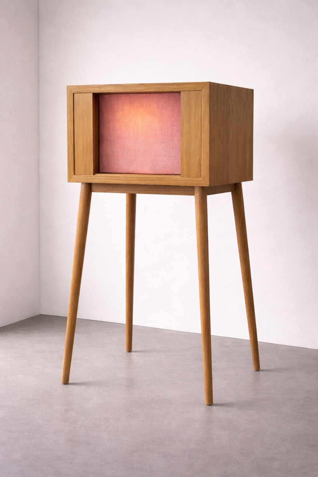
During my first mentoring session with Cecilia Raspanti, we discussed how the research can take place and Cecilia shared an idea of a klaeidoscope with me. Further ideation (and some childhood reminiscing of view master/ stereoscope) brought me to another thought. The swatchbook could be accompanied with a device, which you can wear around your eyes, to disconnect you from the surrounding environment and to have a full colour immersion. Imagine the shape of a VR headset, which holds the naturally dyed swatch at the forefront that you can look at. Our experience of colour is affected by several factors. A few of the main factors are light, size and interactions with other colours. To be able to have some control over these factors a colour immersion apparatus can be used. Of course there is no such apparatus that you can go buy from the store and this is where I would have my input! Another approach would be to create an apparatus that is not portable, but rather like a piece of furniture.
 |
 |
|---|---|
| Colour Immersion Apparatus, created with AI |
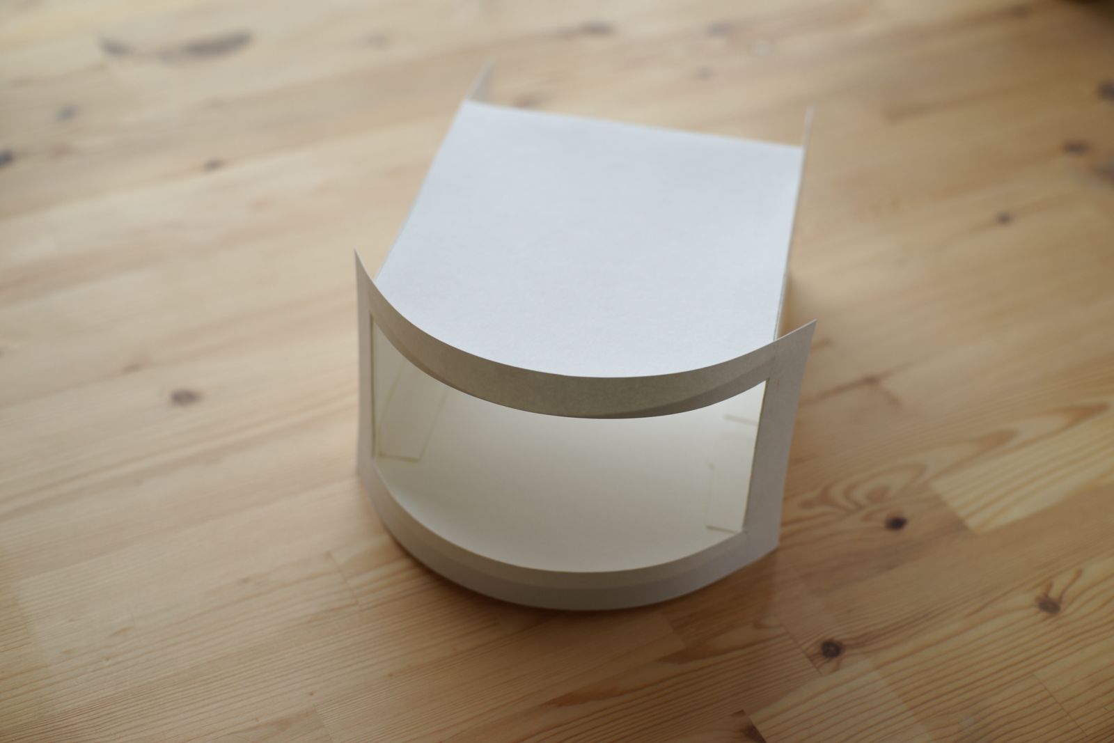
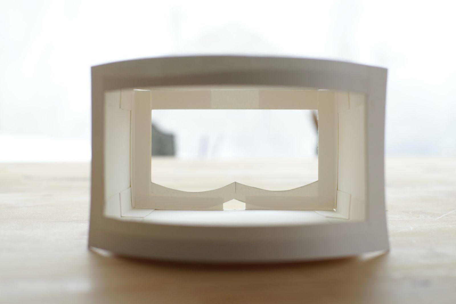
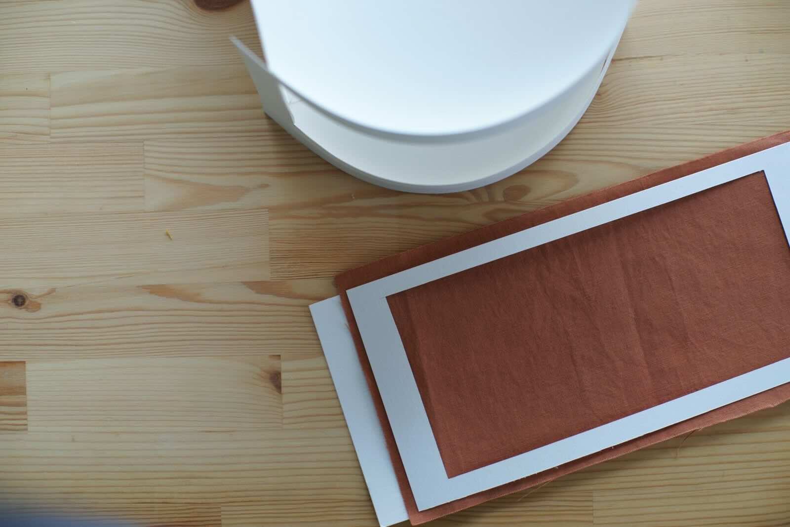
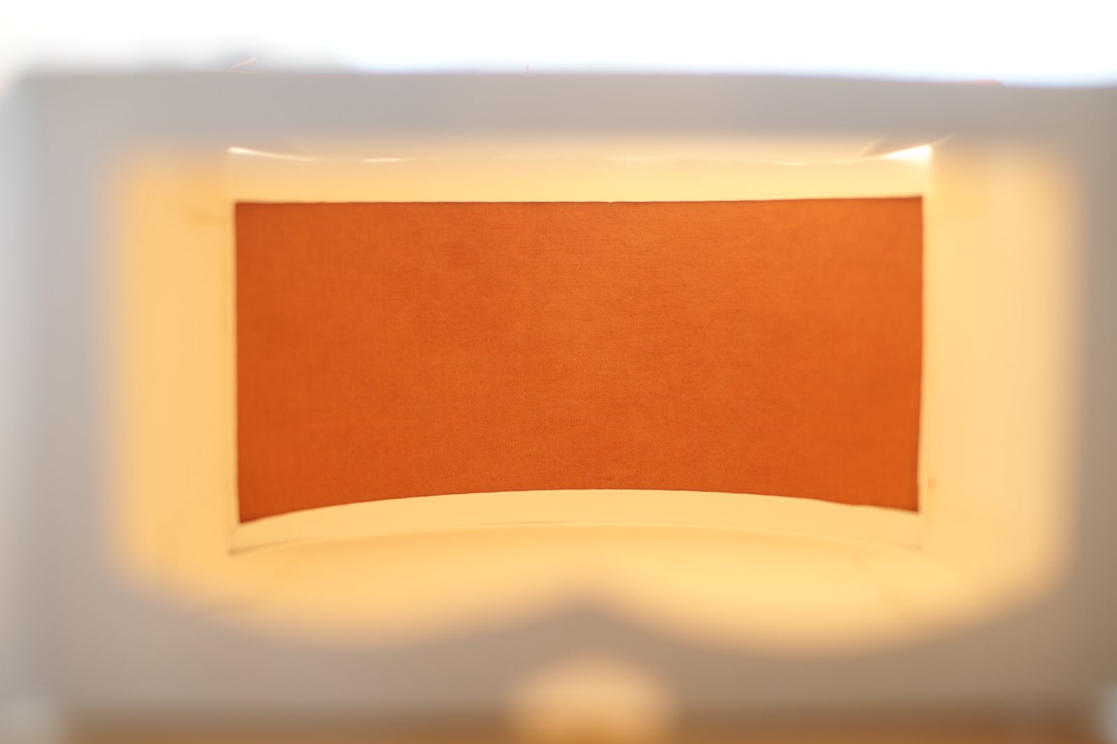
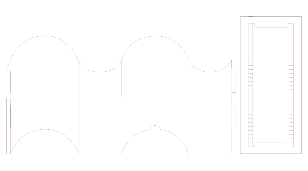
Prototype One
Colour Chamber
In the images below, you can find the first prototype of the Colour Chamber and how it can potentially be. I initially made it with heavy weight paper, for the simple reason of that's what I had in my studio. However, after making it and using it I am drawn to keeping it as paper. It could be a paper cutout which you can fold, just like a box. This way it could essentially accompany the "kit" for those who will participate in the discovery of the natural colours.
 |
 |
|---|---|
 |
 |
Meanwhile, just a few days after making and discussing the prototype of the colour immersion apparatus during the mentoring session, I came across Valentino's Spring/Summer 2026 show - Specula Mundi.
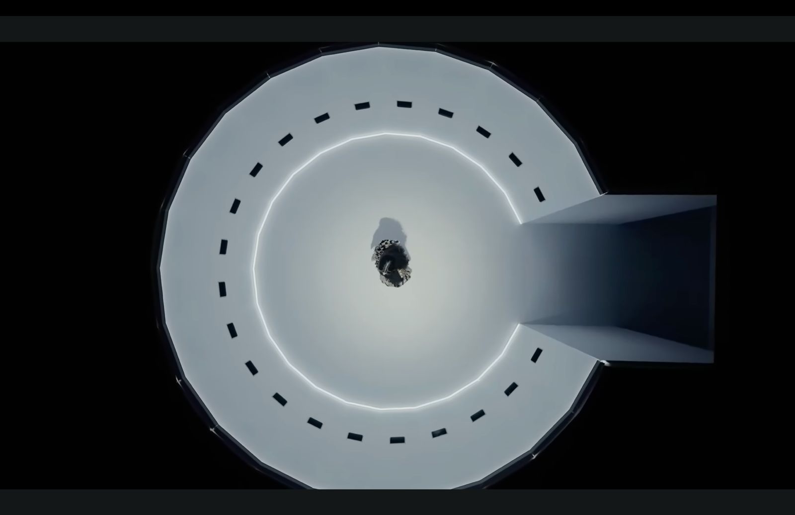
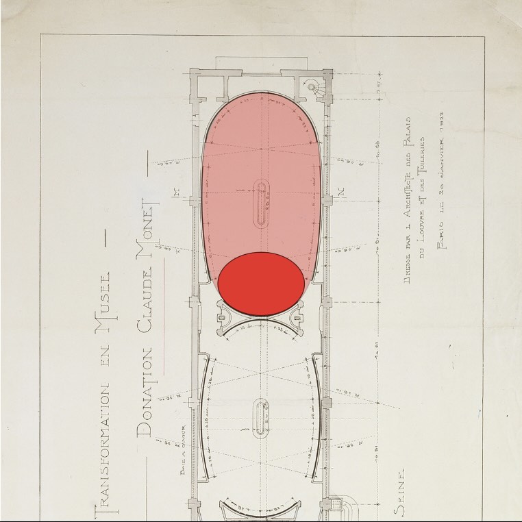
While working on the design, I decided to draw further inspiration for this from the architecture of Musée de l'Orangerie.
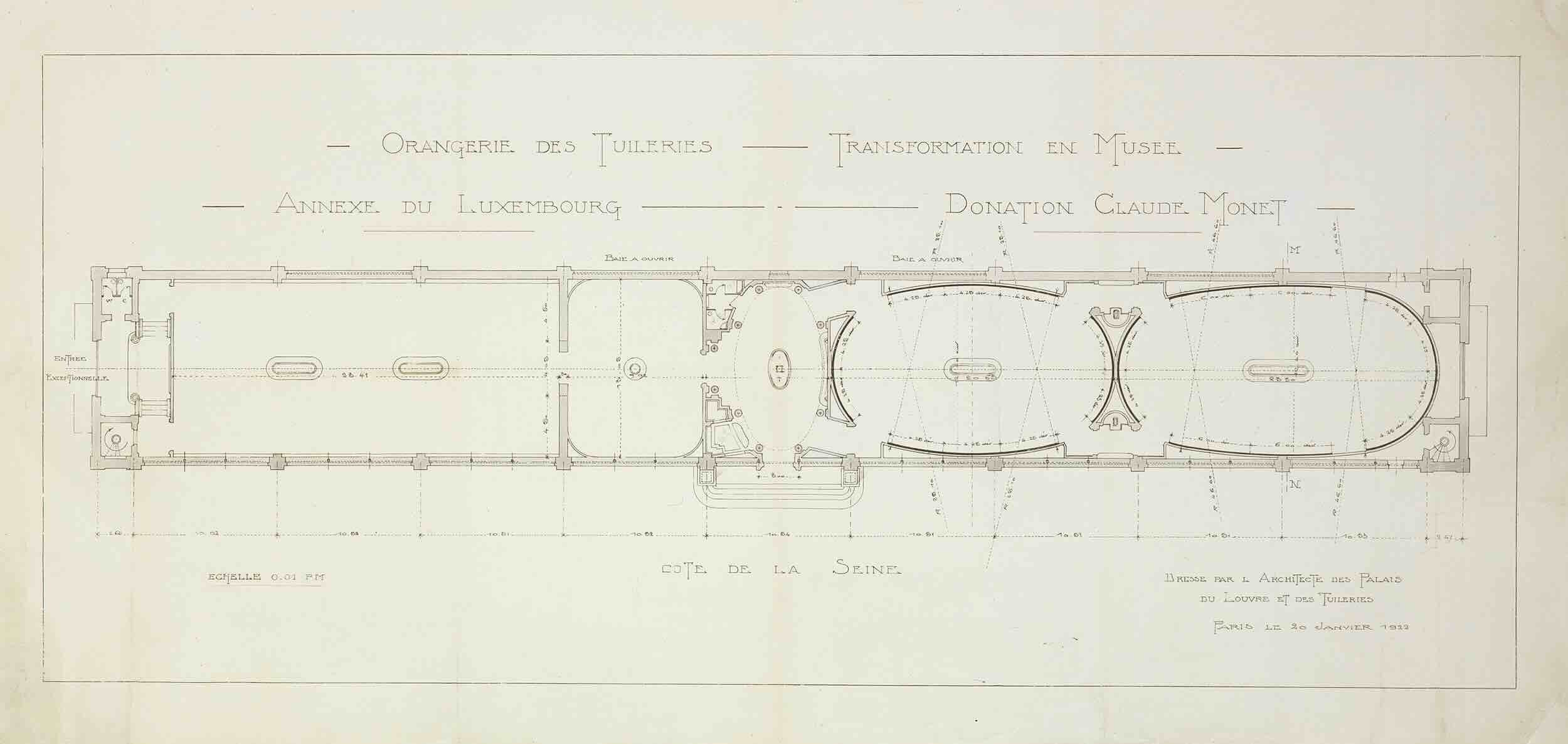
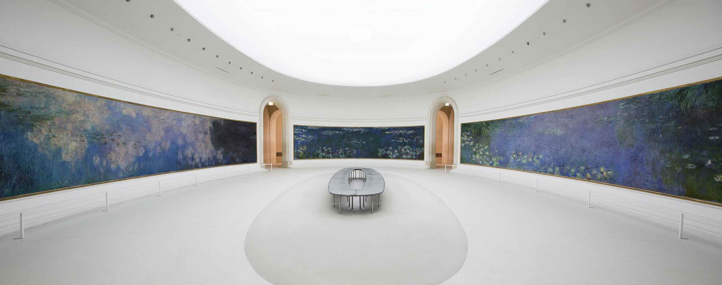
Similar to Monet's artistic practice, where he was "committed to sensory recordings of nature in relation to natural light", natural colours also tend to show themselves off in natural light. The architect who worked on the Musée de l'Orangerie, respectfully designed the ceiling with a skylight and canopy, filtering out unwanted harsh sunlight, and allowing the light entering the room to diffuse and scatter more evenly. This, not only preserved the paintings from photobleaching, but showed the vibrant hues, while eliminating unwanted shadows. Furthermore, the shape of the gallery rooms, alongside the lighting, elevated the viewers immersive experience.
Final development
You can see the developments of the Colour Chamber in the Design Page.
Notes
At the time that I am doing the experiments for this project, I have to note that it is January in Armenia. Natural dyeing is tied so strongly to seasonality and locality. In an ideal situation it would be spring or summer and I could go outside into my garden and harvest the natural dye stuff to experiment with. Nevertheless, I will be using the dye materials that I have harvested and stored during all other three seasons, when nature is a lot more gentle and generous. The four dyes out of the five not only grow in Armenia, but they are traditionally used for centuries here. Indigo is the one dye that is imported.
The project and natural dyeing focuses on sustainability in many ways. Locality and the abundance of local dye stuff plays a major role. However, we live in a very globalized world now and I cannot ignore the fact that I have collected kilos of avocado pits for example. Avocados don't naturally grow in this part of the world and I could decide not to use them. Would that be correct though? Even though it doesn't grow here, almost every supermarket, every restaurant and household uses it. Should I simply let it go to waste? Or should I accept the world we live in now and use it to extract many beautiful shades of corals and pinks. The same goes for plants, such as my Bougainvillea tree, that has decided to be in full bloom in the middle of winter. My aloe vera plant that had to be cut back a little as it was flowing out of its pot.
Mind Map