Portfolio
Aísthi̱ma

Aisthima, derived from the Greek word for feeling, sensation or perception, explores the subtle yet powerful ways colour can influence our emotional and sensory experience.
It is an experimental framework for observing colour more consciously, using naturally dyed textiles as a medium to investigate how colour can affect our emotional perception.
We live in a world saturated with colour, yet we rarely stop to consider how it shapes the way we feel, think, or interpret our environment.
This project began with a simple curiosity:
How do colours affect us emotionally, and what happens when we give ourselves the time and space to truly observe them?
Aisthima emerged as an attempt to slow down our interaction with colour and explore the sensations it can evoke.
Project Development
The project developed in three main phases.
The first phase focused on material research, extracting colour from plants through natural dyeing.
The second phase explored human perception, studying how people emotionally respond to different colours.
The third phase translated these findings into a spatial installation, the Mood Room, where colour can be experienced as an immersive environment.
Phase One
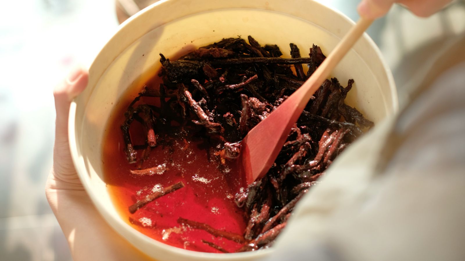
The first phase involved experimenting with natural dyes, extracting colour from plant materials and documenting their variations.
Each dye experiment was carefully recorded, including the plant source, mordants, and dyeing conditions. This documentation allows the dye processes to remain replicable and accessible.
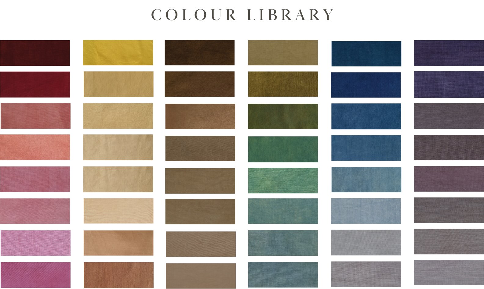
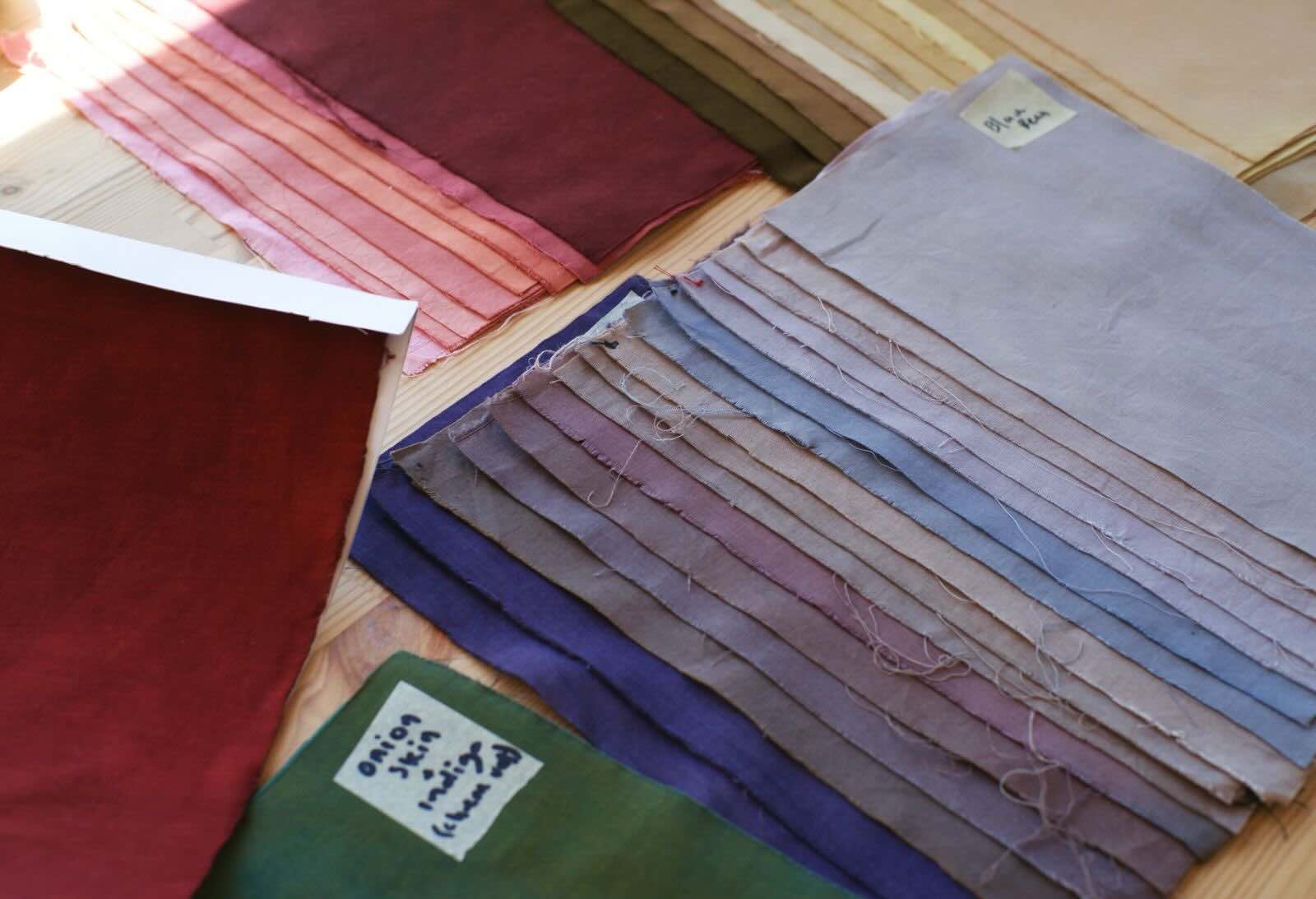
Through these experiments, I created a colour library of more than 50 naturally dyed swatches.
Each swatch represents a small record of the interaction between plant, fibre, and process.
Together they form a palette that reflects the diversity and unpredictability of natural colour — where subtle shifts in material or technique can produce different tones.
This library became the visual foundation for the rest of the project.
Lake Pigments 
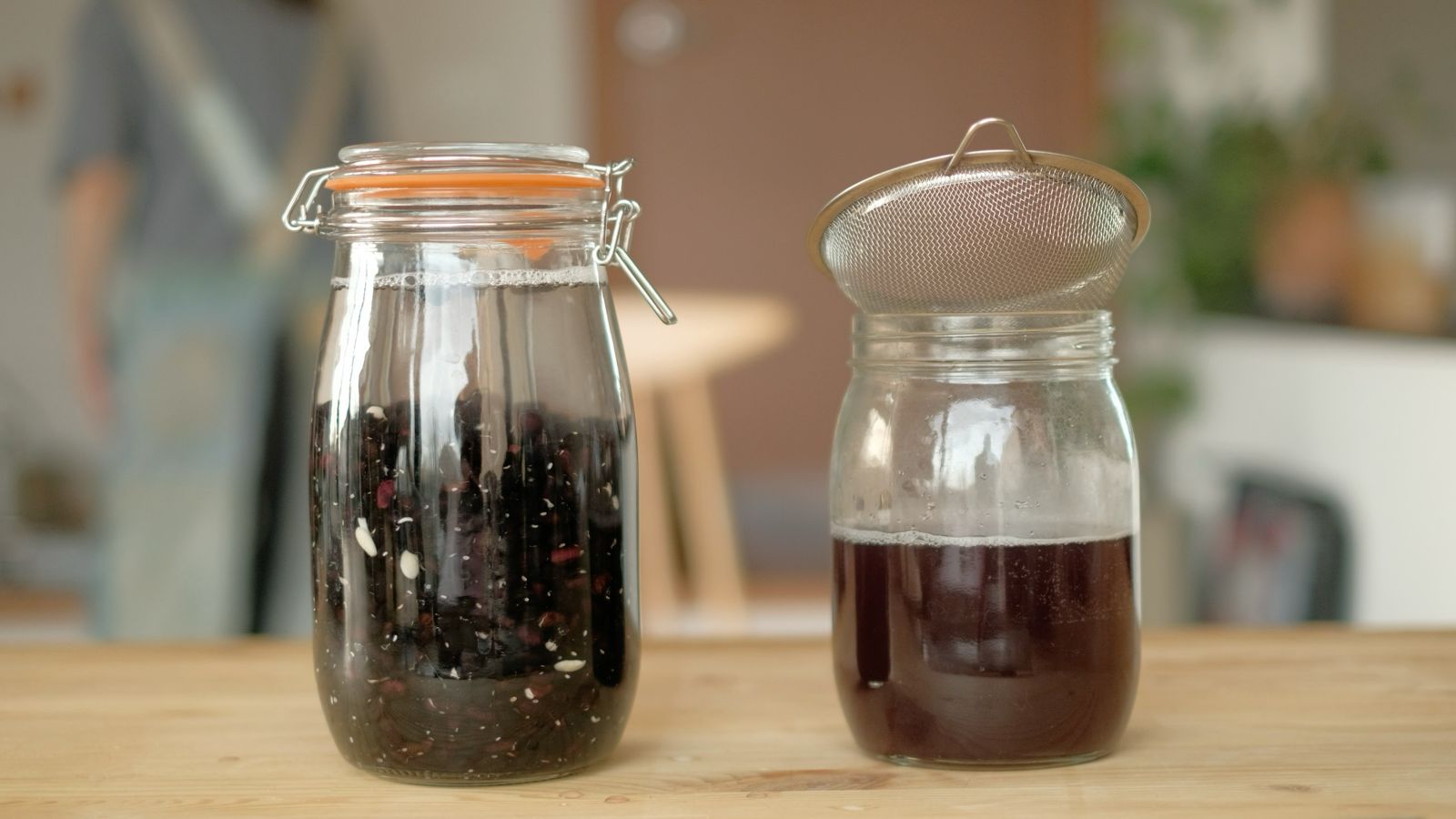
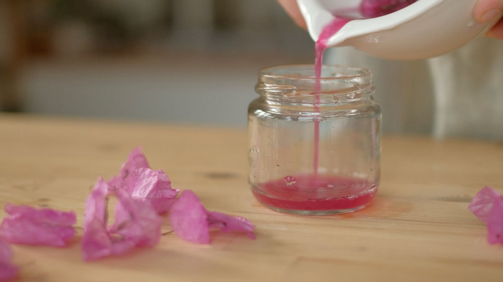
Instead of discarding the leftover dye baths, I began experimenting with transforming these dye baths into lake pigments.
What initially appeared as waste became a completely new material and opened a new direction within the project.
Converting plant dyes into pigment form allows these colours to continue their journey beyond textiles — moving into watercolours, inks, and other artistic applications.
And so my next project, growing from the branches of Aisthima, is to transform these pigments into all-natural watercolour sets, allowing these colours—born from nature—to continue their life through new forms.
Some of the pigments will also be shared with my friend Emma, who is completing her PhD at Harvard, to use in her final printmaking project. This collaboration demonstrates how the research and material exploration of Aisthima can continue evolving across different artistic and academic practices.
Phase Two
A key idea in this project is that colour is not experienced purely as an objective visual phenomenon — it is deeply connected to emotion, memory, and bodily sensation.
To explore this, participants were invited to observe the colour swatches and respond to a structured questionnaire that encouraged multi-sensory reflection. Rather than simply naming the colours, participants were asked to describe:
Where in their body they felt the colour
Emotions, sounds, smells, and physical sensations linked to the colour
The aim was to understand how colour can trigger personal, emotional, and somatic responses — responses that go far beyond merely seeing a hue. This approach revealed how colour can become a mirror of internal states, allowing the observer’s mind and body to engage with colour in a deeply personal way.
Colour Memory
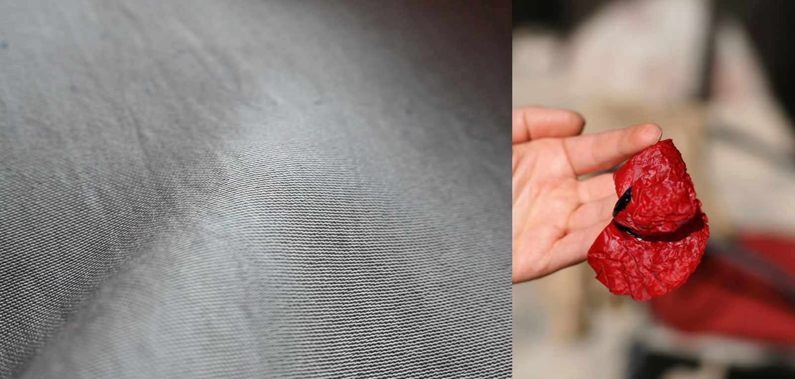
One particularly interesting moment occurred with a swatch dyed using red poppies collected near Lake Sevan.
When asked, “What is the first thing that you think of when observing this colour?”, a participant immediately associated it with Lake Sevan, despite the lake’s usual blue or turquoise and without any information about the plant source.
This moment suggested that colour can sometimes carry a sensory memory of place, allowing viewers to intuitively connect a colour with a landscape or environment.
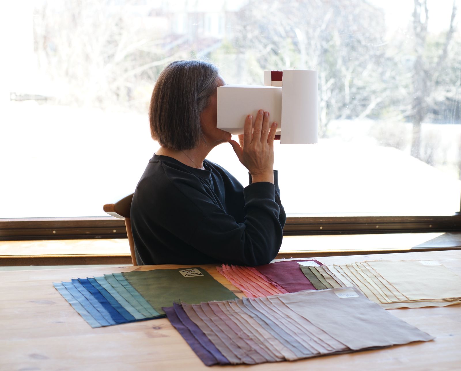
Colour Chamber
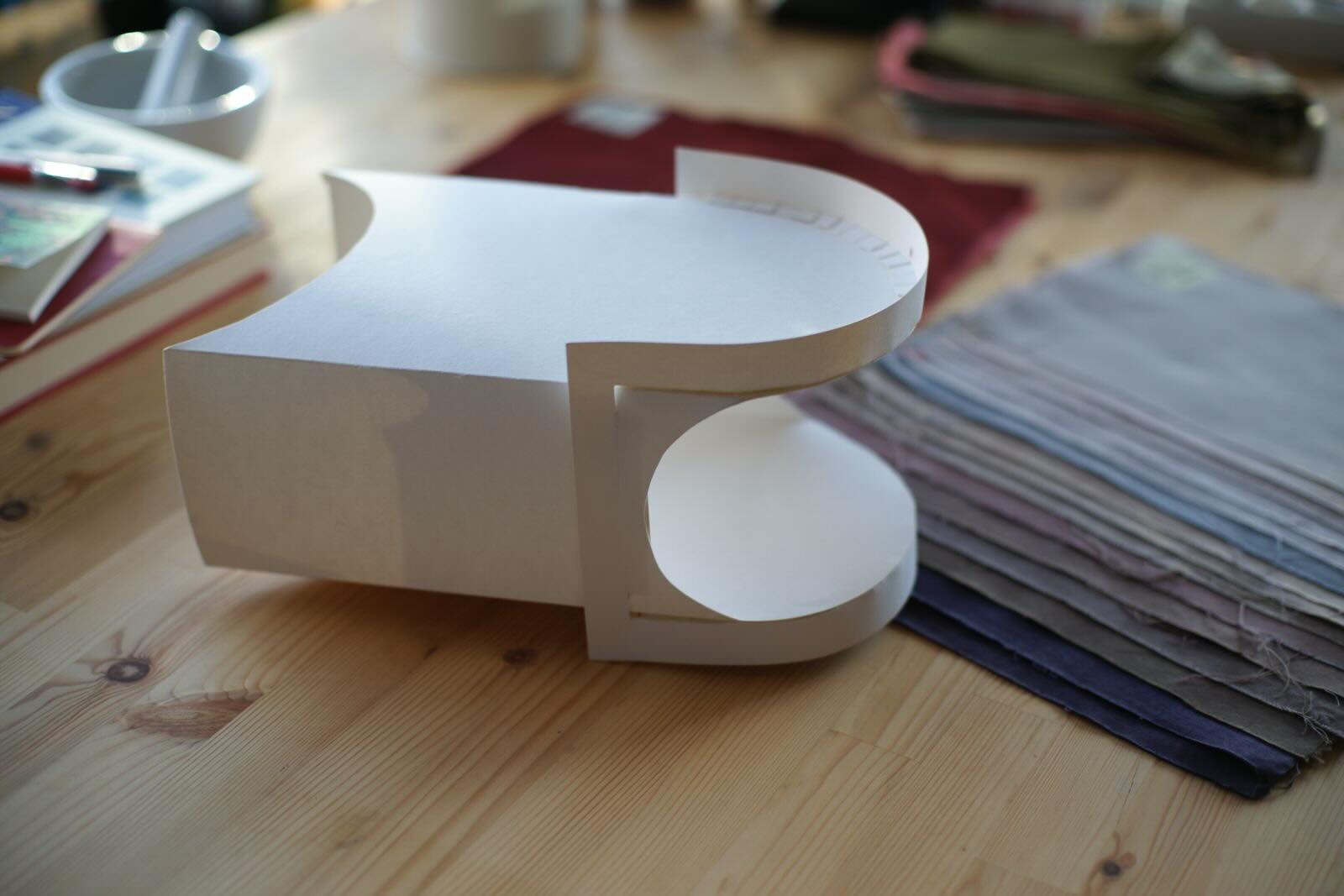
To allow people to experience colour in a more focused way, I also developed a small device that I call the Colour Chamber.
It is light, hand-held and assembled out of heavyweight paper.
When someone looks inside the chamber, the surrounding environment disappears and the viewer is confronted only with the colour of the textile.
This creates a more intimate and concentrated experience, allowing people to observe colour without distraction.
The chamber was used during the research phase of the project, helping participants focus on individual colour swatches before responding to the questionnaire.
Phase Three
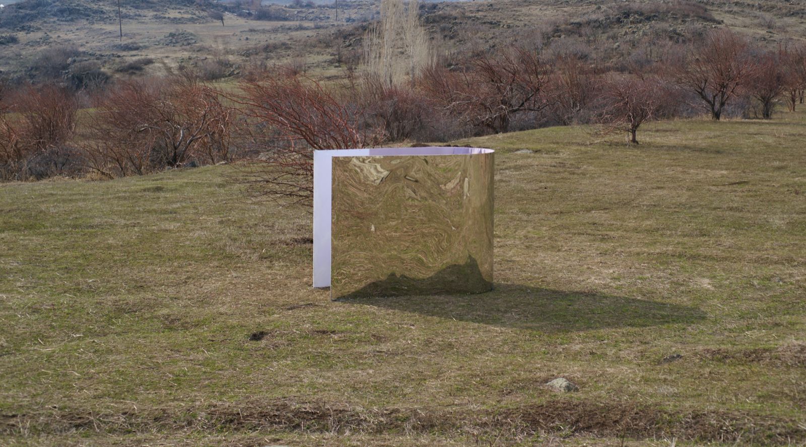
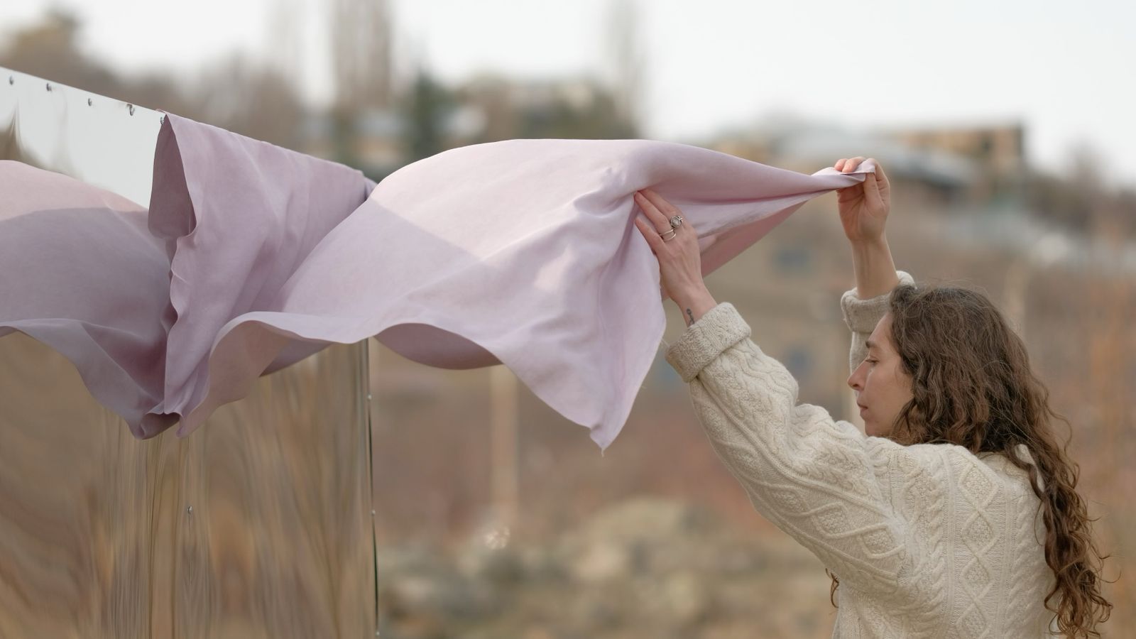
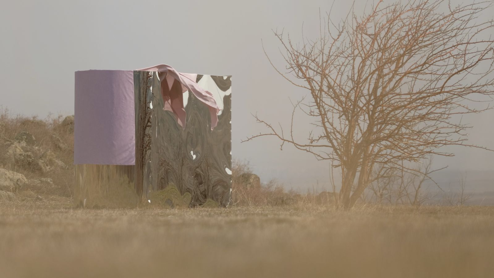
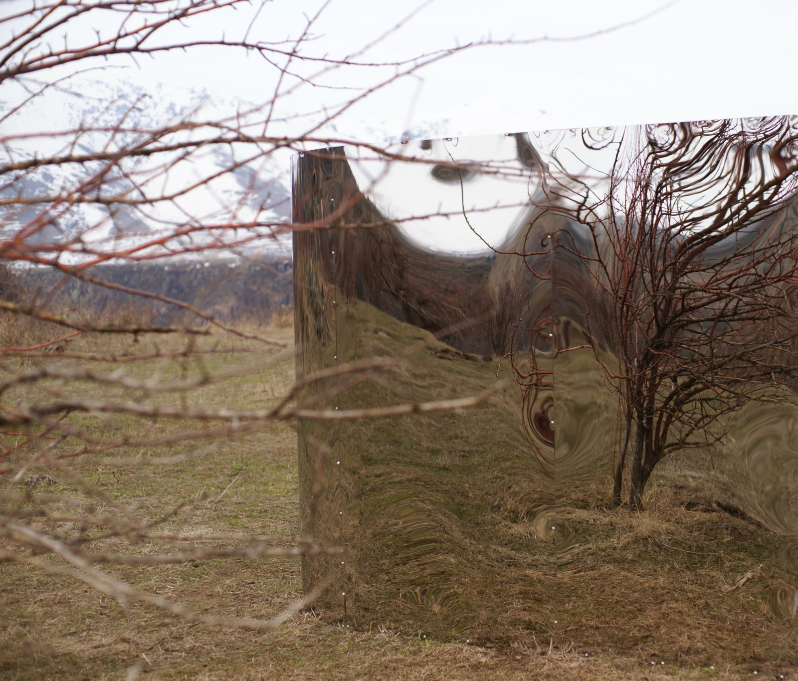
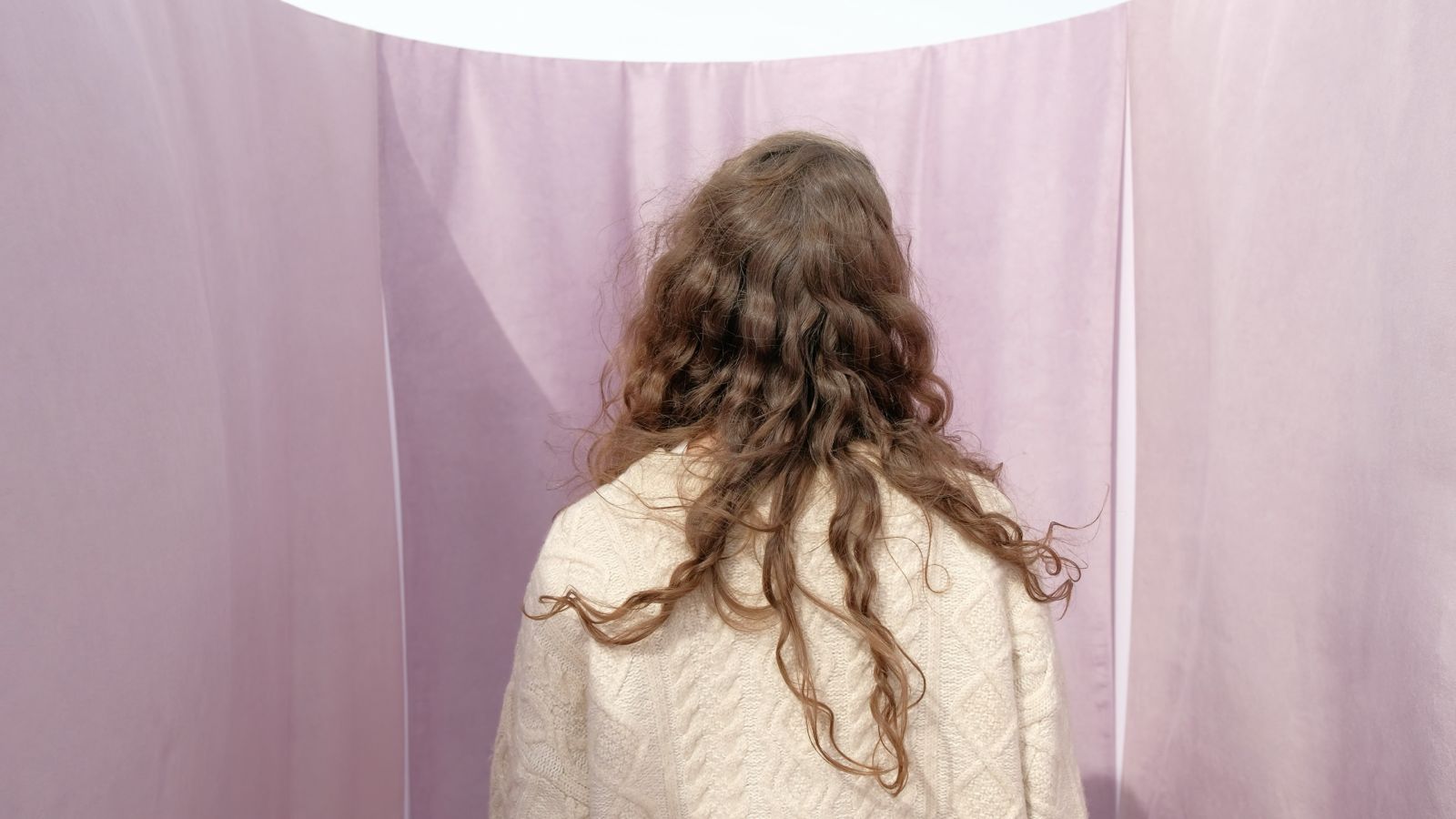
The final outcome of the project is the Mood Room, an immersive installation located in Saghmosavan.
Inside the space, three monochromatic silk textiles — all dyed with the same natural colour — surround the viewer.
Rather than observing colour as a small sample, visitors encounter it as a spatial atmosphere.
In many ways, the Mood Room is the larger spatial version of the Colour Chamber. Both share the same idea of isolating colour and removing external distractions, allowing the observer to focus entirely on the experience of colour.
The Architecture
Interviews conducted during the project revealed that responses to colour often reflect a person’s internal emotional landscape.
To express this idea spatially, the Mood Room structure is covered with mirror metal sheets on the exterior.
From the outside, the structure blends into its surroundings, reflecting the landscape around it.
But upon entering, the visitor encounters a monochromatic interior.
This contrast turns the room into a kind of perceptual capsule, separating the viewer from the outside world and allowing colour to become the primary experience.
The Colour
The colour selected for the Mood Room was not selected for an audience, but for myself.
Colour perception is deeply personal, and the Mood Room reflects my own intuitive relationship with colour.
The choice emerged partly from observing the swatches through the Colour Chamber, but also from an emotional response to the present moment.
In a way, this process resembles how colour trends often emerge — through a mixture of observation, cultural atmosphere, and intuition.
At this particular moment, I felt that this was the colour my mind and body needed.
Final Thoughts
In our daily lives, colour is everywhere, yet we rarely stop to truly experience it.
Aisthima proposes a moment of pause.
Through natural pigments, emotional observation, and immersive space, the project explores how colour can act as a bridge between the external world and our internal emotional landscape.
Within the Mood Room, colour is no longer simply something we see — but something we feel and inhabit.
Presentation
Aisthima_Final_Presentation by Svetlana Khachatryan
You can view and download the presentation pdf below.
Video
Gallery
Mood Room
Studio


Colour Chamber
Thesis PDF
Download thesis here