Concept
Aísthi̱ma
aísthi̱ma is about the perception through the senses, emotional or affective response. It's primarily a research project, where I will be doing a deep dive into natural colours, their extraction and application, as well as the impact these colours can have on our behaviour. As an artist I have always had a fascination with colour. I am especially drawn to monochrome, large scale paintings and textile art. Since I have started extracting natural dyes and applying them on a variety of materials, my perception and experience of colour has changed. So I want to ask...
What is colour?
How does it affect our mood?
How does it change our behaviour?
These questions have opened pandora's box and I am excited to discover! My challenge is to try and understand the mystery of natural colours and try to formalise its language of frequency and emotions. Colour is all around us and we are constantly reacting to it, be it not always consciously. From Goethe’s Theory of Colours, to Kandinsky's Concerning the Spiritual in Art, to Rothko's emotional monochromatic paintings, I want to research and understand everything I can about colour as a whole. I am curious about the physics of colour and how our perception of it is subjective. I want to learn how Max Lusher has used colour as an instrument for diagnostics and more.
But further from this, I want to experiment, extract, apply, record and document natural colours. I want to use different techniques and variations of pigment extraction from the environment around me, giving a voice to these electromagnetic waves that, in a narrow spectrum, hit the eye just right, giving us the chance to "see" colour. Using my experimentations, I would like to create a swatch book for us to discover and observe how these colours and materials impact our moods. Does a colour intensify an emotion? Does it heal? Is it soothing? Exciting? Maybe overstimulating?
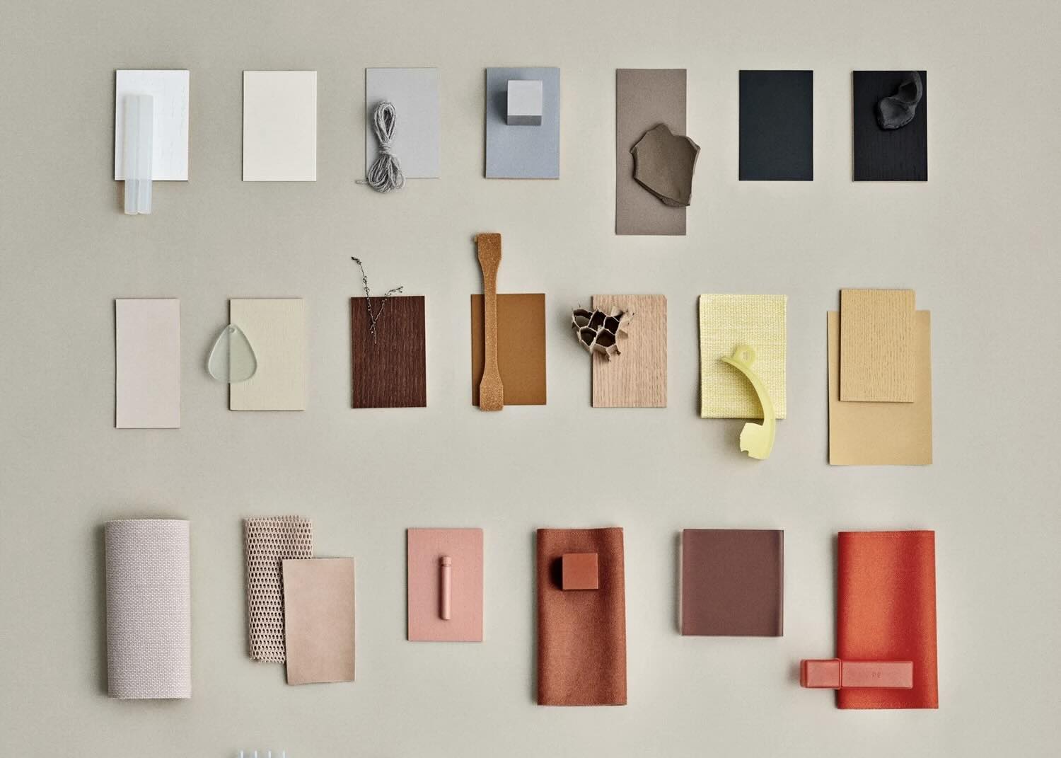
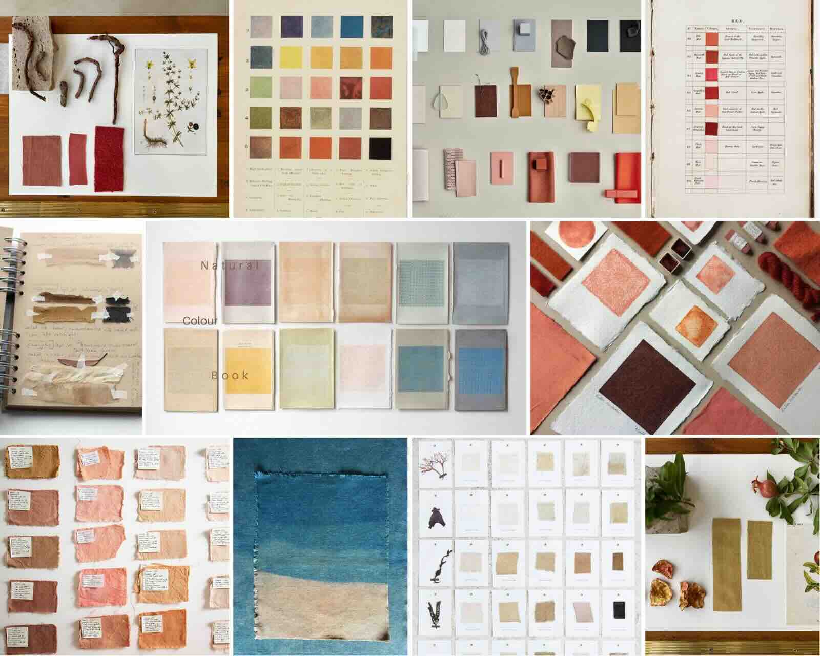 Natural Colour Swatch Book Moodboard
I would further like to argue that naturally extracted colour can have a deeper affect on us, than synthetic colours do.
Through my final project I want to shed light on our experience of natural colour, bringing it to the forefront of our attention for a moment.
I imagine a "Mood Room" where vast monochrome natural colour textiles can hang, giving us the space and time to slow down in their company, reflect and re-balance.
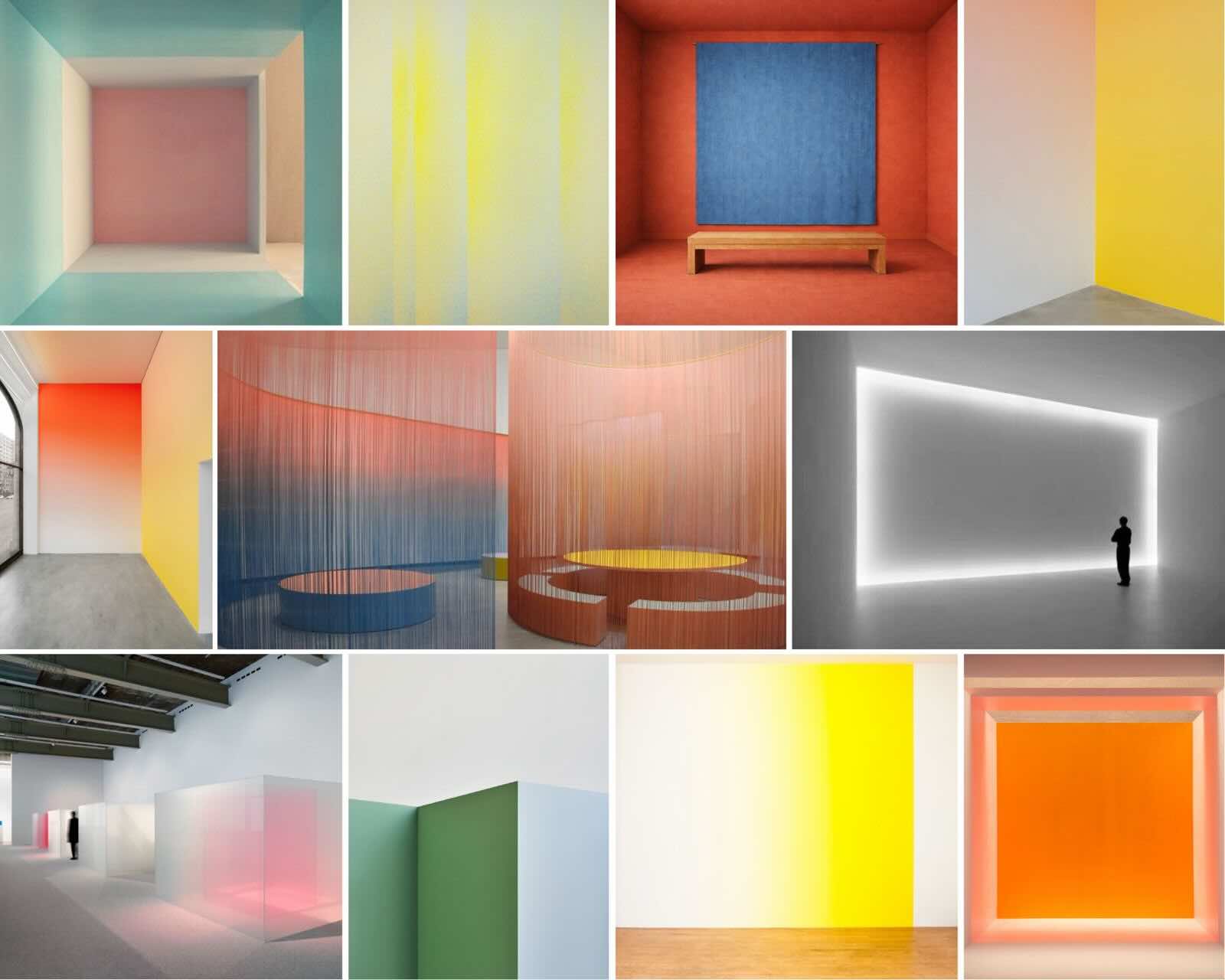 Mood Room Moodboard
Who
The project invites people of all backgrounds to participate in the research process. It would be interesting to see how people of different backgrounds, age and profession will interact with the natural colour sample book and record their experience. The final outcome of the project- the mood room, would be open for anyone who finds colour to be as powerful as I do. It will be especially useful for designers, psychologists, and those individuals who seek for a moment of interneal reflection within their own homes.
What
A research based exploration of the concept of colour, how it impacts us, how we interact with it and how it can influence our mood and behaviour. To further understand, discover and document the extraction and application of biochromes. Analyse and compare the influence of natural colour to synthetic colours. Can we feel closer to nature by being surrounded by natural colour within our own homes? How will this change us in our day to day lives?
When
Where
While colour is a subjective experience and is interpreted differently from culture to culture, this project can serve anyone anywhere. By developing the swatchbook, that can also be digital, I aim to add specific recipies which the user can look up and repeat. This way they can both develop skills for natural dyeing (if they don't already), bringing them a step closer to sustainability and nature. Furthermore, they can create their own mood rooms, according to the colours that they desire.
Why
Our disconnection from nature has deepened over time, while mental wellbeing has suffered. We need a moment to slow down, reflect, re-balance. I believe natural colours hold a great deal of healing properties and I would like to discover how I can use the natural environment around me to impact behaviour, emotion and mood, with the use of biochromes. I personally would love a mood room .
How
Through a deep research and exploration of natural colours and its application on different materials. How can we use the findings of this research in design?
References, projects, research papers, expos
Books
- Interaction of Color, Josef Albers
- Goethe’s Theory of Colours
- The Color Theories of Mark Rothko: A Deeper Look into His Palette
- In Pursuit of Color: From Fungi to Fossil Fuels: Uncovering the Origins of the World
- Color Psychology: Effects of Perceiving Color on Psychological Functioning in Humans
- The Luscher Color Test
- Concerning the Spiritual in Art by Wassily Kandinsky
- Chromatopia: An Illustrated History of Color
- The Secret Lives of Color, Kassia St Clair
Artists
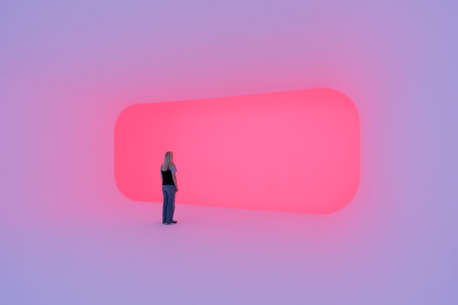
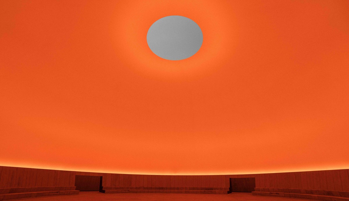
James Turrell
I am fascinated as I discover the work of James Turrell, while doing research for this project. Although, without natural colour, Turrell's installations are vast and the sheer size of it, inspires me. His use of colour seems to make the feeling of space disappear altogether. What an environment to observe and focus solely on colour itsef!
 James Turrell, Aftershock, 2021. Installation view at Copenhagen Contemporary, 2025 Photo: David Stjernholm
 James Turrell, As Seen Below—The Dome, a Skyspace, 2025, permanent installation, ARoS Aarhus Art Museum, Denmark © James Turrell. Photo: Mads Smidstrup, courtesy ARoS Aarhus Art Museum, Denmark
Pieter Vermeersch
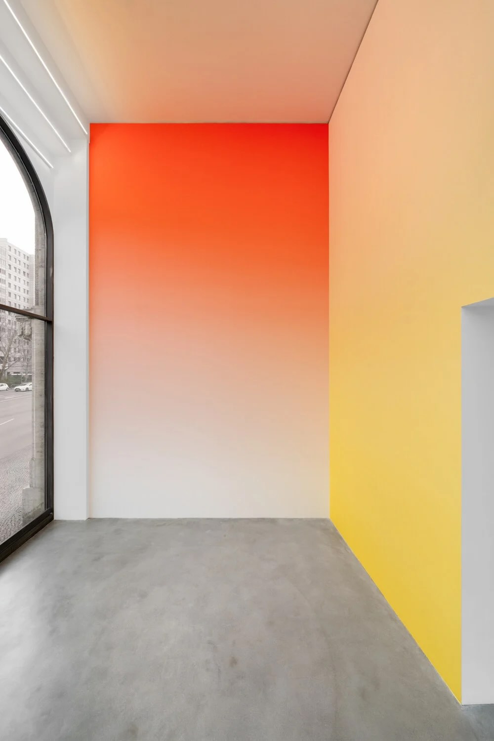
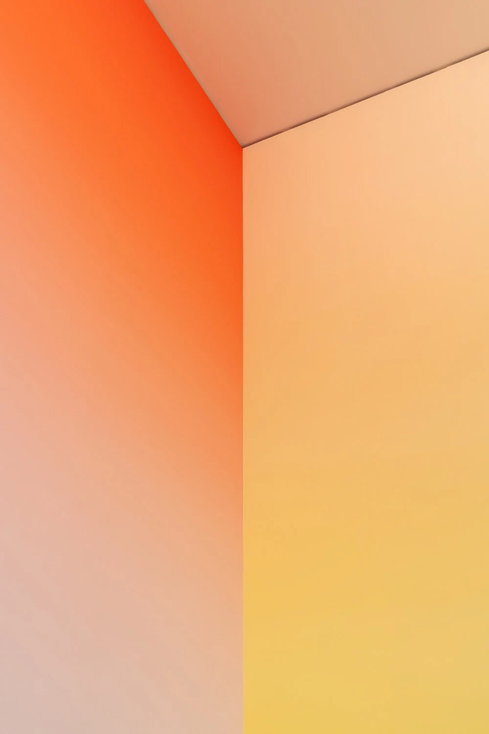
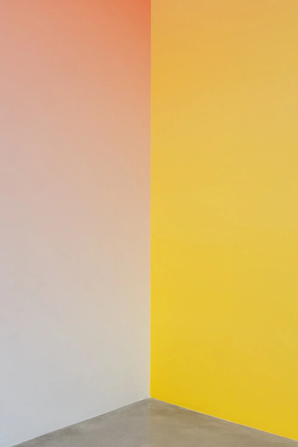
Throughout the research fase of Aisthima, I was reading "Interaction of Colour" by Josef Albers, which was making me contemplate about using a combination of colours in the final Mood Room. In these ideations I stumbled across Pieter Vermeersch's work. His approach to the space as his canvas opened a few more doors in me. It was interesting to think of the room, of the walls as the blank canvas itself. As a painter, I was also drawn to his technique of applying gradients so hyper realistically, that you don't notice brushstrokes. Colour becomes an experience in time, as your gaze moves from one shade to the next.
 |
 |
 |
|---|---|---|
Pieter Vermeersch, Galerie Thomas Schulte
Mark Rothko
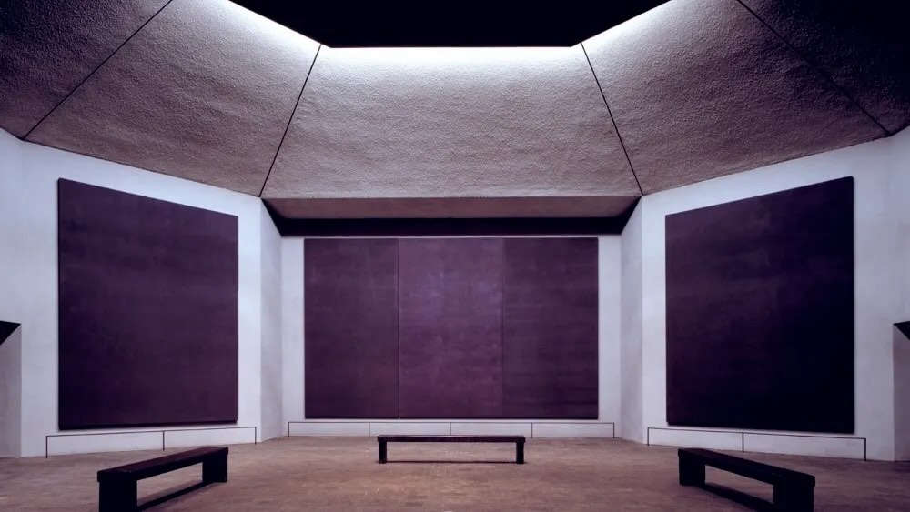 Rothko Chapel, Houston
My very fist colour experience, that has stayed with me all this time, happened at a retrospective of Mark Rothko at the Tate Modern almost 20 years ago. I was physically feeling the colours and as a result having an emotional reaction to them.
Yves Klein
Yves Klein blue was another colour experience that I had, not to be forgotten. His blue that makes concave and convex shapes lose their curve and the more you focus and observe the colour the more you see nothing. In an IKB 71 positive "nothing" kind-of-way.
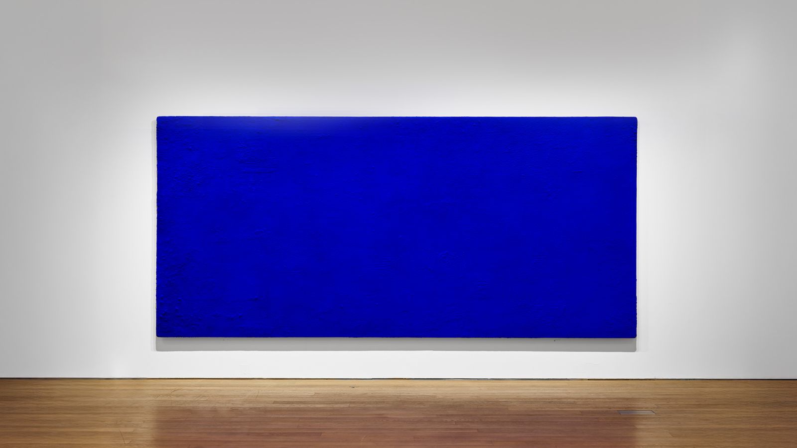 Yves Klein, California (IKB 71), 1961
Magdalena Abakanowicz
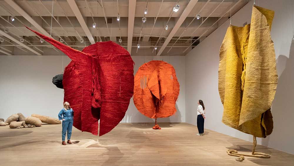
Magdalena Abakanowicz large scale textile sculptures pulls you, yet at the same time intimidates you. In 2023 I experienced her Abakans at the Tate Modern. I say experience, because this was not just an observation. Their scale and the earthy hues embrace you. They invite you close and the more you take the invitation, the smaller they make you feel. Her work is inspired by human experiences, female experiene, of wars, of nature. The Abakans create a situation, an environment and the viewer encounters them. The scale creates a bodily experience.
Susan Magsamen
Magsamen, a pioneer in neuroaesthetics, studies how specific light frequencies and color saturations can trigger the release of neurotransmitters like dopamine or serotonin, literally altering the viewer's state of mind. Her years of work is something that I am now starting to discover and think about deeply. Her discoveries are the evidence, while Aisthima aims to also be the experience.
"S: One of the things that is so interesting to me about color is that while individual colors are important, the actual hue of a color plays an important part in how we respond to it on an individual level. As an example, things with pinker hues tend to have a more calming and soothing effect on us. Understanding hue is an important aspect when thinking about color and so is context. Our perception of a given color changes in relation to the colors that surround it." The Impact of Colour
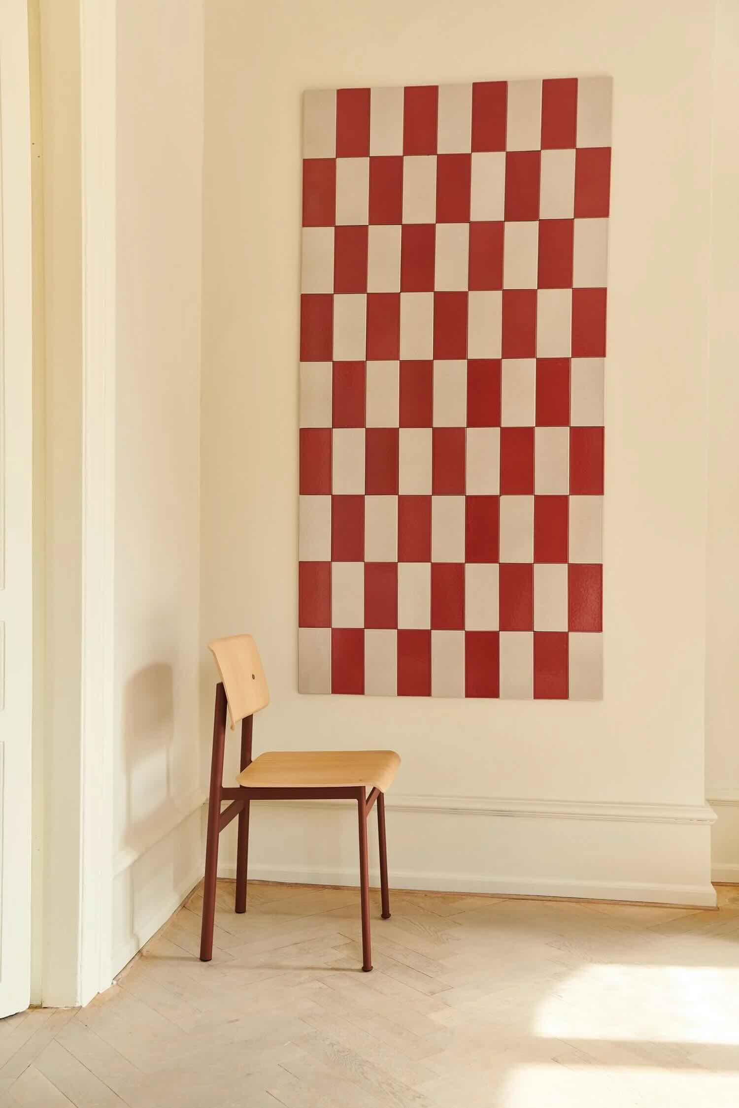
Josephine Yaa Akuamoah
I became inspired by the "File Under Pop" project by Josephine Yaa Akuamoah in how she brings the philosophy of colour into the spaces that we inhabit.
In her own words she describes how through the project "we seek to make connections between our inner and outer space"- the outer spaces being the ones that we share with others. The homes we live in are in a way an extension of our inner spaces. Her approach to choosing colour is how to use it to create an atmosphere, encouraging emotional connections.
"You can create strong stories through color – something poetic, something unexpected. Tensions between soft, calm, and lovely and something powerful, dark and somber. New rooms within rooms occur in these tensions. We also work to add pauses or even shelters within a space."- Josephine Yaa Akuamoah
 |
 |
|---|---|
| Josephine Yaa Akuamoah, File Under Pop |
Josef Albers
One cannot think of colour and not think of Jospeh Albers. His discoveries on how we interact with colour, has changed my perception of colour altogether. How we see the same colour differently, when other colours are placed next to it, is fascinating. What I want to discover is how one singular colour can have an effect on us. I think the learnings from Joseph Albers is something that I will put in use as the next stage - when I have comepleted Aisthima.
Mid Term Presentation
Mid_Term_Presentation by Svetlana Khachatryan