State of the art, project management and documentation
00 Assignment
- Build your documentation website describing yourself and your motivation for the textile-academy, including your previous work.
- Upload the documentation to your project page on class.textile-academy.org.
- Add references and research based on the topic of your interest.
- Learn how to upload images, videos, references and how to use Markdown and GitLab.
- Learn to resize and optimize images, videos and files for the web.
- Extra: Customize your website and document how you did it.
01 Research & Inspiration
Since I signed up for Fabricademy, I have been looking for inspiration and ideas about what I would like to explore during the course. I spent a lot of time looking through the work of previous Fabricademy participants, but also scrolling through my Instagram feed and saving projects that caught my attention.
At the beginning, the amount of possibilities was actually a bit overwhelming. There are so many different Idears that I would love to try, and my first thought was basically: I want to do all of it.
After a while, I started thinking about which topics connect best to the projects I am currently working on. One of them is Bottrop.Gemeinsam.Zirkulär, a project focused on circular economy and how this can be realized in urban society.
Because of this connection, I decided to narrow down my research and focus more on circular economy, reuse and the transformation of existing materials. Instead of only asking how we can produce new things more sustainably, I am especially interested in what we can do with materials that already exist and might otherwise become waste.
During my research, I found several projects that approach this question in very different and inspiring ways.
Jute Translations – Julija Karas
Jute Translations explores how discarded jute sacks can be reused as a raw material. The fibers are separated and transformed into new biomaterials and composite boards, giving an existing waste material a new application.
TWIST AGAIN investigates how textile waste and old garments can be shredded and processed into new composite materials. The resulting material can be used for panels and three-dimensional objects and can be recycled after use.
The project explores how textile waste can be transformed into a new material. Fabric scraps are shredded into smaller fibers, combined with a bio-based resin and pressed into larger sheets. These sheets are then cut and assembled into new products, showing how textile waste can become a usable material instead of being discarded.
Artyzen Design – Masarratfatima
Artyzen Design explores paper as a sustainable artistic material. Some installations use recycled paper pulp to create new artworks and structures.
Paper Pan transforms recycled paper into a new creative material called Liquid Paper. The recycled paper pulp can be mixed with water, shaped or applied in different forms and then dried to create new objects and surfaces.
FabBRICK transforms discarded textiles into a new construction and design material. The textiles are shredded into fibers, mixed with a bio-based binder and cold-compressed into bricks and other objects without additional heat.
All of these projects explore the question of how existing materials can be reused, transformed or kept in use for longer. The materials themselves are different, and the waste is created at different stages, but the underlying idea is very similar: instead of seeing these materials as waste, they become the starting point for something new.
During the 14 weeks of Fabricademy, I would like to use this topic as one of my main areas of exploration. My goal is to develop my own project around reuse and circular materials and to investigate how it could be implemented locally. Ideally, I would like to connect the results with Bottrop.Gemeinsam.Zirkulär and turn some of the ideas or processes into workshops that can be used with the local community.
02 My Documentation Setup
For my Fabricademy documentation, I wanted to work locally on my computer and only upload finished changes to GitLab. The following steps describe my setup from an empty local folder to a cloned Fabricademy repository.
Step 01 — Create a local project folder
First, I created a new folder on my computer.
I recommend chose a local folder that is not inside another synchronized cloud folder, such as OneDrive, Dropbox or Google Drive. Since Git already manages and synchronizes changes itself, an additional synchronization service can cause unnecessary conflicts or file-locking issues. (Something that has already cost me quite a bit of time troubleshooting this)
Fabricademy /
Step 02 — Install Visual Studio Code
Next, I installed Visual Studio Code (VS Code).
Code editor.
VS Code is the main editor I use for my documentation. I use it to edit Markdown files, CSS and configuration files, but also to access the Git repository and the integrated terminal.
After the installation, I opened the Fabricademy folder I had just created:
File → Open Folder → Fabricademy
Step 03 — Install Git
Before a GitLab repository can be cloned, Git must be installed on the computer.
Version control system used to track and manage changes.
Git handles the version control of the documentation and allows changes to be downloaded from and uploaded to the GitLab repository.
After installing Git, I restarted VS Code so that it could detect the Git installation correctly. (really important!)
Step 04 — Open the terminal
Inside VS Code, I opened the integrated terminal.
On my Windows setup, I can open it using:
Ctrl + Ö
Alternatively, it can always be opened through:
Terminal → New Terminal
The terminal opens at the bottom of VS Code. There, I can enter the commands directly.
Step 05 — Copy the GitLab repository URL
Next, I opened my Fabricademy repository in GitLab.
On the repository page, I selected the Code button and chose the HTTPS option.
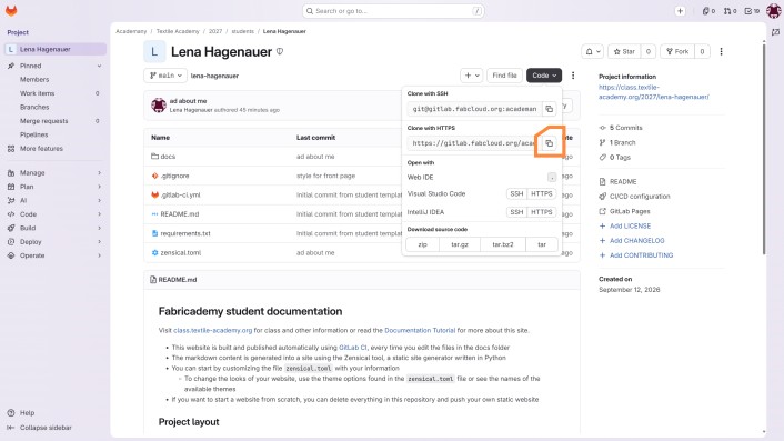
Step 06 — Clone the repository
In the VS Code terminal, I used Git's clone command together with the HTTPS address I had copied from GitLab.
It creates a local copy that remains connected to the original GitLab repository.
Step 07 — Create a Personal Access Token
When cloning a private repository for the first time, GitLab asks for authentication.
Instead of using my normal GitLab password, I created a Personal Access Token for authentication.
In GitLab, I navigated to:
Profile picture → Edit profile → Access → Personal access tokens
Then I selected:
Generate token → Legacy token
I gave the token a significant name and added a short description and set the expiration date to one year from now. (Otherwise the token may expire much sooner and I would have to authenticate again)
For working with the repository through Git, the token needs permission to read and write the repository.
I therefore enabled:
read_repository
write_repository
Then he should download the entire repository.
Step 08 — Install Python
To be able to test the whole thing locally, we now have to install Zensical on the local Computer.
Zensical requires Python, so the next step was to install Python on my computer.
Programming language.
After the installation, I reopened the VS Code terminal and checked whether Python was available.
If the installation was successful, the installed Python version is displayed in the terminal.
Step 10 — Install Zensical
The Fabricademy website uses Zensical to turn the Markdown files in the repository into the actual documentation website.
I installed Zensical directly from the VS Code terminal using Python's package manager pip.
(This only needs to be done once on the computer.)
Step 11 — Start the local website
With Python and Zensical installed, I could now run the documentation website locally.
For this, the terminal needs to be inside the cloned Fabricademy repository, where the zensical.toml configuration file is located.
Zensical now builds the documentation and starts a small local web server.
The terminal displays an address for the local website, usually:
Step 12 — Open the website in the browser
I copied the local address from the terminal and opened it in my browser.
Now I can see my website, with the local changes
You don't have to restart after every change, as soon as you save, you will see it.
03 My Workflow
While working on my documentation, I first edit the page and test all changes locally. I do not upload every small change immediately. Instead, I usually finish a section or a page first and then upload a group of changes that belong together.
VS Code also provides an integrated Source Control interface where most Git actions can be done by clicking through the interface. But I have always worked with Git through the command line, so I continue to use the terminal for my workflow.
Step 01 — Edit and test locally
First, I edit my Markdown, HTML or CSS files in VS Code.
Before uploading anything, I start the local website and check whether everything looks and works as expected.
Step 02 — Check what has changed
Before adding anything to Git, I first check which files changed.
Git then shows me which files are new, modified or already prepared for the next commit.
Step 03 — Select the changes I want to upload
Next, I add the files that belong to the current change.
I prefer to group files that belong together instead of automatically adding everything.
For example, I can add a single file:
Or I can add an entire folder if all changes inside it belong together:
Step 04 — Create a commit
When all relevant files are added, I create a commit.
A commit saves this group of changes as one version in the Git history.
I try to use a short but meaningful commit message.
For example:
or
This makes it much easier to understand later what was changed at each point in the project.
Step 05 — Push the changes to GitLab
The commit currently only exists in my local repository.
To upload it to GitLab, I push it to the remote repository.
If everything works correctly, Git transfers the new commit to GitLab.
GitLab then updates the online repository and the documentation website can be rebuilt with the new version.
Step 06 — Check the result
Finally, I check the repository status once more.
If all changes have been committed successfully, the files that I uploaded should no longer appear as modified.
I then also check the published website in the browser to make sure that the online version looks the same as my local preview. (But sometimes that takes a little while.)
04 Website Development
I started with the standard Fabricademy website and first spent some time clicking through the existing pages and structure.
At the beginning, I considered whether I wanted to continue working with the provided template or build the entire website myself. In the end, I decided to keep the existing setup because Markdown is very practical for documentation, while CSS still gives me enough freedom to adapt the visual appearance to my own ideas and to make it easier for others to understand what I did.
What should my website do?
The website is supposed to serve two purposes.
First, it should show what I am working on and what I create during Fabricademy.
Second, it should work as documentation, both for myself and for others. I have found that writing down a process helps me understand and remember it better. It is also very useful to be able to return to my own instructions later instead of having to figure out the same steps again. (I still use my FabAcademy page sometimes even today as a resource.)
At the same time, I want the documentation to be clear and structured enough that other people can follow the process and reproduce what I did.
What should my website look like?
Before changing anything, I first thought about what I actually wanted the website to look and feel like.
For me, the most important points were:
- a lot of white space
- something that reflects my technical background
- interactive elements with a small “wow” effect
- consistency and recognizable design elements throughout the website
- a dark mode
First design ideas
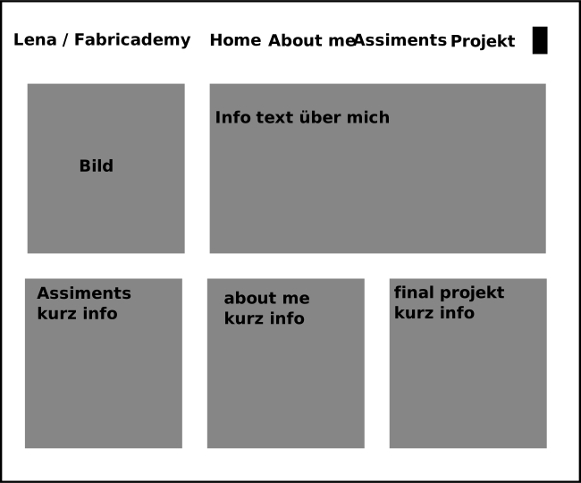
Before starting with CSS, I created some first design ideas in Inkscape.
I experimented with possible layouts for complete pages, but also with smaller elements that could appear repeatedly throughout the documentation.
Rough design for the front page and the header
Possible card with a beveled corner. Normally, left and right when hovering over it.
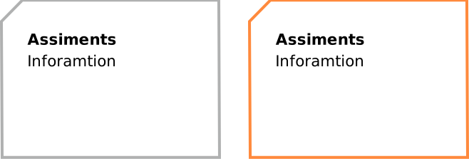
Some ideas changed quite a lot during implementation, because an element that works well in a drawing does not necessarily work equally well on a responsive website.
How the website is structured
The content of the documentation is mainly written in Markdown. Zensical processes these files and generates the HTML pages that are displayed in the browser.
The CSS controls the visual appearance of these pages and you can do quite a lot things with it. Whenever Markdown alone is not flexible enough for a specific element, I can also add my own HTML.
Defining the basic design
I first checked which parts of the website could already be configured through Zensical itself.
After that, I started defining the basic visual appearance in my CSS.
One of the first things I did was create variables for my main colors in variables.
Example Light mode:
:root {
  --page-background: #f2f2f2;
  --text-color: #1d1d1d;
  --secondary-text-color: #555555;
  --accent-color: #ff8a3d;
  --accent-color2: #ffcb3d;

 /* card colors  */
  --card-background: #ffffff;
  --card-border: #c9d1d8;
  --card-glow: rgba(255, 138, 61, 0.45);

}
The same idea is also used for the dark mode, where these variables are replaced with alternative values.
Experimenting with the navigation
After defining the basic colors, I experimented with the navigation bar.
My original idea was to place the navigation in the same line as my name in the header.
I tried several approaches, but none of them behaved exactly the way I wanted across the complete layout. Instead of spending too much time forcing this solution, I decided to leave the navigation closer to the existing structure for now.
Creating a consistent visual language
The next question was which elements would appear repeatedly throughout the documentation and therefore needed a consistent visual style.
I wanted the website to have recognizable elements instead of designing every page independently.
Two of the main visual ideas became returning elements across the website.
Interactive LEDs
One returning element is a small LED-like circle.
The LED can be used as part of a line or other technical-looking elements and reacts when the user hovers over it.
This creates a small interactive effect without making the website overly animated.
Clickable cards
Links that are more important than a normal text link are often designed as complete clickable cards.
Instead of only making the title clickable, the entire card acts as the link.
When hovering over the card, its moves and glow.
Different content, different visual elements
I also wanted different types of content to be visually recognizable. What is important to me is that the brand's recognition value remains high across all pages.
Therefore, several recurring content types received their own design language.
Images
Images use a simple technical frame or a cut corner instead of a conventional rounded image style.
Videos
Embedded videos receive their own frame so that they visually belong to the rest of the website instead of appearing as an unrelated YouTube element.
Software
Software and tools are displayed in their own reusable component with the software name and a short description.
Links and interactive elements
Important links are designed as larger interactive elements or cards instead of only changing the text color.
Pages with their own layout
Not every page follows exactly the same visual structure.
The Home page and the Assignments overview have their own layouts because they have different functions from a normal documentation page.
The Home page uses cards to introduce the main areas of the website.
For the Assimatn page, I initially had the idea to create a circuit board where the weeks were represented by individual components, but I ran out of time, so I tried a simpler design instead. Here are my first two ideas; I ended up implementing the second one.
Idee 1:
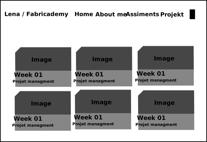
Idee 2:
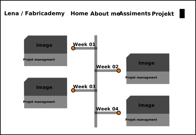
The actual weekly documentation pages remain simpler so that the content itself stays easy to read.
Building the design with CSS and HTML
To adapt the website to these ideas, I worked mainly with CSS and added my own HTML where I needed more control.
Instead of creating every element independently, I tried to build reusable design patterns that I can use throughout the complete Fabricademy documentation.
Two examples show this approach particularly well:
- the styling of the H1 headings
- the reusable cards on the Home page
When I get stuck or want to know how something works, I use W3schools.
Example 01 — H1 headings
One of the first recurring elements I designed was the main page heading.
Design idear

Instead of using the standard H1 styling, I wanted the heading to reflect the technical visual language of the website. I therefore added a line inspired by a circuit trace and an LED that reacts when the user hovers over the heading.
The complete element is created only with CSS. I did not need to add additional HTML to every heading.
Preparing the heading
First, I changed the positioning and added some additional space around the H1. This space is needed for the LED and the circuit line.
h1 {
  position: relative;
  padding-left: 2rem;
}

.md-typeset h1 {
  position: relative;
  padding-top: 2.2rem;
}
Using position: relative is important because the additional elements can then be positioned relative to the heading instead of the complete page.
Adding the circuit line
The line above the heading is not an image. It is created with the ::before pseudo-element.
.md-typeset h1::before {
  content: "";
  position: absolute;

  top: 1.4rem;
  left: 1.5rem;

  width: 55%;
  height: 1.2rem;

  border-top: 4px solid var(--card-border);
  border-left: 6px solid var(--card-border);

  transform: skewX(-40deg);
  transform-origin: top left;
}
I use only the top and left borders of the element to create the line.
The skewX() transformation tilts part of the line and creates the angled connection that makes it look more like a circuit trace instead of a normal rectangular border.
The color comes from my CSS variable --card-border, so it automatically follows the color scheme of the website.
Adding the LED
The second pseudo-element, ::after, creates the LED next to the heading.
.md-typeset h1::after {
  content: "";
  position: absolute;

  top: 2.5rem;
  left: 0;

  width: 25px;
  height: 25px;

  background: var(--accent-color);
  border: 4px solid var(--card-border);
  border-radius: 50%;
}
The equal width and height combined with border-radius: 50% turn the element into a circle.
I had to play around a bit with the positioning of the individual elements until I was happy with it.
Adding the interaction
I wanted the LED to react when someone moves the mouse over the heading.
For this, I added a glow using box-shadow.
.md-typeset h1:hover::after {
  box-shadow:
    0 0 0.4rem var(--accent-color),
    0 0 0.8rem var(--accent-color);
}
The two shadows use different sizes, which creates a softer glow around the LED.
The result is a very small interaction, but it became one of the recurring visual elements of my website.
Finish example

Finish example with glow

Short excursion — px vs rem
I've worked with CSS before, but today I learned something new.
px defines a fixed size in pixels, while rem is relative to the root font size of the website.
From now on I use rem for spacing and element sizes because it scales together with the text. Otherwise, Lini and Led have moved when the website size was changed.
Example 02 — Homepage cards
For the cards on the homepage, I wanted to continue the same technical design. Instead of using rounded corners, I decided to simply cut off the top-left corner.
My first approach was quite simple: I used clip-path to change the rectangular shape of the card.
Example Card
This card uses a normal border and a clipped corner.
This worked for the shape itself, but created another problem: the normal CSS border did not follow the new diagonal edge in the way I wanted. Since clip-path clips the complete element, the original rectangular border is clipped as well.
Because I wanted the border to follow the complete shape, including the diagonal corner, I used a slightly more complex solution.
Creating the shape with clip-path
The shape itself is defined with a polygon.
Each value defines one point of the polygon. Together, these points describe the outline of the element.
For experimenting with the shape and finding the correct coordinates, I used the CSS Clip Path Generator.
This is especially useful because the polygon can be adjusted visually instead of calculating every point manually.
Simulating the border
Since a normal border did not follow the clipped corner correctly, I created the border using two shapes on top of each other.
The .home-card forms the larger outer shape and uses the border color as its background.
.home-card {
padding: 1.5rem;
color: var(--text-color);
height: 100%;
position: relative;
isolation: isolate;
background-color: var(--card-border);
border: none;
clip-path: polygon(
  24px 0,
  100% 0,
  100% 100%,
  0 100%,
  0 24px
);
}
Then I use the ::before pseudo-element to create a slightly smaller shape inside it.
.home-card::before {
  content: "";
  position: absolute;
  inset: 4px;

  background-color: var(--card-background);

  clip-path: polygon(
    22px 0,
    100% 0,
    100% 100%,
    0 100%,
    0 22px
  );

  z-index: -1;
  pointer-events: none;
}
The inner element is moved 4px away from the edges using inset. This leaves part of the outer shape visible and makes it look like a border.
Making the complete card clickable
I did not want only the title or a small text link to be clickable. Instead, the complete card should be like one large link.
For this, the card is wrapped inside .home-card-link.
.home-card-link {
  display: block;
  height: 100%;
  position: relative;

  text-decoration: none;
  color: inherit;
}
Adding the hover effect
Finally, I wanted the interaction to be clearly visible when someone moves the mouse over a card. just like with the LED
The outer shape changes to my accent color:
At the same time, the complete card moves slightly upwards and gets a glow.
.home-card-link:hover {
  transform: translateY(-3px);

  filter:
    drop-shadow(0 0 4px var(--card-glow))
    drop-shadow(0 0 10px var(--card-glow));
}
Cahanges on Zenssical
I also made a few changes directly in the Zensical configuration instead of using CSS for everything.
For example, I removed some elements that I did not need, such as the search function and repository link, and adjusted the available color schemes.
I also configured the website so that it starts in light mode, while still allowing the user to switch to dark mode using the toggle in the header.
But I haven't found all the settings I'm looking for yet, some of the links still appear in turquoise. I hope I'll figure that out over the course of the week so the site looks completely consistent.
Using Markdown
For the individual assignment pages, I mainly use Markdown because these pages focus more on documentation than on complex visual design.
To keep the formatting simple and consistent, I use a basic Markdown cheat sheet that we received from our instructor as a quick reference while writing.
05 Working with Media
For my documentation, I use different types of media depending on the content.
Videos
I upload my videos to YouTube and embed them directly into the documentation using HTML. This makes it possible to watch the videos without leaving the page.
I also modified the CSS of the video container to match the visual style of my website.
<div class="video-container">
  <iframe
    src="https://www.youtube.com/embed/VIDEO_ID"
    title="YouTube video"

    allowfullscreen>
  </iframe>
</div>
Images
For creating and editing graphics, I mainly use Inkscape.
Vector graphics editor used to create and edit SVG files and prepare graphics for the documentation.
Whenever possible, I use SVG files instead of raster images such as JPG or PNG. SVGs are vector graphics, which means they can be scaled without losing quality and are often very small in file size.
A good example can be found in my old Fab Academy documentation:
Fab Academy 2020 – Computer-Aided Design
It is probably best to reload the page once after opening it, I have learned quite a few things about building websites since creating this page. ;)
Of course, vector graphics are not suitable for everything. Photos, screenshots and similar images still need raster formats.
To avoid unnecessarily large files, I therefore reduce and optimize raster images before adding them to the documentation.
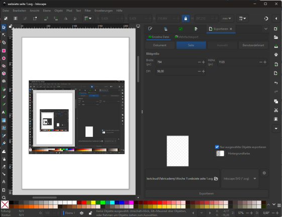
Image Export Workflow
For raster images, I use Inkscape to reduce the file size before adding them to the documentation.
- I open the image in Inkscape and place it on an A4 page at a size that is still clearly readable.
- Then I go to File → Export.
- The export panel opens on the right side, where I can adjust the width, height and DPI of the exported image.
- Usually, I select the image and enable “Export selected objects only”. This automatically defines the export area based on the selected image.
- I then reduce the DPI until I find a good balance between image quality and file size.
- Finally, I export the image and check that it is still sharp enough for the documentation.
This way, raster images do not take up more storage space than necessary while still remaining clearly readable on the website.
AI usage
I used ChatGPT as a supporting tool throughout my documentation process.
I mainly used AI to help me with spelling and grammar, to improve the clarity of my writing, and to support me. As spelling is something I often struggle with, this was especially helpful for reviewing and correcting my texts. For translations, I used both ChatGPT and DeepL.
For coding, I use ChatGPT mainly to explain concepts, errors and possible approaches rather than to generate complete solutions for me. This way, I can understand what I am doing and write or adapt the implementation myself.
I also use it to help visualize an idea when I already have a concept in mind but am not able to create the visualization myself at that moment.
06 FabLab Workflow & Safety
I have been working in our FabLab since 2016 and was also involved in setting up many parts of the lab when we moved into our larger space. Because of that, I know the lab like the back of my hand (in Germany we say like my pants pocket "wie meine Hosentasche") and its workflows very well and can operate most of the machines.
There is one exception: the Portafilter machine is still a complete mystery to me.
As one of the safety officers of our FabLab, I am also very familiar with the general safety regulations as well as the specific rules and requirements of the different machines. For this reason, I feel quite well prepared for this part of Fabricademy. Of course, especially when working with new machines, materials or processes, I need to check the corresponding safety instructions before starting.
My main blind spot is everything related to the BioLab. We are currently only beginning to establish this area in our FabLab, so my practical experience there is still quite limited. I am therefore especially looking forward to learning more about it and to working closely with Julia Krayer, who is doing Fabricademy together with me.
07 What I Learned
Even in the first few days, I already learned quite a lot, not only about the tools and workflows, but also about myself and how I have developed since I did Fab Academy.
Looking back, I notice that I have grown a lot. I feel more confident showing my work, my technical knowledge has expanded, and I also understand much more about how websites are structured and designed.
One thing that was quite new to me was working with Markdown. Until now, I had barely used it, but I can already see why it is so useful for documentation. Compared to writing everything directly in HTML, it is much easier to focus on the content when they aren't all over the place >>><<<<.
I also refreshed and extended my CSS knowledge. Especially while adapting the design of my documentation website.
The State of the Art research was another useful learning experience. I noticed that I need a clear structure when researching, otherwise I can easily follow too many interesting directions at once and lose focus. Taking some time to define what I am actually looking for helped me approach the research more systematically.
Overall, the first days already showed me that Fabricademy will not only be about learning new technologies, but also about reflecting on how I work, document and communicate my ideas.