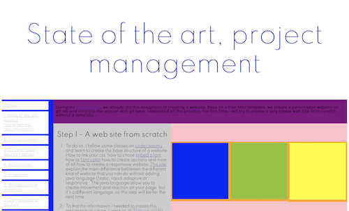
During my fabacademy, we already had this assigment of creating a website. Based on a free html template, we had to create a personalised website on Git Lab and control the version with Git Bash. I explained all the process inside it. This time, I will try to create a very simple web site from scratch without using a template.
Step 1 - A web site from scratch to document
- To do, I follow some classes on codecademy and learn to create the base structure of a website: How to link your css, how to choose imbed a font, how to html color, how to create sections and most of all how to create a responsive website. This site explains the main difference between the different kinds of website that you can do without adding java language (Static, liquid, adaptive or responsive. The java language allows you to create movement and reaction on your page, but it's a different language, so this step will be for the next time.
- To find the informations I needed to create this responsive structure, I go on W3School, a HTML responsive Web Design. This site is a gold mine of informations. It gives you all little pieces of code that you can play with and understand better what influences what. I use this same site to fine a way to create the responsive image grid of the main page. This main image grid of 5 colons reduced in 2 and then 1 colon depending on the size of your device.
- Theory is good, but in real...It doesn't work right now. You can see in my sketches that my main goal was to create a static menu to the left. In the main section dividing this space in one, two and three colomns that I can play with. The main problem is when I close a division section in my html, the next one will open under the menu, so it doesn't align with the rest of the page.
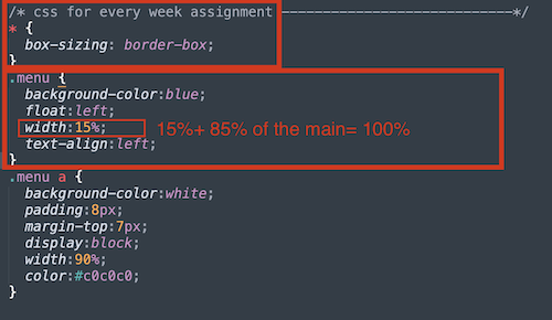
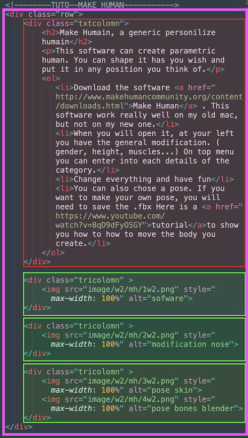
- It took me few week to figure out what was going on. I did some research, but when you find a piece of code, it's only a piece so it doesn't tell you what will react to what. To figure out, I put some crazy colorful background to every sections and to see the position of the actual divisions of sections. After few other researches, I discovered that normaly alot of web developper devided their page into 12 colomns. When you do a responsive site, theses colomns are one of the only way to control your devided sections. So you can control a number of colomns in a vertical way and you can control your horizontal sections with your divisions. When you close a section you can call another style of css. For exemple, you will see in my code a styling div call:tricolomn and txtcolomn.
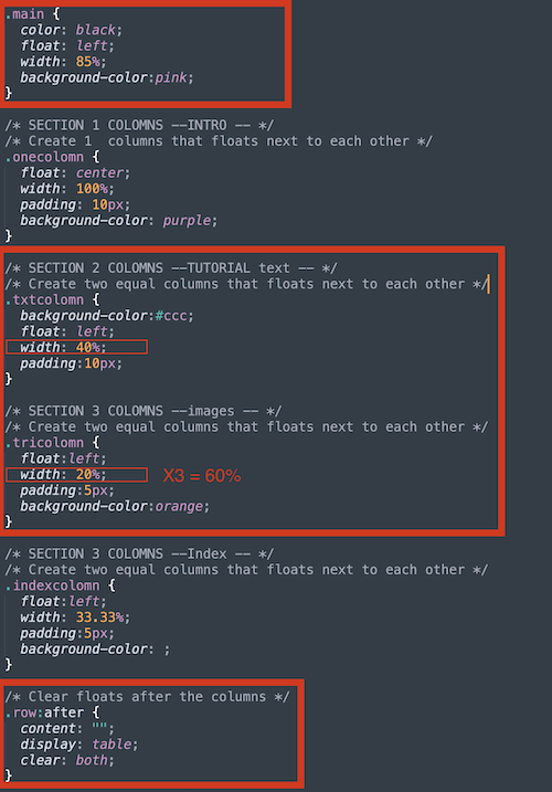
- All width that you will choose will be in %. For me, I have a with of 20% for the menu space and my main section will be a width of 80%. In total, you will arrive at 100%! Tataaaaaa.
- In the 80% main section, it's possible to redevide another colomns. I choose 40% for my text colomn and 60%/3 for 3 small colomns for pictures. If you play with the size of the web, it will be streching. If you want to make other division, you need to set up another division with a different name in your css like my indexcolomn for my website front page.
- After, when you want to make a typical section with two div next to each other, you need to see if together your both set up will not go over 100% and begin with the row that you see in my css.
- Here is the Git Gab web site.
Website
Css
Html
This web site will help me to document during all the fabricademy. I add also a section about me to present myself. I already have an idea for my final project, do I will link also the link of the final project.