State of the art, project management and documentation
Interests & Inspiration
Over time, I've found myself increasingly drawn to furniture and lighting as forms of functional sculpture with seemingly endless possibilities for blending creative and technical thinking. Lighting especially is a designer's playground given its range of purposes, from functional illumination to ambiance, or even just being mesmerizing to watch. Because light fixtures tend to live in a controlled environments and not be load-bearing or handled often, they're also the perfect medium for experimenting with new materials and design elements that may not be robust enough for other applications.
I Joined the Fabricademy to deepen my design experience, continue exploring my interests, immerse myself in a creative environment, and make connections in the field. I'm interested in finding ways to incorporate alternative materials and practices into products to reduce environmental impact, so I'm looking forward diving deeper into the integration of digital fabrication and biology as an opportunity to experiment with combining digital fabrication techniques and materials development to create unique patterns and structures, not only for speculative design, but also to understand what might be viable for application in real products, especially lighting.
Inspiration
I'm looking to explore materials and techniques, with project designs emerging from what I learn about working with the medium. I do intend to experiment with textiles, or at least flexible materials, even though my current inspiration pieces are rigid products. The works shown below capture concepts that may inform my work rather than serving as a full visual guide.
Pyr by Studio Tabo
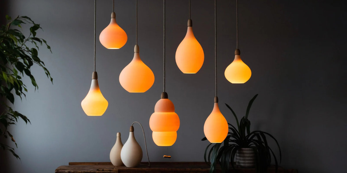
Pyr by Studio Tabo is a major source of inspiration for me as a starting point for developing a lighting line. They produce light fixtures that combine digital fabrication for 3d-printed shades/diffusers and more traditionally crafted wood accents. I imagine that this method simplifies the process of developing new designs, as the wood and internal components can be shared across the line while the shades can be change out for new forms and/or textures.
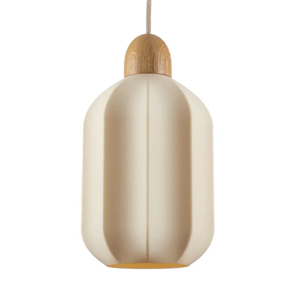
Material Combinations (credit: Pyr by Studio Tabo)
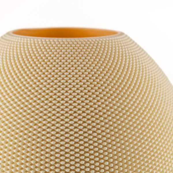
Interesting Textures (credit: Pyr by Studio Tabo)
I think the base material is PLA, and the addition of crop waste reduces the carbon footprint of manufacturing, so it's theoretically possible to improve the material further by switching out the base formulation for a more compostable alternative. The cellulose-filled material that makes up the shades adds texture to otherwise simple forms and diffuses light beautifully for a warm ambiance. As a minimalist, I can appreciate the simplicity of Pyr's forms and focus on texture. The large-scale 3d printing process opens up opportunities for interesting surface texturing with modified slicing.
Creating Experiences
Continuing with the idea of creating a mesmerizing experience from 'Sculpting Light', I'm also still drawn to ways of capturing movement and projecting into rooms rather than just lighting them. Glass I by Oxman achieves controlled refractions and caustics, while Ripple by Poetic Lab creates ethereal, watery, wisps of light.
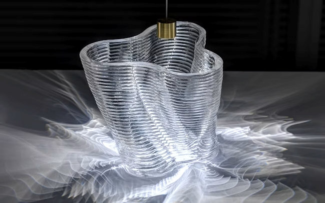
Glass I (credit: Oxman, 2015)
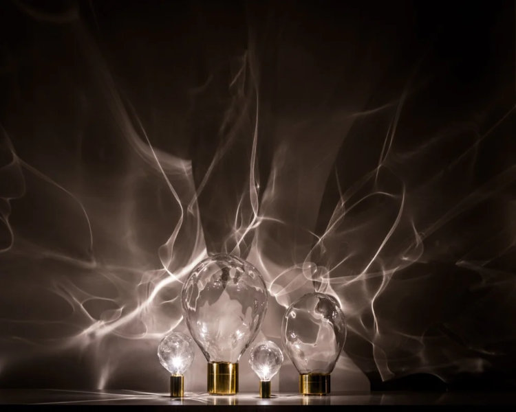
Ripple (credit: Poetic Lab, 2013)
Website Customization
To save time debugging, I tried to keep my website customization to a minimum, but I did make some modifications to bring the site more in line with my personal branding. For the basics, I just filled out the zensical.toml configuration template with my name, a site logo, and my brand font. For now, I've left the favicon to help myself differentiate my personal site from this one when I have multiple tabs open, but it's an easy swap if I change my mind later.
Workflow & Tools
For the most part, my customization workflow is:
- Use my browser's developer tools to find the elements and settings I wanted to change
- Figure out what I wanted set by changing setting just in developer settings
- Add my changes to the extra.css file
In addition to using developer tools, I consulted:
- The official Zensical documentation
- MDN CSS reference
- MDN HTML reference
- W3C CSS reference
- W3C HTML reference
Colors
To match my usual white background with black text and orange accents, I went in and adjusted the themes overrides used in the Fabricademy template. The Zensical documentation mentions the ability to create one's own custom color schemes/themes1, but at least to start, I just edited colors directly in the extra.css stylesheet.
The default template uses overrides for the primary colors, but the accent color is still set in zensical.toml. To use custom colors for accent colors as well, I changed palette.accent = "teal" to palette.accent = "custom" and then added my colors to extra.css. After switching colors, I found that the background for the active tab on the left navigation sidebar was not updating to what I had set, so using my browser's developer tools, I found that the background color needed to be set separately in extra.css with the css variable --md-accent-fg-color--transparent: #XXXXXX1a;, where XXXXXX is your text color's 6 character hex code and 1a is the correct alpha/transparency.
Typography
I also wanted to update all of my site's typography for readability, so I set out to change the base unit to 1rem in order to respect browser font size settings. Doing so resulted in needing to update sizing for every text type and many visual elements, something I did not have time to finish going through, so I ended up removing my changes.
While inspecting my site, I saw that a lot of text was slightly squished, which was particularly noticeable on bold headings. This might have been useful for the default font used on the site, but could cause readability issues for other typefaces. I added the override below to extra.css. I believe that I included all of the affected classes, but there could be another that I missed.
/* remove default letter spacing adjustment */
.md-typeset, .md-typeset h1, .md-typeset h2, .md-typeset h3, .md-typeset h4, .md-typeset h5, .md-typeset h6, .md-header__title {
  letter-spacing: 0;
}
Visual Details
I was inspired by Johanna Schrunder's2 website to remove the left navigation sidebar from my landing page as well. I ended up referring to the Zensical documentation3 to understand what to remove, as the code snippet on Johanna's page did more than just hide navigation.
For adjusting other elements, like the header shadow, navigation active page underline, and adding rounded corners to all images, I used developer tools to find the element/setting and then adjusted it in extra.css accordingly.
Lightbox Issues
A larger issue that I had when working with my website was trying to figure out what was going on with glightbox, the Zensical lightbox plugin. The default template had the plugin supposedly disabled on the landing page with glightbox: false in the front matter, but I could still open my avatar photo. The major issue was that, after switching to another page and back again, clicking on an image would no longer open the lightbox but instead load copies of all images below the footer of the site. The video below demonstrates the issue:
These seem to be separate issues, which explains why I was confused that no single change to my site would resolve all of the problems. For now [as of Sept 18 2026], Julian is reaching out to Zensical and looking into the issues.
Reflection & Future Development
When setting up a documentation platform, I usually want to spend time at the beginning getting the site ready for how I will use it, that way I don't need to think about fixing problems or restyling while contributing content. I knew that I didn’t have time to set up this site ahead of time, so going into this week, I intended to populate my website without going down the customization rabbit hole. What I ended up doing was bouncing between trying to write up content to share and making small changes to my site here and there, because customizing the site what I was actually interested in doing. The result was that I spent way too much time on both activities and neither reached a level of quality that I was happy with.
I need to find a way to simplify and speed up my work and documentation, because what I did this week is not sustainable. I realized that, because I don’t use social media, I'm not accustomed to sharing a curated version of my personal self, just my professional self. I did end up finding ways to cut corners by moving or removing content so I wouldn't have to generate as much, but that meant that I shared a lot less than I would have liked.
When it came to setting up my website, I gave up on the color contrast, typography, and responsive design check/fixes that I would have liked to implement, just to save time. I also didn't document my work to level that I would have liked to for creating a usable resource. Perhaps I will continue working on the site over the course of the program, but I really need to focus on doing the bare minimum for documentation so I have time to work on the actual projects.
References
-
Reference: Zensical; Colors; Zensical Docs ↩
-
Reference: Schrunder, Johanna; Landing Page; Fabricademy Student Website ↩
-
Reference: Zensical; Frontmatter; Zensical Docs ↩