State of the Art
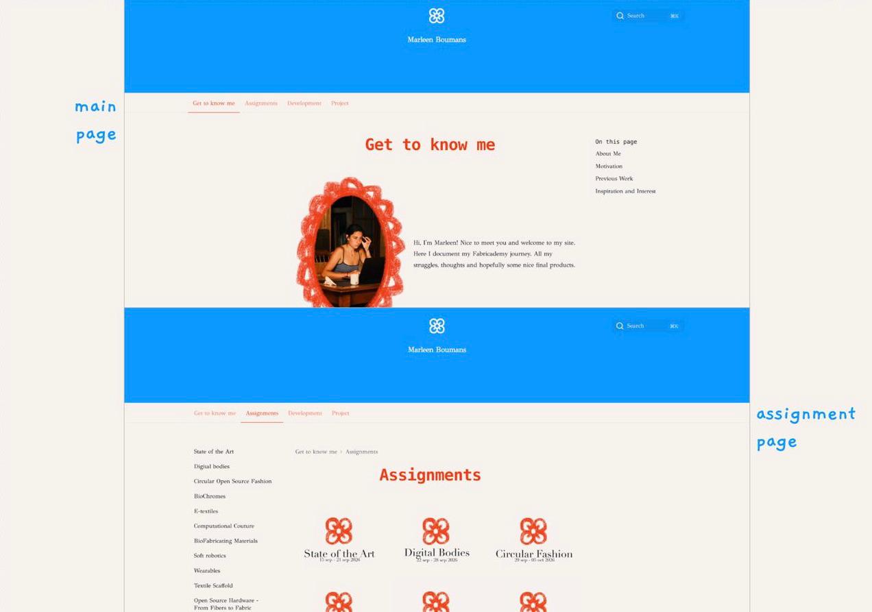
This week we focus on the introduction to the Fabricademy program. I will introduce myself on my main page and show you why I’m here. I will create a personalised space in this corner of the internet that will be filled with my inspiration, thoughts, projects, and the process of how I achieved them. On this page, I will explain to you how I got my site to look like this.
Moodboard and Reasearch
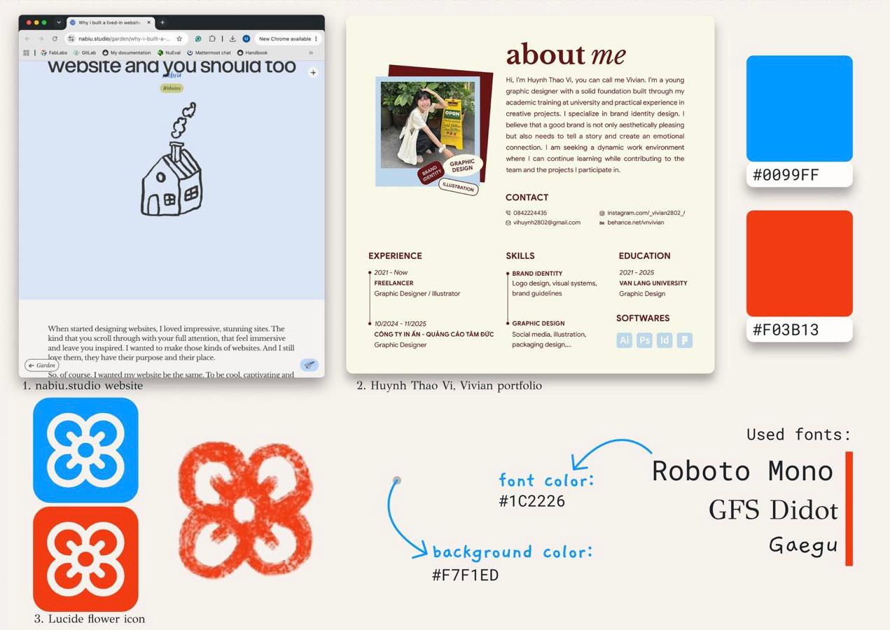
Before I started to make changes to the site, I wanted to have a global idea of how I wanted the site to look. I found via Pinterest a site that inspired me a lot 1, and I found a portfolio that I liked the look of 2. With keeping those inspirations in mind, I started looking for fonts, colors, and a main icon 3 to use. Here is what I came up with:
Process
Oh my god, that was something! Something I enjoyed a lot, but with lots of struggles to make my vision come to this point. After some research and putting together the moodboard, the work started. I made a quick drawing of how I wanted the main page to look.
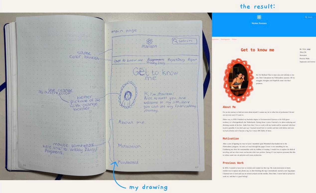
The things I needed to change were: site name, color scheme, font style, header size and layout, navigation tabs, and the assignments navigation page.
Let’s start!
The site name, color scheme, and font style can be changed in sensical.toml, for this, I followed the steps documented on Zensical.
Header Size and Layout
This was a difficult part, and I think the biggest change to make my vision become reality. Via the Zensical site, it showed me how to make an override template. I read into it, and because I don’t have much experience with coding, I decided not to touch that part of Zensical for now. But still, I was set on making this change; I went into developer tools and started playing around with the css files. I read about the basics of CSS on W3Schools and figured out that I needed to change the padding size to get the bigger header.
Padding size of header
.md-header__inner.md-grid{
    padding-top: 0.8rem;
    padding-right: 0.4rem;
    padding-bottom: 5rem;
    padding-left: 0.4rem;
}
For the layout, I needed to make more changes, getting rid of the git link and the navigation icon on smaller pages, and putting the icon and page title in the middle. I started this by opening the developer tools again, searching for the git link .md-header__option and the navigation icon .md-header__button[for=__drawer], and changing the display to none. When those were gone, I was ready to place the wanted items in the right places.
For the layout, the header first had the flex display, this made all the items align horizontally. Because I wanted the title underneath the icon, I needed to change the display to grid. This is kind of a table that you can adjust to your liking.
My grid looks like this
.md-header__inner{
    display: grid;
    grid-template-columns: 20% 60% 20%
    grid-template-rows: 50% 50%;
    justify-content: space-between;
}
In this grid, I can place all the items where I want with grid-column and grid-row. This worked fine for all except the text, this was just off-centre and was frustrating me a lot. I couldn’t figure it out in developer tools, almost to the extent that I was planning to revert the changes and go with a simpler plan. But after going through a lot of pages of CSS on W3Schools, I found the position property and transform that helped me position the title correctly.
It got these placement changes
.md-header__topic {
    left: 50%;
    transform: translateX(-50%);
}
Because the title (Marleen Boumans) changes to the page title (Get to know me) when scrolling down, I need to change that one as well. This item is related to the title, so only the transform is needed.
When resizing the webpage, things went flying everywhere, and I didn’t understand at first why this was happening. So guess what I did… I opened developer tools!! Here I saw some new CSS that was not there before @media screen, I looked up what it does on W3Schools, and that was exactly what I needed to change to prevent all the items in the header from moving.
All the @media screen changes
/* Header style when changing screen size */
/* search button */

@media screen and (max-width: 60em) {
    .md-header__button[for=__search] {
        grid-column: 3;
        grid-row: 1;
        justify-self: flex-end;
    }
}

/* flower icon */

@media screen and (min-width: 76.25em) {
    .md-header__button.md-logo {
        display: block;
        grid-row: 1;
        grid-column: 2;
    }
}

@media screen and (max-width: 76.2344em) {
    .md-header__button.md-logo {
        display: block;
    }
}
Okay, that’s a lie. I changed one more thing in @media screen, but that is for the navigation tabs.
Navigation Tabs
Because I made the navigation icon in the header non-existent, I needed to have the navigation tabs underneath the header there at all times. So I made a change in the @media screen.
@media screen change for navigation
/* navigation tabs */

@media screen and (max-width: 76.2344em) {
    .md-tabs {
        display: block;
    }
}
Now that’s really all the changes I made for the main page.
Assignment Navigation Page
For this page, I made as well a drawing of how I wanted it to look. It’s pretty much the same as the main page but with all the pictures for the assignment.
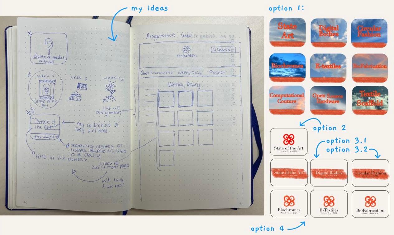
In Inkscape, I played around with the style, the pictures, and information. The first idea was to make a collage of lots of pictures I made from the sky.
I love looking at the sky and the clouds and seeing them change into different shapes and colours. It gives me a relaxed feeling looking at this organised chaos, and that reminds me of myself. I love organising and having everything in a designated place, but the other side of me loves 10 projects at the same time and stuff everywhere (as long as I remember where I put it). So with that, I would like to say that I see the similarities between me and the clouds.
Okay, back to what I was saying… the first idea of the clouds. It gave a chaotic look, and not the nice chaos like looking at the clouds. So it needed to change. I came up with three other options where I went back to a more simplistic view, and that was perfect! I went with the fourth option to make the site feel coherent.
For the layout, I used the HTML code Diane Wakim provided and changed it a bit so it would work for me. I deleted the text part underneath the picture and made the display a grid instead of flex because with that I could define the sizes of the item/pictures better so the titles wouldn’t be cut off.
This is the CSS I have for the grid
/* Assignments page */

.assignments-grid {
    display: grid;
    grid-template-columns: repeat(3, 1fr);
    grid-template-rows: repeat(5, );
    gap: 1rem;
}

.assignments-grid .row{
    display: contents;
}

.assignment-link{
    position: relative;
    aspect-ratio: 118 / 138.5;
    background-size: cover;
    background-position: center;
    background-repeat: no-repeat;
}

.assignment-link:hover{
    opacity: 0.7;
}

.assignment-link img{
    width: 100%;
}

.assignment-link span{
    position: absolute;
    left: 0;
    padding: 6px;
    bottom: 0;
    width: 100%;
    font-weight: bold;
    color: white;
    background: #12121261;
}

@media screen and (max-width: 60em) {
    .assignments-grid{
        grid-template-columns: 2, 1fr;
    }
}
Smaller Header When Scrolling
I was already very happy with the site at this point, but at some sizes of the webpage I was not happy with how much space the header was taking up. The fix I came up with was a changing size. So when you scroll down, the header gets smaller so there is more room for the text. I found on W3Schools that this was possible with the use of JavaScript. Because I wanted to keep it simple, I wanted to know if it was possible by only using CSS. I searched a bit, but all searches came out to use JavaScript. So, my last option was to ask Claude for advice. Here is the conversation we had:
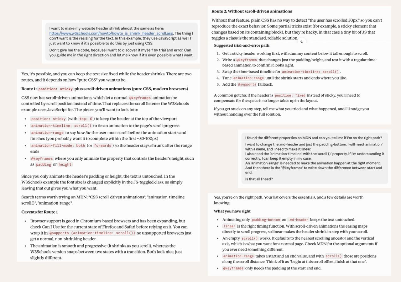
At this point, I already read a lot about animations and the properties used. So felt pretty confident to try a bit and see what would happen. With the use of animation, animation-timeline, scroll(), @keyframes, and animation-range explaination on mdn I had a good base written down in my CSS file. I pushed it through and checked the working of the site.
When I first opened it, the bigger header was small again, and when scrolling, it became bigger instead of getting smaller. I went into developer tools and searched for the animation. When scrolling through the list of CSS I saw the first changes I made to the header. Here I deleted the padding-bottom, and that fixed the problem.
This is the CSS I have for the grid
.md-header {
    animation: smaller-header linear;animation-timeline: scroll();
    animation-range: 0 200px;
}

@keyframes smaller-header {
    from {padding-bottom: 5rem;}
    to {padding-bottom: 1rem;}
}
Results
This week’s results are a good start for all the future assignments, the documentation will be easier. The layout I had in mind for the website became real and is now something I’m looking forward to keeping updated through my Frabricademy Journey.