Process
📝 Ideation & sketches
Here are a few sayings written on my tea bags 🍵:
Recognize and embrace who you are!
It's by searching within ourselves that we find what we've lost.
I found this quite amusing, as these phrases were often in line with the state I was in during this research phase.
As the research continued, the question of the adoption experience came up again and again. In discussing intercultural communication with Diane, certain points became obvious, such as the stages people go through when they are immersed in another country, a place, whose culture is totally different from their culture of origin:
By going through these phases of adaptation, acculturation and assimilation
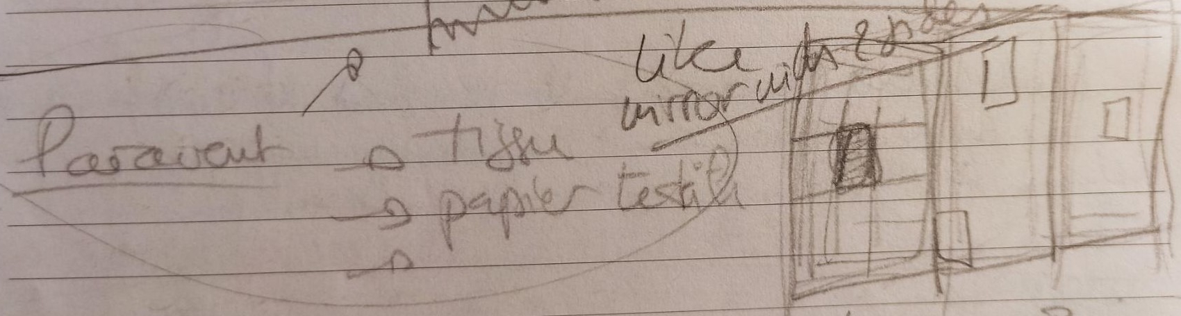
That's why I'm planning to approach the project from these 3 angles, via a folding screen, 1 panel for 1 theme. Like a story to be told, but with several facets. The screen will be visible and legible from both sides, with windows as if to see oneself through the looking glass.
Interculturality and emotional design
My project is called Hangug Yeohaeng, which means "Journey to Korea" in Korean.
It focuses on emotional design to invite you to travel to Korea, between adaptation, acculturation, assimilation.
-
Emotional design, interculturality, and language are interconnected concepts that play a significant role in the realization of my project, particularly concerning design, communication, and cultural understanding. It is important to understand and incorporate elements that can create an emotional connection with others, while considering nuances, in order to "create designs" that resonate with everyone.1
-
It is also important to take into account the meaning of colors, symbols, and other cultural factors that influence emotional associations, with the aim of finding a language that allows for the expression of these emotions.
-
The objective is to create inclusive and emotionally engaging experiences that resonate with each and every one of us, and present them in the form of assembled panels like a folding screen.
That's why I made some search and found informations on Intercultural communication whose work has been studied by Edward.T. Hall.
There are different features of these theories that I would like to associate in the “translation” of my story into the production of the project:
- Empathy
- Openness
- Emotional stability
- Self-criticism
- Observational skills
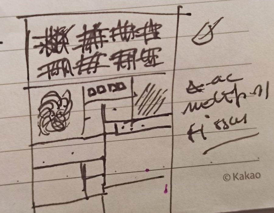
I decided to associate one color to one feature.
| Emotional state | Colors | Work topic |
|---|---|---|
| Empathy | Blue | Patterns |
| Openness | Yellow | Colors |
| Emotional stability | Red | Texture |
| Self-criticism | White | Materials |
| Observational skills | Black | Story link |
Design & Fabrication
🎨 Color and pattern Research
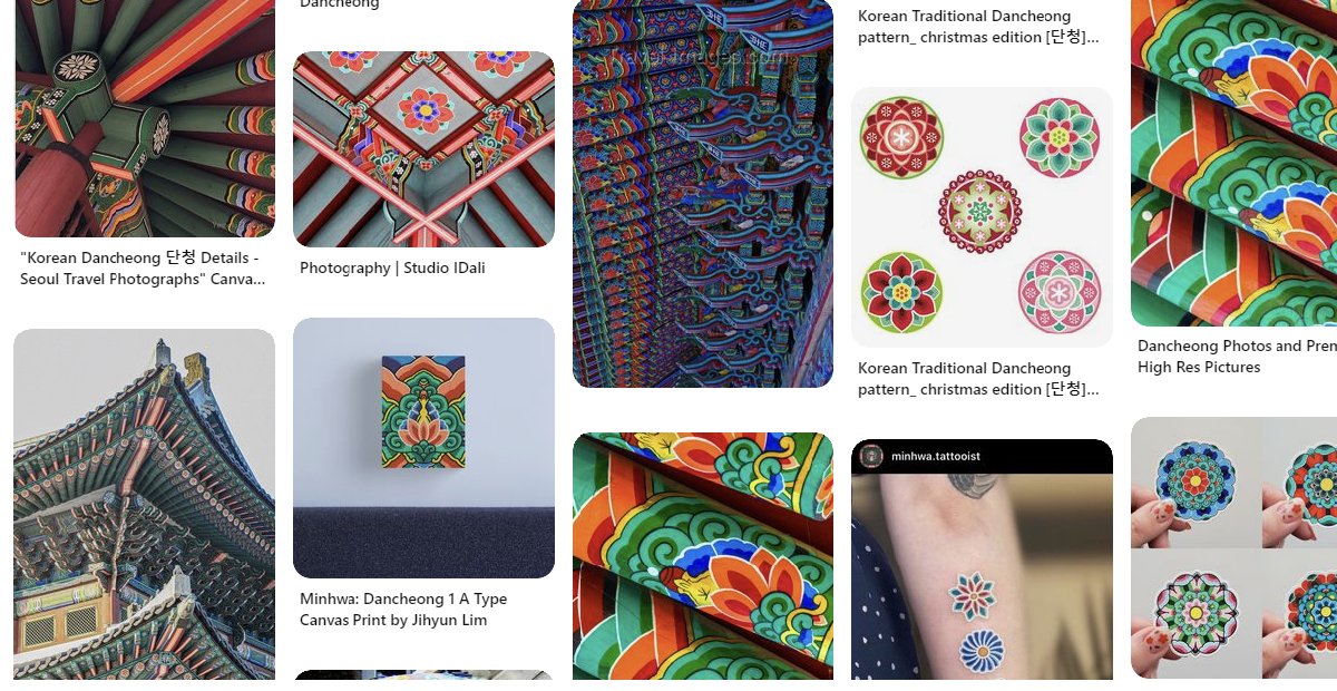
My search for colors and language is inspired by the history of Korean craftsmanship: Blue, Red, Yellow, White, and Black.
White refers to the white clothes worn by lower-class Koreans. They were called " The White-dress people". Colored clothing were for the wealthy classes.
The other colors come from traditional Korean colors used in the decorations of temples, buildings, and traditional attire, associated with the term "Dancheong" which means "cinnabar and blue-green" in Korean. It is an ancient technique of decorative painting that portrays delicate and colorful patterns.
Some of my Pinterest search
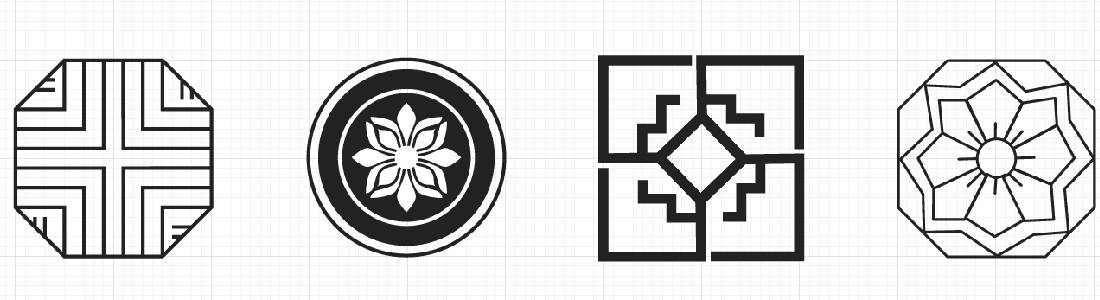
I would like to use Korean craftsmanship, such as patchwork techniques (Jogakbo) or traditional patterns(Dancheong), as mediators to convey a language, a story, stories.
Google search results for the term Bojagi
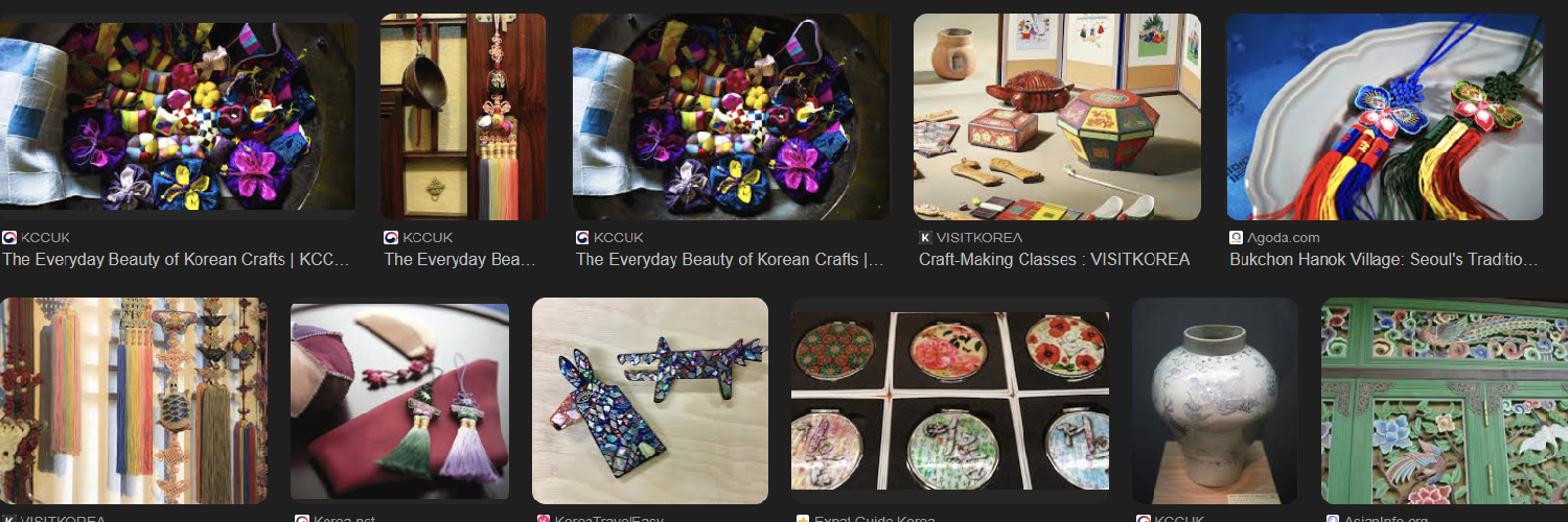
I found more informations about traditionals embroideries on Wikipedia Korean embroidery
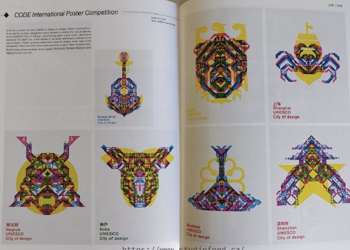
The book "Playful Patterns" by Editions SendPoints is also a great source of inspiration.
Especially with the patterns created by the Spanish Design Studio Toormix that worked on visuals to promote Catalan wines, using geography and elements of nature for these visuals.
 Portfolio screenshot
The idea is to associate these patterns, varying the intensity with different density according to the intensity of the experienced emotion and as seen in my experiments with my pattern machine that I created during Week 10, to create color blends (inspired by the work of the Canadian Studio Feed).
Prototypes
Here are a few prototypes created to test my project ideas, embroidery tests, folding screen structure research and patchwork techniques.
🧵 Embroidery test
I made a first attempt at embroidery to familiarize myself a little more with the machine. But my images weren't sharp enough. The embroideries show a few errors.
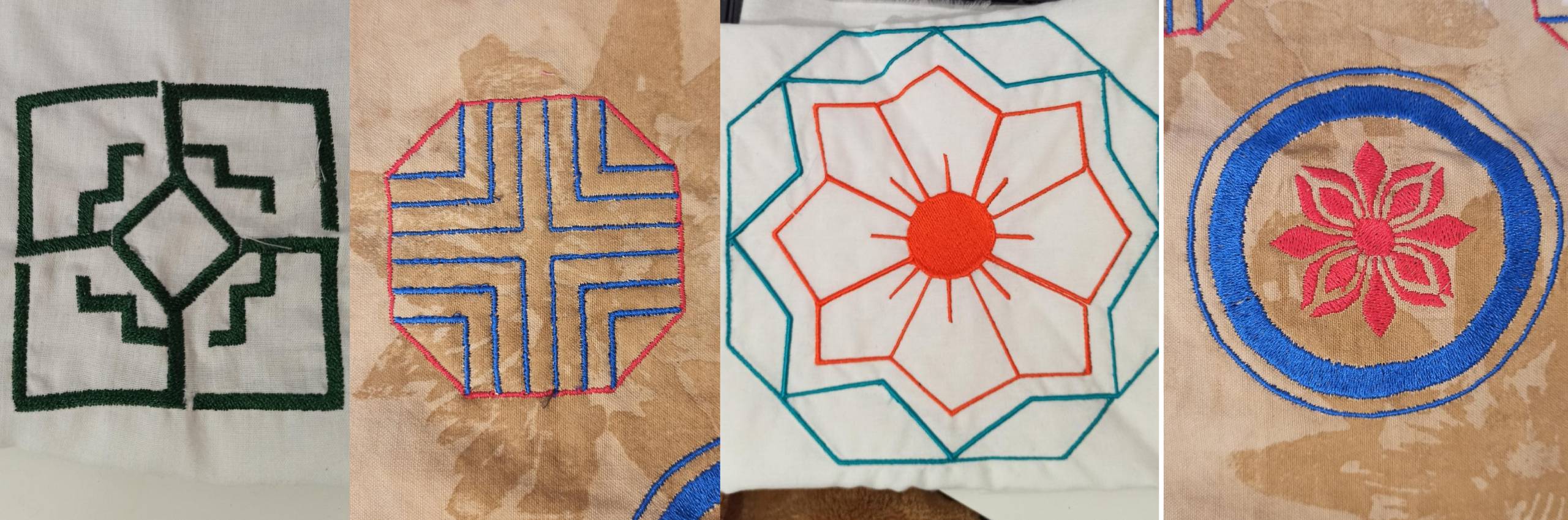
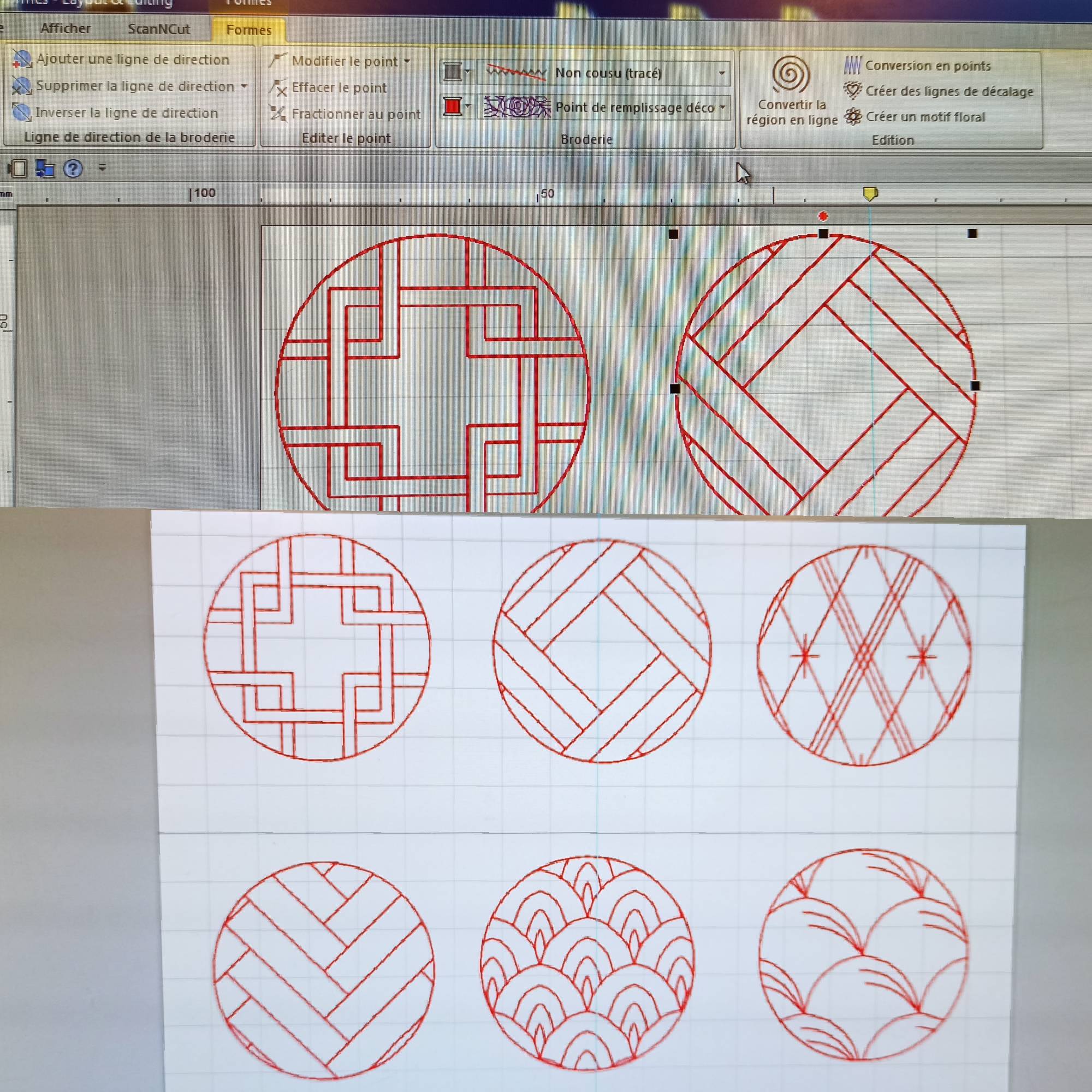
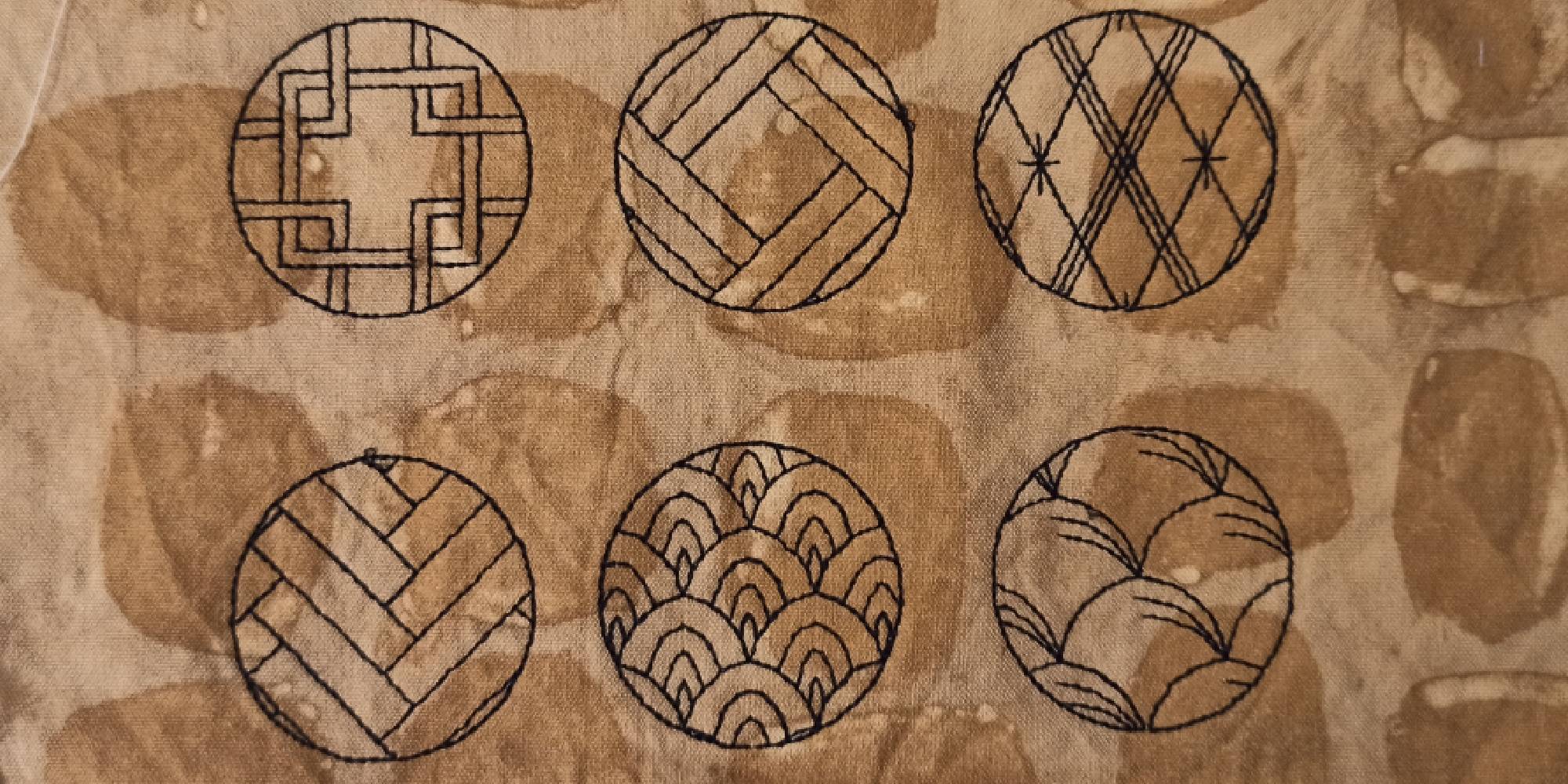
Then I wanted to see the different stitch density possibilities offered by the digital embroidery machine.
I used the same model but with different shapes and fillings to see how it would look. I had a problem with the embroidery hoop when the machine was embroidering the second design. I tried repositioning the design but it didn't work. The fabric wasn't taut enough or too thin for this design.
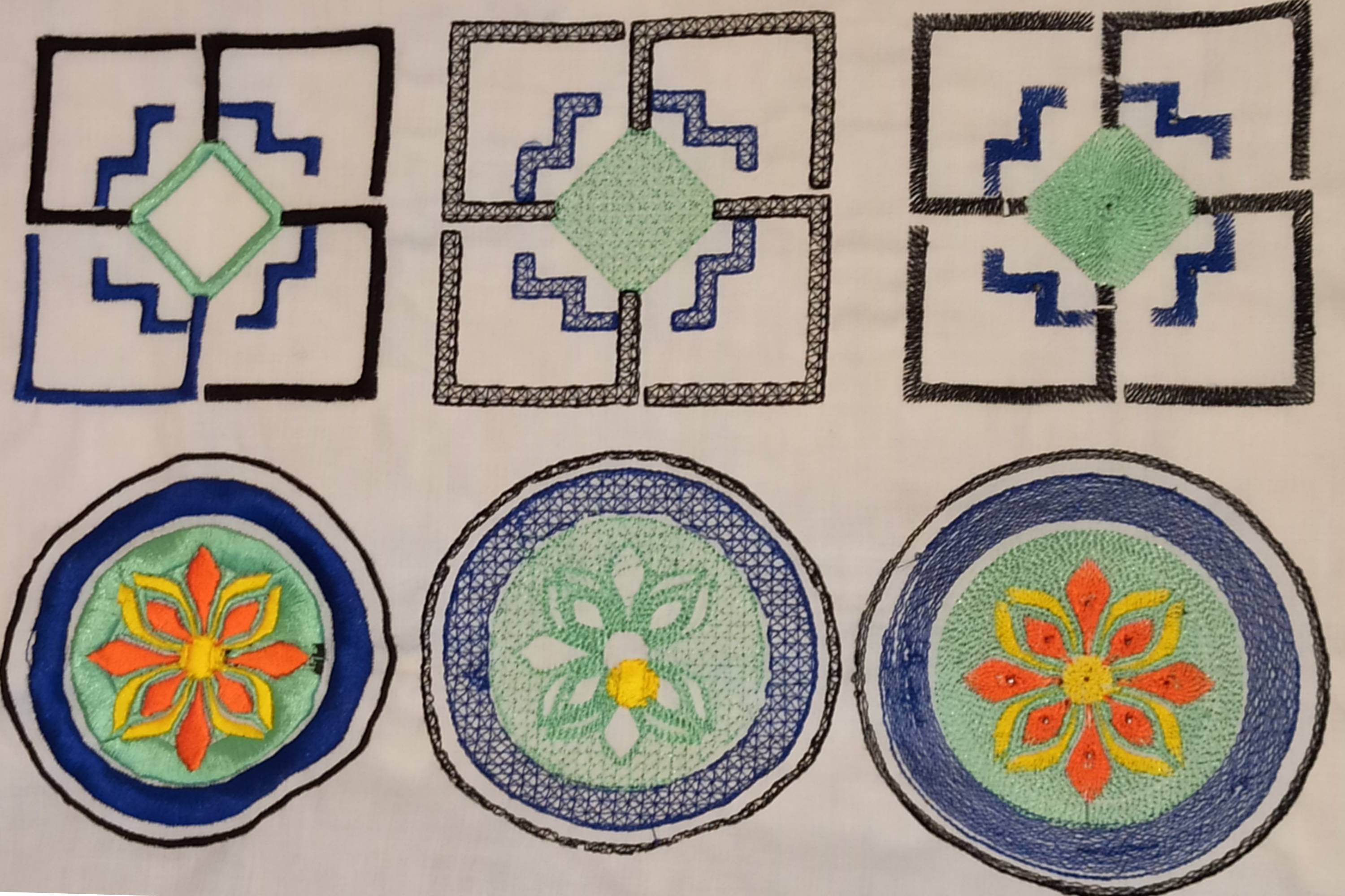
featheredge stitch/thread-fill stitch/serpentine or radial stitch
Pay attention
- Pay attention to the thickness of the fabric used
- Reduce stitch or embroidery density
- Do not touch the hoop during embroidery!!😬
I also simply declined a stitch that presented several choices: decorative filler stitch, in a round shape to see how it would look on the fabric. The different choices in this stitch made me think of the Asian-inspired motifs I'm looking for.
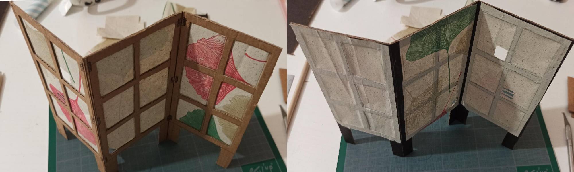
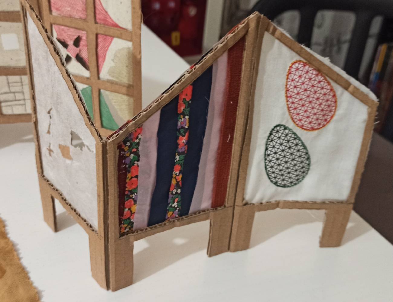
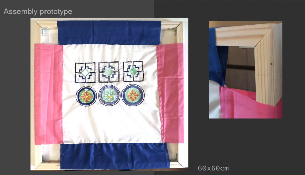
Folding screen prototype
Made some research and trials for the final support with cardboard, paper, fabric scraps and embroidery.
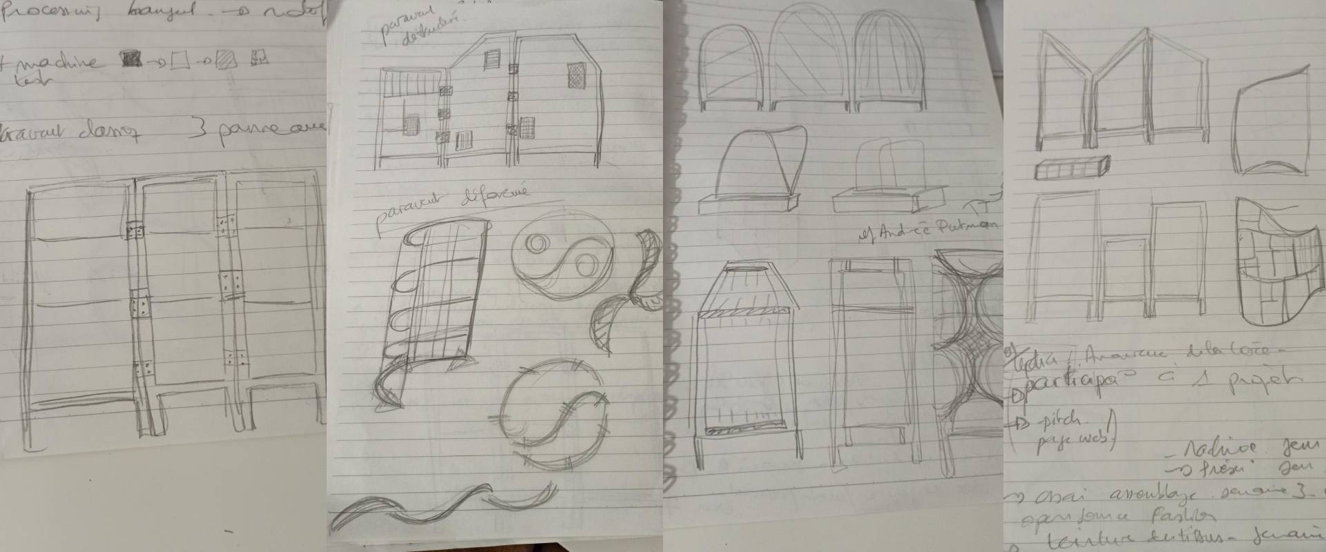
And one prototype made with pine batten and embroidery:
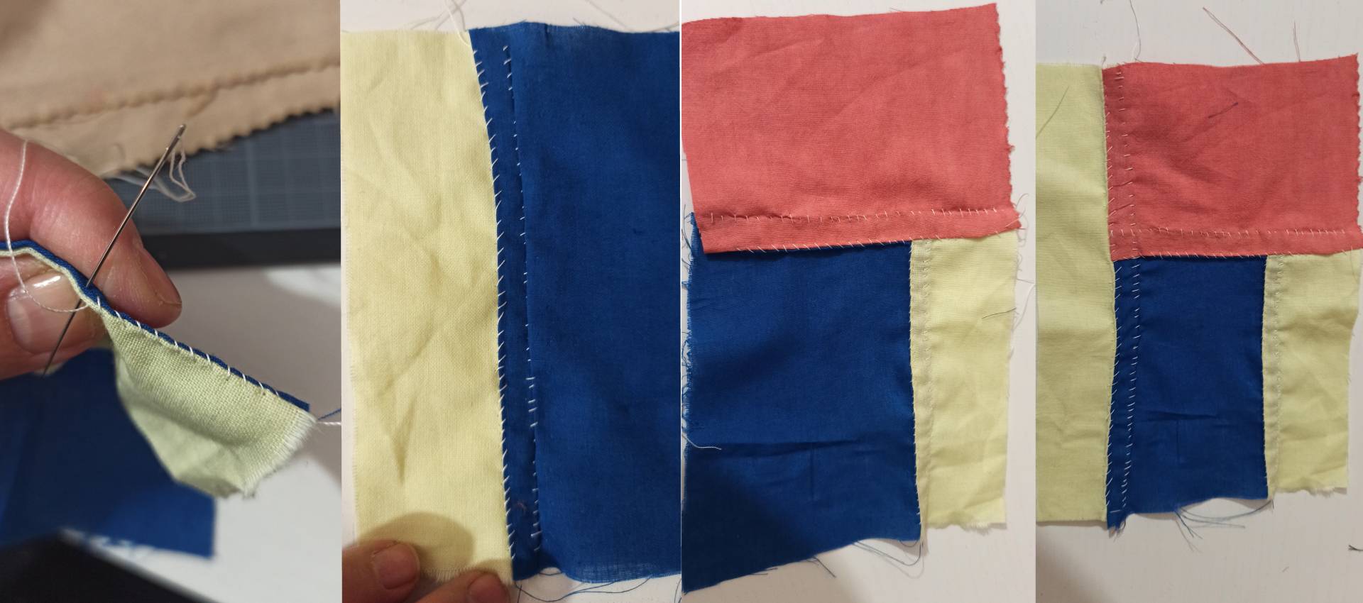
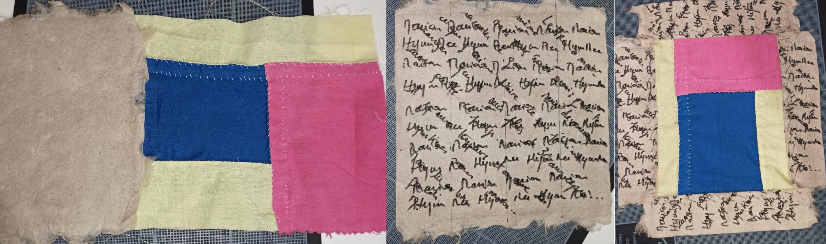
Patchwork prototype (Jogakbo)
Sewing tests on fabric scraps using the jogakbo method.
Following a workshop on textile paper, I tried my hand at piecing with the patchwork I'd sewn. I wrote a few words to see what the pattern might look like before cutting out the textile paper and sewing it onto the patchwork.
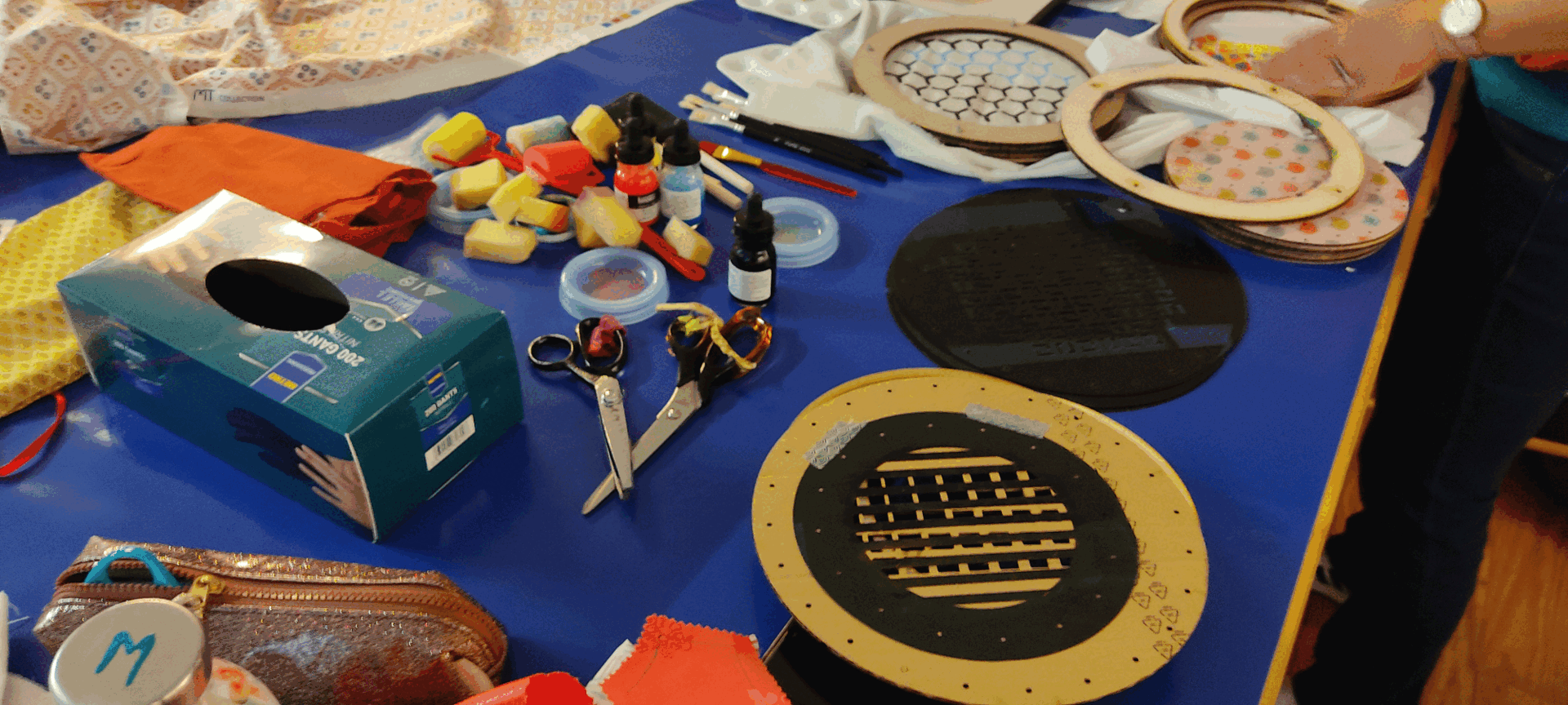
Workshop
I also presented my project and tools during a workshop with the Korean community. Members of the French association “Les amoureux de la Corée-Inkas Lyon” took part in a workshop where I presented my work for the final project.
I was able to show them how my pattern machine worked and have them practice on fabric scraps I had brought along.
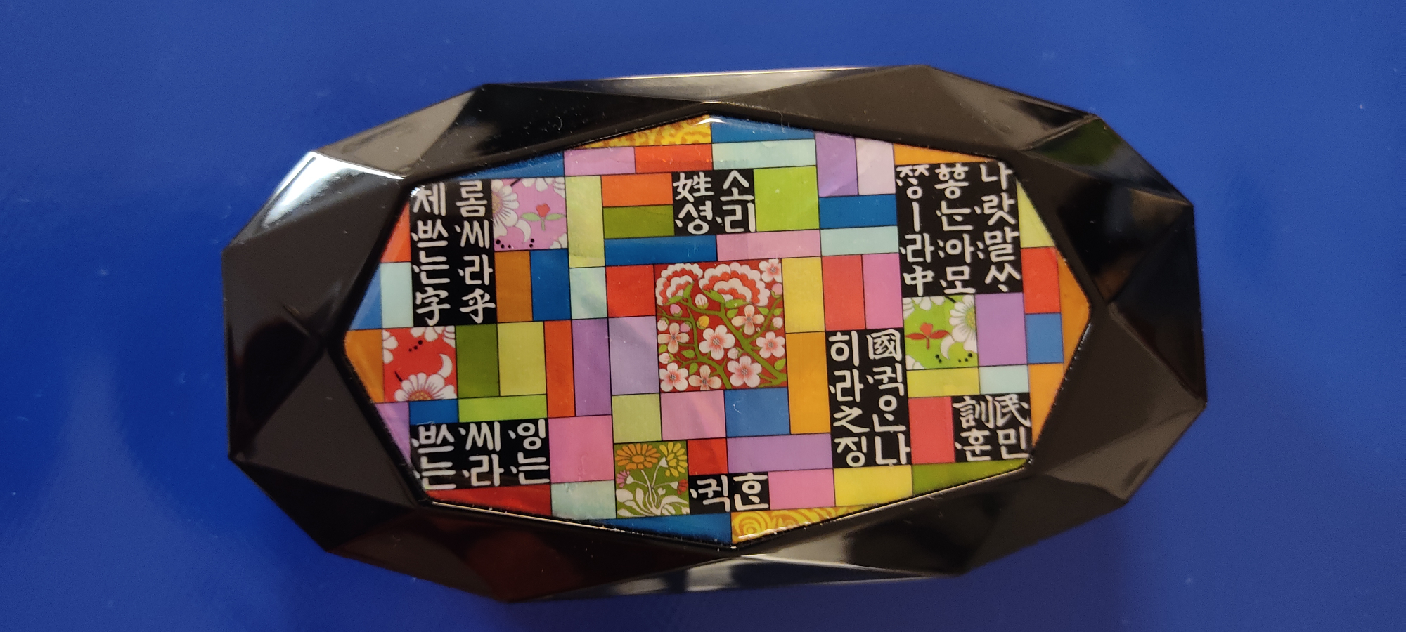
It was also during this workshop that I found another source of inspiration for the design of my fabric panels via the decoration of a box of needles and sewing kit.
I really liked the composition of the motifs, the writing and the color pieces, and it helped me focus my ideas for the composition of my color panels.
Feedback
The feedback from the mid-session presentation and the mentoring helped me move forward with my project and see what I could exploit in the final production.
Feedback Mid-Term Presentation
Ricardo:
Great that you are basing this on your culture. Would advise you to make it very personal, because it's hard to generalize.
About the research on different symbols and different fabrication techniques, perhaps make it more explicit, the part of connecting cultures. Really enjoy the frame and the patchwork technique.
Find a way to make it more obvious, even if you're almost there! Focus on yourself!
Would like to see more experimentation (NDD: the layers!)
Cecilia:
Hi Marion,It would be great to tell more about your journey, and tools, the patchwork technique Pojagi/Bojagi? I was looking at the image and missed the title, if it was another patchwork.
Anastasia:
Lets make the story more real , since it is personal, could you share what drives you to do this project, the story should be said from a first person perspective.
Claudia:
Very clear presentation Marion, great to see iterations of the final piece. I love the integration between os hardware's outcomes and the different arts in korea, printing, stitching and the korean alphabet. About colors, did you already defined a palette? Still thinking about the integration of shapes and colors to give voices to different stories.. and wonder if a digital tool can help you in this process, creating coding or processing? This is a way also to translate stories into shapes https://www.youtube.com/watch?v=784jkR0EwqU
Rico:
Having travelled thru Thailand, Philippines, Taiwan, China, Indonesia, Japan...and Korea. The words I would associate with Korea and its arts...what makes it distinctive...is softness, curve, subtlety. When you mentioned that commoners wore white and raw material colors...it resonated with my impression of Korea. I am not sure if any of this makes sense...but I found this video that I think captures the feeling I am trying to express...https://www.youtube.com/watch?v=pG4c13EAHcA&t=10s
Diane:
Now that you started developping the language, you're going to have to use it to showcase your emotions and your journey... Can't wait to see more :) :)
Feedback Mentoring Session
Troy:
Search the reason. To try to do so like I wish to do. Are you familiar with Frailing? It'll all be collision. The guy who advanced the term research through design, comes up with this definition between the old craft and the new craft1. And what I love that you've captured here is that you've taken an old craft form and an old visual language, and you've really modernized it and painted it. That's, I think, nice.
You have taken an old visual language and you've really modernized it and made it incredible. I think you just need to push a little bit harder through this, as in I really like it, and I think if you just keep going in the direction you're going.
Because of the visual language of what came out of it, it's what you do with it that's going to be the most important part. And I think you've got it.
That story, that narration that you've got so far is really just dead on. The process is good, and I'm excited to where it's going to lead to.
-
Article:FRAYLING: Old New Craft ↩