1. State of the art, project management and documentation
Learning GitLab
I have never used GitLab or anything similar before so this week started very slowly with trying to understand how to use any of it. I looked at a lot of the past students websites to try and find things that I liked to copy over to my page so I didn't have to start from scratch. Below is some of the features that stood out to me as intersting things to try - even if I couldn't get them all to work yet
GitLab Lecture Notes
 |
I liked the alignment of the photo in the text here | IMAGE |
 |
I liked the emoji that followed the cursor on this page | IMAGE |
 |
I really liked the embeded gif here, I had been trying to do this with some of my work or my homepage, I have not worked it out yet | IMAGE |
 |
Another nice example of a gif | IMAGE |
 |
I thought the theme and opening page of this site were cool but definately a lot too complicated to try copying at this point | IMAGE |
Experimenting with layouts
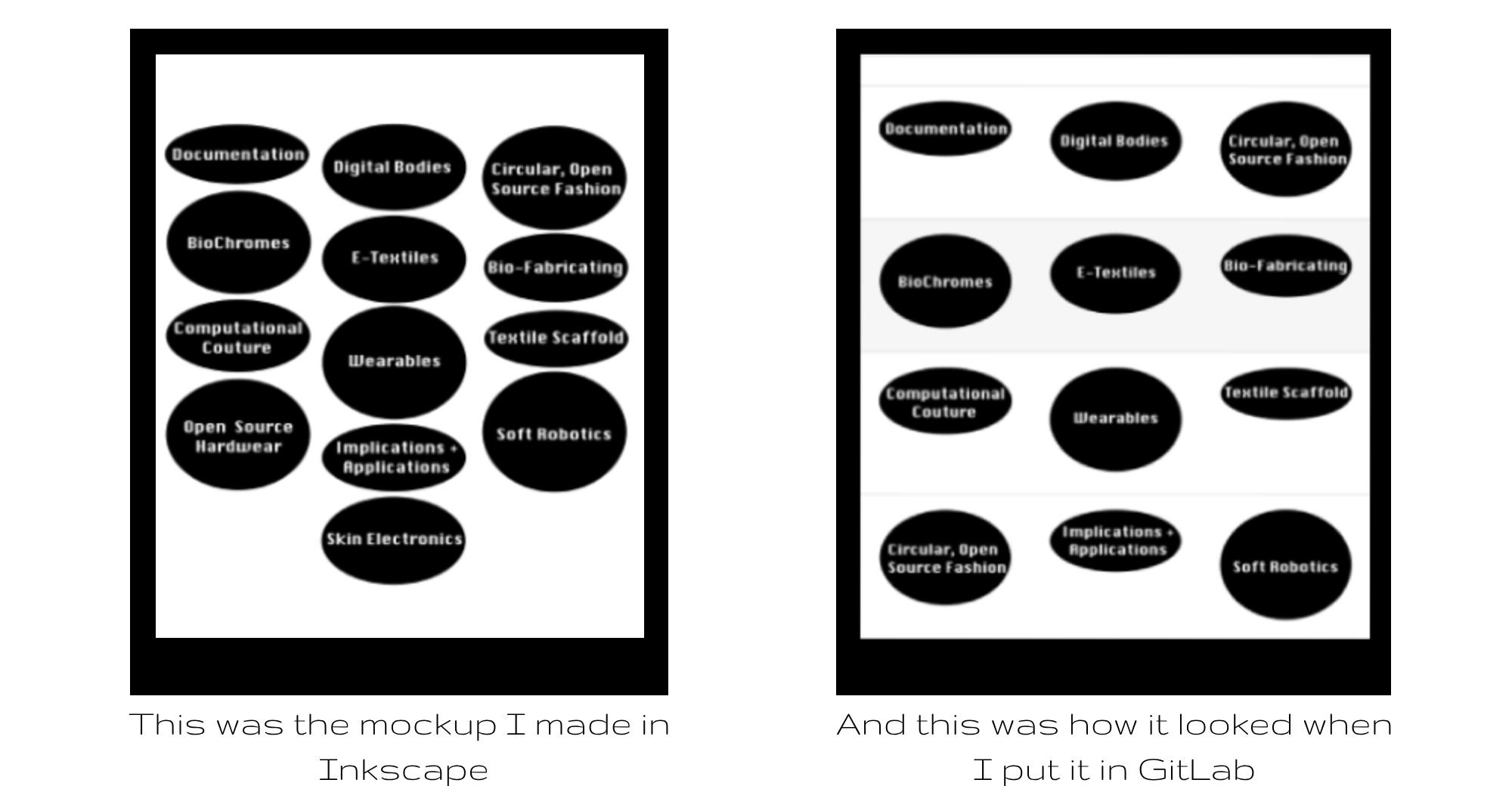
I wanted to customize the layout of my page a bit and decided to try to start with the contents table for the links to the other weeks pages. I made an outline of what I wanted to try on Inkscape - this was also useful as I had not used this software before so it was good to help me ghet to grips with the basics of using this. Inkscape was fairly easy to use and similar to softwares I had used before but I found that this maybe wasn't a useful way to mockup going forward as the control you have over the image placements in GitLab and Inkscape are very different and it's a lot more limited in GitLab.
After playing around with this for a while I decided to leave the contnets blank for now and come back to add an appropriate image after every week.

In another way of customising my page, I had a look at the the other themes that GitLab supported. This wasn'st something I thought I would be able to change easily at this point but I was curious to see how much control of the page layout was possible. I didn't really like any of the the other themes I could find so decided to focus more on the content for now.
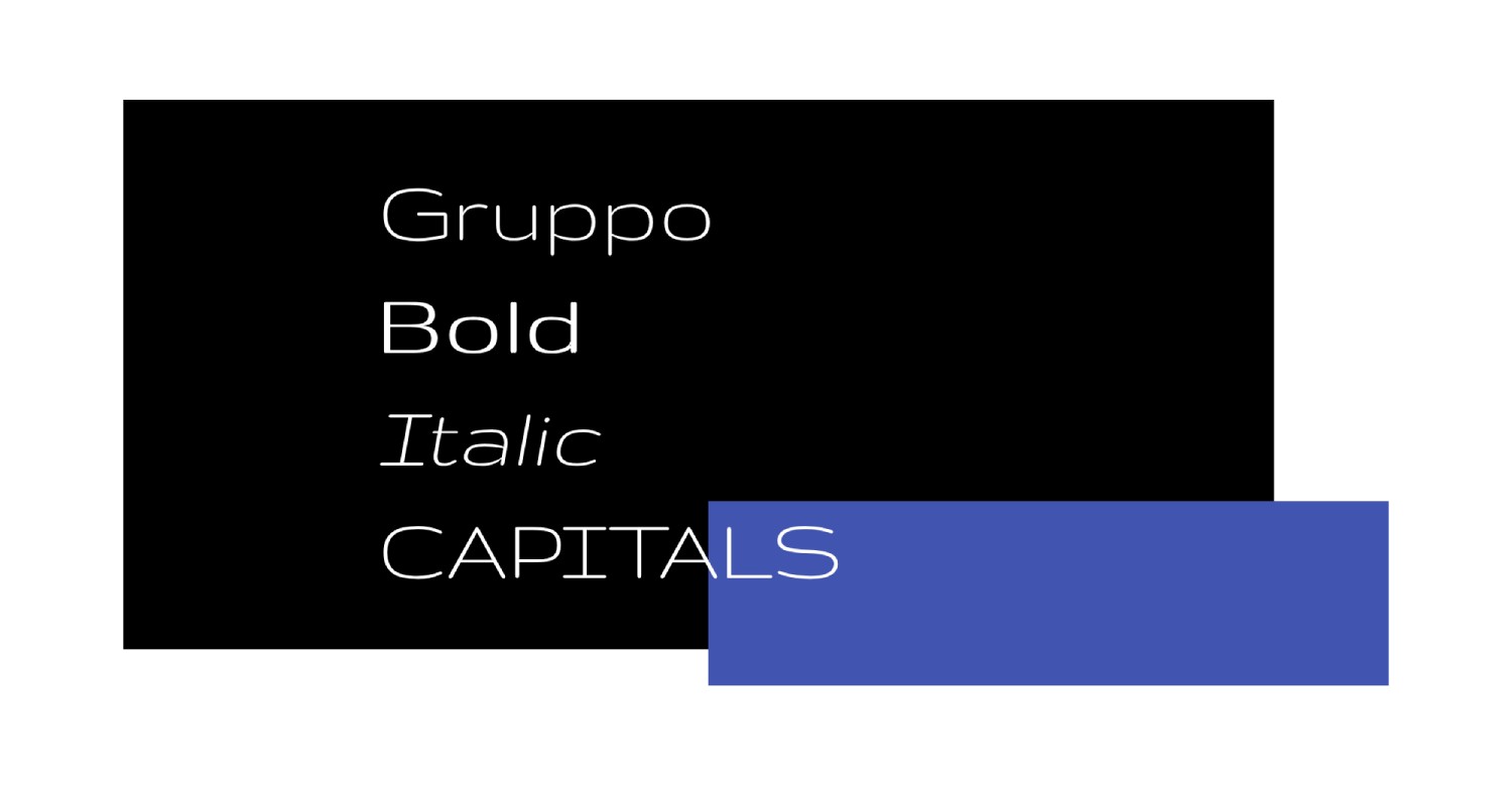
Having started unnecessarily big, I then focused in on more acieveable changes including font and colour. I wanted the site to be quite modern and sleek and to be a blank slate for the content so I avoided using any bright colours in the palet and picked a font that I thought fit this.
After this, I spent a very long time trying to work out how to add images, position them, caption them and generally control the layout of my page. Below are some of the main things I picked up:
Useful Code to copy
{ width="200~800" align=right/left }
<figcaption>[Visible Caption]<figcaption>
[Visible Text](https://weblink.com)
||||
|---|---|---|
| Image/Text | Image/Text | Image/Text |
----
#Text
##Text
**Text**
_Text_
Useful Tools and Sites
Videos
learn how to add video tutorials, inspirational videos and movies etc
From Vimeo
Sound Waves from George Gally (Radarboy) on Vimeo.