01 State of the Art / Project Management / Documentation
Save the Bónus Pig
Our first mission in Fabricademy is to build a documentation website describing myself and my motivations for joining the course. I have never used Gitlab or any of these programs so before I start to tell the full story I had to start with the very basics.
I figured after all the lectures and information was given to us it was best just to deep dive right in and start this with a familiar old friend.
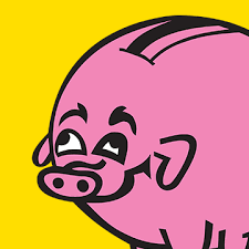
Firstly, I live in Iceland so I am obsessed with the old logo for a supermarket here called Bónus. They recently updated the pig on the logo much to the horror of every Icelander.You can see the change here.
The Original design for the Bónus pig is by designer Edith Randy Ásgeirsdóttir who tells the story to RÚV on the radio in Icelandic.
The Bónus pig is so iconic in Iceland I even have a tattoo of this pig. I and many others here have been inspired to create work relating to it. I thought it would be a good image for me to use and also a good basic colourway to play around with this as I was learning to customise my site.
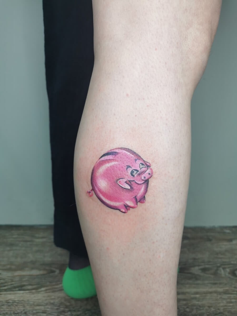
- Bónus Pig Tattoo by Martyna Popiel
-The Original Bónus Pig Designed by Edith Randy Ásgeirsdóttir
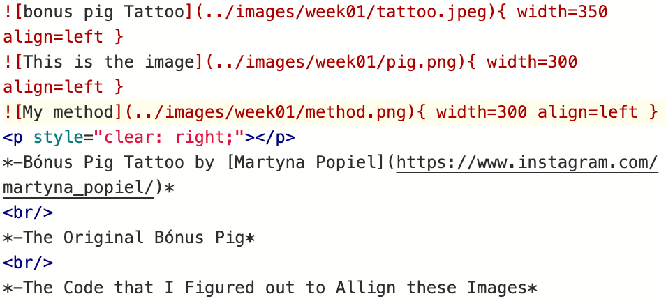
-The Code that I Figured out to Allign these Images
The Beginning
We are using a system called GitLab where we are using a thing called WEB IDE
The Web IDE is an advanced editor with commit staging. You can use the Web IDE to make changes to multiple files directly from the GitLab UI. We have a system that has been made for the course and we sign in through FABLABS ID. As a complete newbie to this type of system I have to say I don´t fully understand how it works at this stage but it involves using certain commands to enter text, files, images then pressing COMMIT. The COMMIT button then uploads this to the main page on the web. It can sometimes take a little while to upload but theres a little rocket icon on the side of the interface that takes you to the pipeline where you can see the progress of the jobs that are processing. It also shows you if the "jobs" fail in the pipeling so you know if something is wrong with what you entered. I got a lot of these messages as I was learning. It is very inportant to Commit to the main branch or you have to use a merge request to bring this into the main branch again. Below you can see some of my explorations in how to use this system.
Colour
First things first...... A theme colour.
Very simple to do thankfully.
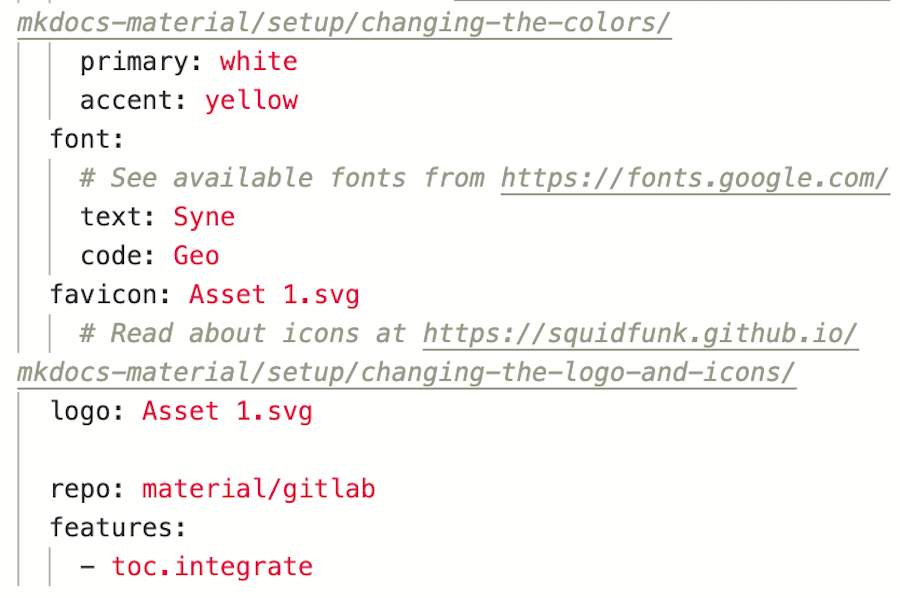
- Find code in mk.docs.yml folder.
- Find colour choices in Squidfunk.
- Primary is Pink, Accent Yellow. I eventually changed the Primary Colour to White.
- Done!
Oh this is gonna be easy right??? RIGHT???
Well not so much as I tried to change the icon in the top corner of left corner of the page. So many failures I made a gif of them. Also,I made a gif and learned how to embed it. Pats self on back in triumph.
Honestly It was 3 full days of utter frustration trying to figure out how to change this. I used several different versions of the image and how it was uploaded. I followed every instruction I could find online before realising it was IMPOSSIBLE! I gave in and found out how to change the icon to the icons within Mkdocs itself using the code-
- logo: material/puzzle-heart-outline. this is the first time I changed the font colour. See more about this victory further below
Looks decent enough, I thought, It´ll do, I reasoned, I was HAPPY enough with it. Then one of my fellow participants had figured it out. She simply explained the code to me in a easier way and it still required many different attempts at it. I learned how to convert the image into a vector file and... I finally changed the Icon and the Favicon to the Bónus pig and...
JOY IS BACK IN MY LIFE AGAIN!!!
The Journey
3 months ago I was running a bar in downtown Reykjavik. Now I sit here in Blönduós, North Iceland So in the immortal words of David Byrne, How did I get here?
I embedded a video, pats self on back again!!!
It was hard to go public about having a heart attack at 43 years old and hard to put it into words as I was writing about me and my motivation to be here. My previous inspiration was mainly Brutalism,Modernism and Social housing and there isn´t much of that in Blönduós, Northern Iceland (current population roughly 880 people). So I decided to use my heart disease as my inspiration as I feel I can explore many avenues within Cardio health.
I was a bit stuck with how to start but I took inspiration from Lucia Javicoli. Her page really appealed to me as it was just fun and light and I feel it is always better to be funny especially when dealing with something serious. After I decided to use this more as a personal diary, I have found it easier to document my process.
Playing With Code
Font Choice
My choice of font is directly related to my reasons to join Fabricademy and my intention to focus my research and designs on the heart. I did lots of research on the Typography I wanted to convey this theme.
- I looked at many examples of fonts in use for health and fitness on a great site called Fonts in Use for Inspiration
- A fun game about emotions in typography
- Here is an interesting summary of the most used google fonts for hospital websites
After this research I knew I wanted something clear, very contemporary and versatile. looking through current trends in Qode Magazine I was drawn to the font Syne.. I really liked the g in this example as it reminded me of the disposable ECG electrodes frequently used to monitor my heart rate in Reykjalundur.
THE GREAT THING ABOUT THIS FONT IS ITS VERSATILITY BETWEEN BOLD CAPITALS, lowercase and numbers 1234567890 1234567890 1234567890 1234567890 !"%&/=?+ !"%&/=?+ !"%&/=?+ !"%&/=?
I also like the Icelandic letters áæíöóúðþý ÁÆÍÖÓÚÐÞÝ ÁÆÍÖÓÚÐÞÝ ÁÆÍÖÓÚÐÞÝ ÁÆÍÖÓÚÐÞÝ
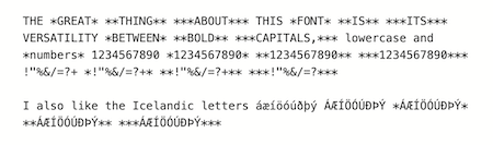
Here is an screenshot of the code I used to make this example in BOLD & ITALICS..
Font Colours
NOW I KNOW HOW TO DO THIS THERE IS NO END TO MY JOY!!!
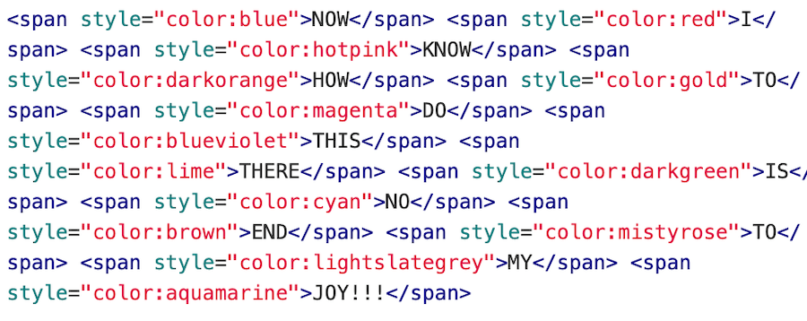 . Screenshot of the Code Used to Create the Multi Coloured Sentence Above
I found an amazing website called HTML Colour Codes that has a comprhensive list of the 140 colours that are supported already in Modern Browsers. You can find the names of all the colours HERE
Playing with colour in text lead to the decision to make the site white in base colour instead of pink.
I plan to use bright colour in my projects so white will help me to present my work in full clarity.
Font Size
Here I decided to play with the sizes of text to see what was possible. I also inserted lines to show the full spacing of the font.
BÓNUS pig BOLD bold This is Size 4
BÓNUS pig BOLD bold This is Size 3
BÓNUS pig BOLD bold This is Size 2
BÓNUS pig BOLD bold This is size 1 or Regular Size
. Screenshot of the Code Used to Create the Font Size Changes Above
I would like to make the font smaller than 1 for photo captions and that doesn´t seem to be possible. I tried -1 but that didn´t work. so I decided to try to hack it by using the sub and sup commands.
BÓNUS Pig BOLD bold This is the SUP Command
BÓNUS Pig BOLD bold This is the SUB Command
I am going to use the sup command to make my photo references with colour for the theme now.
Navigation
I played around with removing the tabs and header but after speaking with Louise I decided to put them back in. Removing the table of content (toc) had shown me that some of my coding wasn´t correct. I went back in and made sure the code works in different formats. I have found that the hardest thing to accomplish is the allignment of images and photo credits but I feel I have made headroads into understanding this better now. Resizing images is quite easy the more you do it too using programs such as tinypng and canva
Useful Tools
Alumni Resources
Research & Ideation!!!
Iceland
As I have lived in Iceland for many years I am naturally inspired by some of the local artists here. I have decided to intially focus on local designers and those connected to here as my project will also try to include mostly local resources.
James Merry
One of my absolute favourite artists on the island is James Merry. He is an embroiderer who is working as Björks creative director. His masks and headpieces, often inspired by local wildlife and fauna, are incredible.
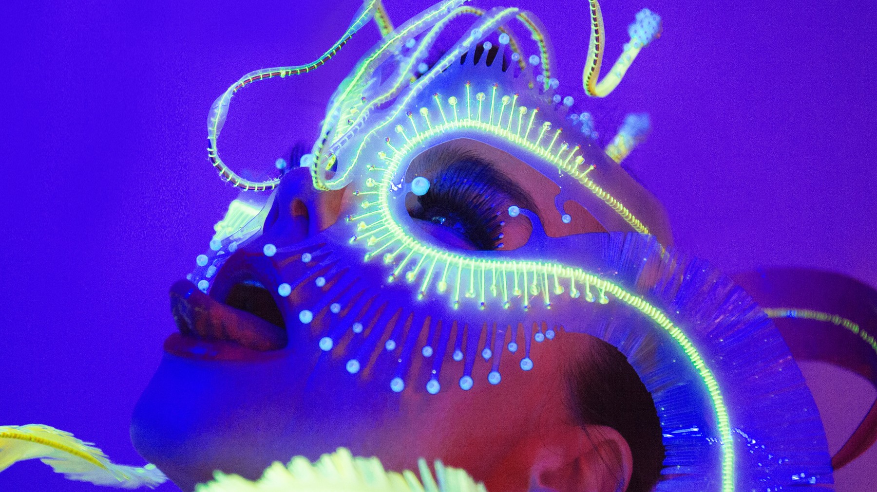 Björk Wearing a Custom James Merry Headpiece for her Utopia Tour. Photo by Santiago Felipe for the Vice Article The Artist Turning Björk into a 'Björchid´
Staskauskas
An artist working in a similar field who was formerly based in Iceland is Benas Staskauskas who also makes a range of computational jewellery. In this video its one of his Silicone pieces.
Ýrúrarí
The Icelandic Textile Artist Ýrúrarí
has a wonderfully playful way of looking at the human body through forms such as upcycled jumpers and felting.
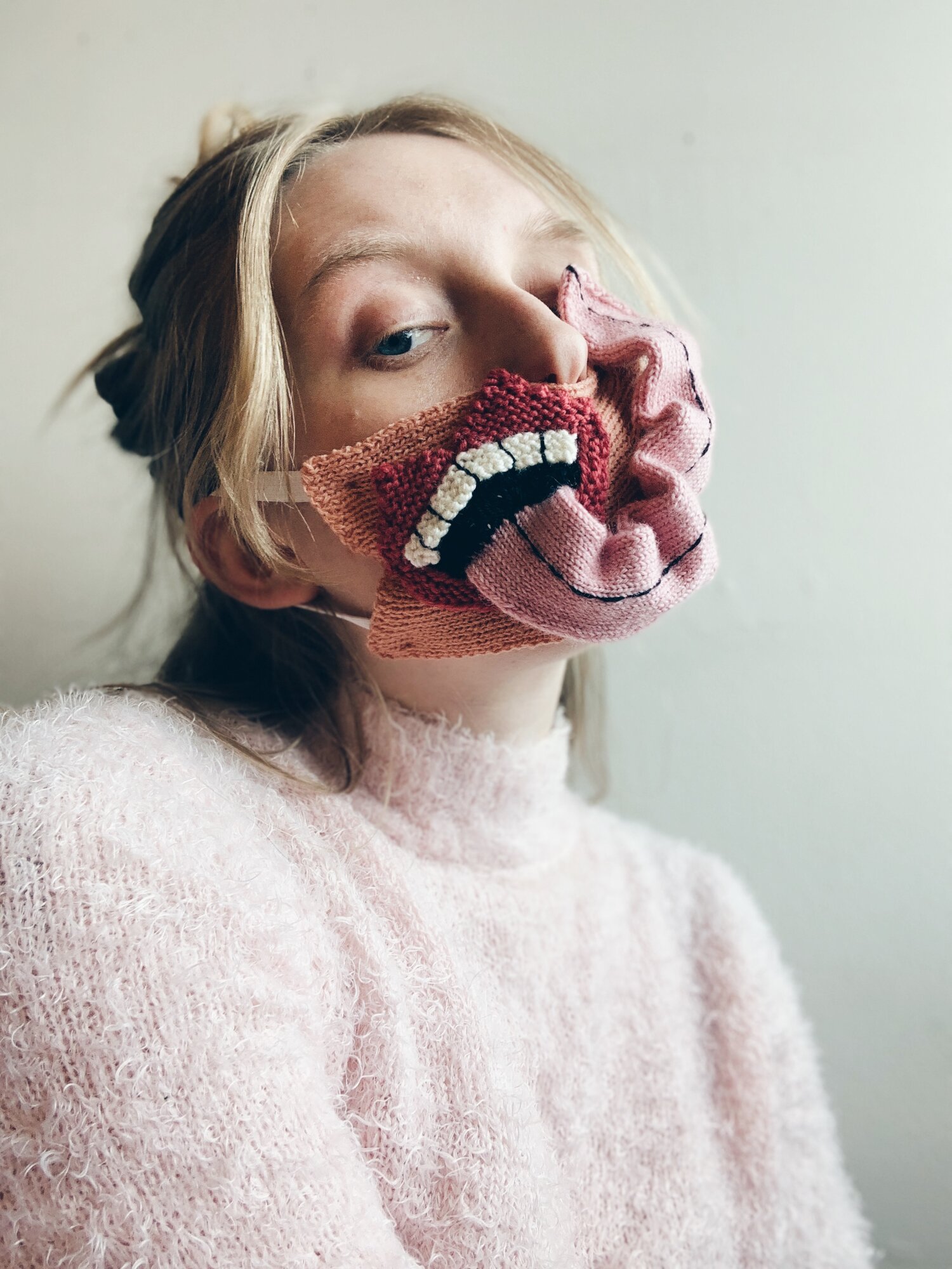 Ýrúrarí wearing a handmade face mask in response to COVID 19
Other useful local contacts and inspiration
Moving On
Things I have Learned Week 01.
- I am way less scared of using programming languages than I thought.
- The history of the Bónus Pig is fascinating.
- I think now I am only working on one place my workflow will be vastly more organised.
- I am more comfortable around image manipulation than I was.
- Time Management is important. You can work on forever on each project as its all so interesting and expansive.
- Stay focused
- Stop tweaking this and move on to Week 02 already!!!
PEACE OUT